
¿Por qué si tengo un dashboard no soy capaz de tomar decisiones? vía @tristanelosegui. En los últimos posts he insistido en que la analítica digital nos ayuda a tomar decisiones sobre nuestra estrategia, y que en función del punto de madurez en el que se encuentre nuestra empresa, nuestra ‘necesidad de datos’ será diferente (estaremos en una etapa u otra del modelo de madurez de la analítica digital).

Pero ¿cuál es la realidad de muchas empresas? Las empresas tienen gran cantidad de datos a su alcance, pero no son capaces de poner orden entre tanto caos y como consecuencia, no tienen una visión clara de la situación. Gephi. Gephi social network visualisation. Hello!

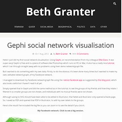
I just did my first social network visualisation. Using Gephi, on recommendation from my colleague Ollie Glass. It was super easy! Gephi is free and is a piece of software like Photoshop which runs on PC or Mac. It also has a really nice tutorial, which I ran through straight away with no problems using their demo network/graph file.
But I wanted to do something with my own data. I managed to download my Facebook network graph file using the netvizz facebook app as suggested by this blog post, which also looks useful but I haven’t read it all yet. Simply opened that in Gephi and did the same method as in the tutorial, to see the groups of my friends and how they relate. Primeros pasos con Gephi. Esto es un minitutorial, pensado para aquellas personas que quieran iniciarse en Gephi, no soy ni mucho menos un experto en este tema, esta entrada pretende ser una ayuda para comenzar.

Vamos a hacer unas primeras operaciones con un fichero, que podéis descargar aquí, se trata de la relación entre unas 3.000 cuentas de twitter. El Gephi que estoy usando está mitad en castellano y mitad en inglés, tenerlo en cuenta a la hora de seguir mis indicaciones. Primero vamos a Gehpi y Archivo/Abrir y abrimos este fichero: 15m.2013 Una vez abierto ya salen los nodos, nos vamos a quedar en “Vista General” donde aparecen 3 columnas, la primera con las pestañas Particionamiento y Clasificación, en la segunda está el grafo, y en la derecha contexto, estadísticas y filtros.
Introduction to Network Visualization with GEPHI. New tutorial available!

A completely new version of this tutorial has been published, with 2 complete and complementary datasets to learn and explore many basic and advanced features of Gephi: To the new tutorial Gephi workshop at University of Bern (photo Radu Suciu) Social Network Analysis is a lens, a way of looking at reality. (Claire Lemercier at Swiss Digital Humanities Summer School 2013) Network Analysis appears to be an interesting tool to give the researcher the ability to see its data from a new angle. I propose below, after a short introduction about the basis of SNA and some examples which shows the potential of this tool, a transcript of tutorial given during a workshop of the first Digital Humanities summer school in Switzerland (June 28. 2013), and kept up to date. 1.
Using Visualization to Understand Social Networks on Datavisualization.ch. Visualizing Social Media Data for Educational Use - Infovis Tools. Visualization as Process, Not Output - Jer Thorp. By Jer Thorp | 8:00 AM April 3, 2013 “Please make me a visualization.”

I get a lot of emails that say this or some variation of it. They tend to make me think of other requests that could be made in the same form, like: “Please make me a roast beef sandwich.” Or: “Please make me a scale model of the Eiffel Tower.” Roast beef sandwiches and scale models of the Eiffel Tower, in these sentences, are common nouns. “Please visualize our data.” The nice thing about this sentence is that it may result in many things. In 2009, I was asked by Jake Barton to design an algorithm that would place the nearly 3,000 names of victims on the 9/11 memorial in Manhattan in specific places, so that certain names could be near each other, per the wishes of their next-of-kin.
The first step, then, was to get some idea of the scale and peculiarities of this particular problem. A visualization of the victim names and requested adjacencies for the 9/11 Memorial. None of these is meant for public consumption. Big Data Analytics: el futuro de la analítica digital vía @tristanelosegui. En el anterior post vimos los pasos previos al Big Data: basic y small data.

Ahora nos toca adentrarnos en el mundo del Big Data. Es un tema que da para decenas de post, así que lo mejor es que empecemos por el principio. The Data Visualisation Catalogue. The Data Visualisation Catalogue. Anatomy of a Facebook Business Page — Greg Kroleski. Reposed from the Hearsay Social blog - See the original post here One of the things I love about working at Hearsay Social is the freedom to explore new tools and methods of analysis.

I recently spent some time digging into the open source data visualization program Gephi and decided to share some of the insights I came across. Many marketers still measure the value of their social media pages by a count: either a count of fans or a count of engagements (likes, comments, etc.). Unfortunately, the insights provided by these measurements are nominal. If you want to know the true value of your fans or how your social media communities are contributing to real ROI and sales results, then these basic counts should be a start, not an end. We have already learned that not all fans should be valued equally and that local fans can be worth as much as 40x that of corporate fans. Below is an image representing Hearsay Social’s Facebook business page.
It’s not just a pretty graph.