

Media Queries Level 4. Conformance requirements are expressed with a combination of descriptive assertions and RFC 2119 terminology.
The key words “MUST”, “MUST NOT”, “REQUIRED”, “SHALL”, “SHALL NOT”, “SHOULD”, “SHOULD NOT”, “RECOMMENDED”, “MAY”, and “OPTIONAL” in the normative parts of this document are to be interpreted as described in RFC 2119. However, for readability, these words do not appear in all uppercase letters in this specification. All of the text of this specification is normative except sections explicitly marked as non-normative, examples, and notes. [RFC2119] Examples in this specification are introduced with the words “for example” or are set apart from the normative text with class="example", like this: Informative notes begin with the word “Note” and are set apart from the normative text with class="note", like this: Note, this is an informative note. The specification will remain Candidate Recommendation for at least six months.
No properties defined. Use CSS transitions to link Media Queries and JavaScript — Paul Hayes. A common problem in responsive design is the linking of CSS3’s media queries and JavaScript.
For instance on a larger screen we can restyle, but it might be useful to use JavaScript and pull in different content at the same time, eg higher quality images. With CSS transitions, specifically their transitionEnd events, we can marry up our media queries and JavaScript perfectly, without resorting to window resize events. Media Queries Level 4. Media Queries cours et formation gratuit. Media Queries: An illustrated introduction. What are media queries?
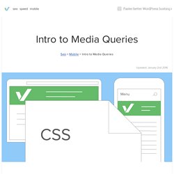
Media queries are CSS instructions essential to building modern websites and blogs They allow different css instructions to be used for different sized screens Media queries allow you to present the same content differently on different size screens. Most people think of them as a way to make the same webpage look good on a phone or a desktop computer. Media Query Snippets - list of media queries. Landscape @media (max-device-width: 1024px) and (orientation: landscape) { } Portrait @media (max-device-width: 600px) and (orientation: portrait) { }
CSS3 Media Queries. Media Queries for Standard Devices. If you think responsive's simple, I feel bad for you son.
We got 99 viewports, but the iPhone's just one. —Josh Brewer, March 10, 2010 A major component of responsive design is creating the right experience for the right device. Taille des écrans, responsive design, et point de rupture. Très régulièrement, on me pose des questions sur les tailles des écrans pour faire un design « responsive ».
Pour ceux qui connaisse le terme, mais qui ne savent pas vraiment ce que cela veut dire, sachez qu’on appelle « design responsive » (ou responsive design ) la capacité d’un site web à s’adapter au terminal de lecture. Responsive design – harnessing the power of media queries. Webmaster Level: Intermediate / Advanced We love data, and spend a lot of time monitoring the analytics on our websites.
Any web developer doing the same will have noticed the increase in traffic from mobile devices of late. Over the past year we’ve seen many key sites garner a significant percentage of pageviews from smartphones and tablets. These represent large numbers of visitors, with sophisticated browsers which support the latest HTML, CSS, and JavaScript, but which also have limited screen space with widths as narrow as 320 pixels. Media queries for common device breakpoints. The @media query is 1/3 of the recipe for responsive design.
It is the key ingredient that, in it’s simplest form, allows specified CSS to be applied depending on the device and whether it matches the media query criteria. Before you start copying and pasting below, read why you don’t need device specific viewports. CSS3 Media Queries. CSS2 allows you to specify stylesheet for specific media type such as screen or print.

Now CSS3 makes it even more efficient by adding media queries. You can add expressions to media type to check for certain conditions and apply different stylesheets. For example, you can have one stylesheet for large displays and a different stylesheet specifically for mobile devices. Awesome Media Queries in JavaScript - enquire.js.
The Lowdown What is it?
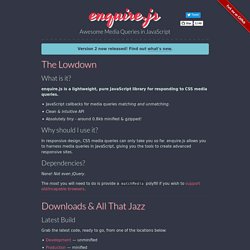
Enquire.js is a lightweight, pure JavaScript library for responding to CSS media queries. JavaScript callbacks for media queries matching and unmatching. Clean & intuitive API Absolutely tiny - around 0.8kb minified & gzipped! Why should I use it? Defining Breakpoints. Breakpoints are the point a which your sites content will respond to provide the user with the best possible layout to consume the information. When you first begin to work with Responsive Design you will define your breakpoints at the exact device widths that you are looking to target.
Most often these are the smart phone (usually the iPhone at 320px and 480px), the tablet (usually the iPad at 768px and 1024px) and finally anything above 1024px. I hope I didn’t hurt your feelings but seriously, you’re approaching this in the wrong way. Instead of being concerned with device breakpoints the best practice is to design for your smallest viewport first. Media queries for common device breakpoints. Reponsive design : les Media Queries. Avant, créer un webdesign, c’était simplement créer l’interface pour les écrans d’ordinateurs. Il y avait plusieurs contraintes, notamment la gestion des différents navigateurs, mais on devait aussi faire avec les différentes résolutions existantes. Aujourd’hui, c’est toujours le cas, mais le problème des résolutions est devenu encore plus important avec l’avènement de la navigation mobile. Scottjehl/Respond: A fast & lightweight polyfill for min/max-width CSS3 Media Queries (for IE 6-8, and more)
Google Code Archive - Long-term storage for Google Code Project Hosting. How To Use CSS3 Media Queries To Create a Mobile Version of Your Website. Advertisement Many companies try to create a great experience for customers. But few are willing to make the changes required to deliver on that promise. In fact most don’t even realize just how bad their experience can be. This is why we made a new book called “User Experience Revolution,” a practical battle plan for placing the user at the heart of your company.
Un Petit Conseil: N'oublie pas la Balise Viewport Meta. How To Write Mobile-first CSS. 17th Dec 2014 Building responsive websites is a must-have skill for front-end developers today. When we speak about responsive websites, the term mobile-first pops into mind immediately. We know the importance of designing from a mobile-first perspective. Unfortunately, much less was said about coding from a mobile-first approach. Today, I’d like to share with you about the mobile-first approach to styling, why it is much better, and how to work its magic. Responsive Web Design · An A List Apart Article.
The English architect Christopher Wren once quipped that his chosen field “aims for Eternity,” and there’s something appealing about that formula: Unlike the web, which often feels like aiming for next week, architecture is a discipline very much defined by its permanence. Article Continues Below A building’s foundation defines its footprint, which defines its frame, which shapes the facade. The 100% correct way to do CSS breakpoints – freeCodeCamp. For the next minute or so, I want you to forget about CSS. Forget about web development. Forget about digital user interfaces. And as you forget these things, I want you to allow your mind to wander.
To wander back in time. Back to your youth. It was a simpler time, when all you had to worry about was drawing shapes and keeping your incontinence in check. Take a look at the dots above. Go ahead. You probably came up with something like the below, right? Sure, those two dots on the right could have gone either way. Before I go on, did you draw something like the below? Probably not.
Responsive CSS Patterns without Media Queries. Let me start by saying that despite the title, this article is not about doing away with media queries or media query bashing in any way. Media queries are incredibly useful and I use them all the time for all sorts of things. However, they don’t solve all our responsive design problems. It’s often desirable to effect changes to an arrangement of elements based on the dimensions of their container, rather than the viewport.
To solve this problem, the concept of element queries was born. However, element queries aren’t really a thing yet, and Mat Marquis has demonstrated some problems with the concept and reformulated them as container queries. Responsive web design : Les autres usages. Un site web « adaptatif » Vous l’aurez remarqué, depuis quelques temps, le web ne se consomme plus seulement derrière son écran d’ordinateur mais sur des tas de nouveaux appareils ayant chacun leurs spécificités (Taille de l’écran, résolution, connectivité internet, écran tactile, …). Au début de cette transition, beaucoup se sont lancés dans la création de site internet dédié au mobile afin de permettre aux utilisateurs nomades, d’avoir accès à l’information dans une version souvent très simpliste. A cette époque, il n’était pas rare de trouver deux versions d’un site internet (La version Desktop et la version Mobile).
Les Media Queries CSS3. Essential considerations for crafting quality media queries. Responsive Web Design - but for real! Les Media Queries CSS3. Comment utiliser Chrome pour gérer les media Queries. Les sites « Responsive » deviennent incontournables en 2012. Par « Responsive » entendez tout site qui peut facilement s’adapter au contenu en se reposant sur la taille de la fenêtre du navigateur. Dans ce tutoriel, je me contenterai de vous donner quelques articles qui font référence et un moyen de peu à peu explorer la toile avec Chrome tout en intégrant le processus. Quelques liens incontournables Sur Webdesignerwall. Look Ma! No media queries!! Media Query Bookmarklet. We created this bookmarklet to aid in designing responsive websites. Now you can always know what media query just triggered. Never again will you lose track of where you are. One thing that I quickly noticed when we started building responsive websites was that we were constantly resizing our browsers.
We would resize the browser to the largest media query, and then step down and watch the changes so we knew what media query we were looking at. This is not a good way to design a website. So, I wrote this little bookmarklet. Media Queries. Media Queries for Standard Devices. Media Queries. Responsive Web Design Media Queries. Les Media Queries CSS. CSS3 : initiation aux media-queries pour adapter ses pages web à tout type d'écran - CSS débutant.
Avec l'avènement des smartphones ou autre tablette, la multiplication des tailles et des résolutions d'écran, il devient de plus en plus aléatoire de ne réaliser qu'une seule disposition graphique de sa page web... Comment en effet visualiser correctement sur un smartphone une page qui aurait été pensée pour une résolution minimale de 1900px ? (ce qui est très mal, d'ailleurs...) Le responsive design avec les Media Queries. Media queries. Une media query (ou requête média) consiste en un type de média, et au moins une expression limitant la portée des déclarations CSS, en mettant à profit les particularités des supports multimédias comme leur largeur, leur hauteur ou leur affichage des couleurs. Les Media Queries CSS3. Css3-mediaqueries-js - css3-mediaqueries.js: make CSS3 Media Queries work in all browsers (JavaScript library)