
Accessible Design Systems: Look Good While Doing Good. Esign is powerful.

We chat with our friends and loved ones halfway across the globe, we can check on our pets while at work, and sync as a team in a pandemic. And design systems let us scale those experiences seamlessly to any device or touchpoint. But who is your design system excluding from the conversation? /inspiration-ux-ui-les-bonnes-pratiques-dun-formulaire-de-connexion-login-form/amp/ Where to put buttons on forms by Adam Silver. Button placement on forms is often ignored or prioritised based on what looks good.
But button placement can make or break a form, and a form can make or break a user’s experience. That’s why it’s essential to get it right. This is more challenging that in sounds because it depends on the buttons and the form in question. It also requires us to analyse different forms holistically. Otherwise we could end up with the same button appearing in different places which is inconsistent and confusing. Content or design first? - DESK Magazine.
This is the first in our new UX Writing series on the blog, exploring how we – as designers or copywriters – can write better, smarter, more effective copy for our digital products.
The age-old question: Should design or content come first? Despite all the talk of teamwork in our industry, creative departments still work mostly in isolation. We may gather for a grand strategy meeting at the beginning of a project or schedule weekly standup meetings to check items off a list. We might swing by someone’s desk to answer a question or give feedback on a specific problem.
This doesn’t necessarily amount to collaboration. The First Banner Ad - AT&T "You Will" Should I Use A Carousel? How to Master the Design Grid - UX Planet. For the past year, I’ve been teaching UX and Product Design at General Assembly here in Toronto.
I’ve learned a ton, and the students that come through the door are full of excitement, hope and enthusiasm for building the products and services of tomorrow. On several occasions I’ve seen that excitement, hope and enthusiasm drain from their faces, and leave them drowning in a pool of despair. The cause? 10 Tips On Typography in Web Design - UX Planet. For mobile devices, you should go for 30–40 characters per line .
Below is an example of two sites viewed on a mobile device. The first one uses 50–75 characters per line (optimum number of characters per line for print and desktop), while the second one uses the optimal 30–40 characters. In web design you can achieve an optimal number of characters per line by restricting the width of your text blocks using em or pixels. Users will access your site from devices with different screen sizes and resolutions. Most user interfaces require text elements of various sizes (button copy, field labels, section headers, etc). Réferentiel de normalisation web - Renow // Luxembourg. Confronté aux doutes des clients, AWS veut démythifier le CLOUD Act. What is email open rate? Design Better Forms - UX Collective. Carousel Interaction Stats - June 2013 Update. Carousels continue to be a hot topic.
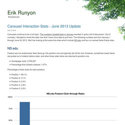
The numbers I posted back in January resulted in quite a bit of discussion. Out of curiosity, I decided to revisit the data now that I have more data to pull from. Les Progressive Web Apps, le futur du Web mobile ? : Siècle Digital. 10 commonly confused air travel terms to get straight. Does a ‘non-stop’ and ‘direct’ flight sound the same to you?

Or do you use the terms ‘transit’ and ‘transfer’ interchangeably? In fact, these air travel terms actually mean different things. Fret not, as even the most seasoned of frequent flyers get confused with similar-sounding terms such as these. Here are five pairs of air travel terms to get right, as they can impact your trip significantly. Non-stop vs. direct flight. 50 Million Is Just The Beginning: Automation, Templates, And More New Features To Keep Your Team Building. Today Trello is celebrating a massive milestone—50 million registered users!

From organizing projects to automating processes, we are the operating system for how teams get things done. That's why I am excited to announce that we're releasing new features to help your team get started quickly, automate and simplify essential processes, and save valuable time. Today’s feature launch is about doubling down on removing the barriers that keeps your team from moving forward. Here’s what you can start using right now: Quels sont les meilleurs moments pour poster sur les réseaux sociaux ? : Siècle Digital.