
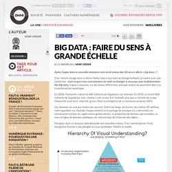
Redefining optimal. It's not about the data : Nature Genetics. Big Data : faire du sens à grande échelle. Après l'open-data la nouvelle tendance tout droit venue des US sera-t-elle le « big data » ?
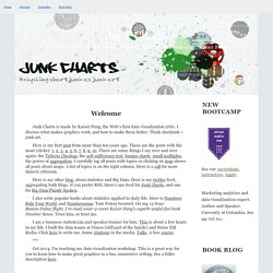
D’un récent voyage dans la Silicon Valley (merci aux amis du Orange Institute), je rentre avec une conviction : tout ce que nous connaissions du web va changer à nouveau avec le phénomène des big data. Il pose à nouveau, sur des bases différentes, presque toutes les questions liées à la transformation numérique. The Sex Profile. CNN lance Ecosphere Project, un magnifique dispositif de visualisation de conversation twitter. Education Pays. Education Pays. The capitalist network that runs the world - physics-math - 19 October 2011. AS PROTESTS against financial power sweep the world this week, science may have confirmed the protesters' worst fears.

An analysis of the relationships between 43,000 transnational corporations has identified a relatively small group of companies, mainly banks, with disproportionate power over the global economy. The study's assumptions have attracted some criticism, but complex systems analysts contacted by New Scientist say it is a unique effort to untangle control in the global economy. Pushing the analysis further, they say, could help to identify ways of making global capitalism more stable. The idea that a few bankers control a large chunk of the global economy might not seem like news to New York's Occupy Wall Street movement and protesters elsewhere (see photo). Alternative and Nuclear Energy (Percentage of Total Energy Use) Mapping a World of Human Activity. With the world networked on an unprecedented scale, and the global population hitting 7 billion only weeks ago, we are living in a uniquely interconnected era, creating new opportunites and dependencies.
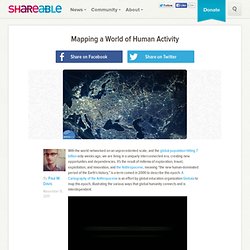
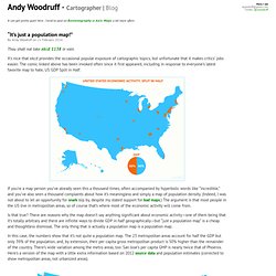
It's the result of millenia of exploration, travel, exploitation, and innovation, and the Anthropocene, meaning “the new human-dominated period of the Earth’s history,” is a term coined in 2000 to describe this epoch. A Cartography of the Anthropocene is an effort by global education organization Globaïa to map this epoch, illustrating the various ways that global humanity connects and is interdependent. Anthropocene Mapping from Globaïa on Vimeo. Les data en forme. La veille hebdomadaire des journalistes de données d'OWNI vous propose cette semaine de vous data-situer dans l'humanité, de visualiser votre dîner ou encore d'ouvrir les données de la Bible...
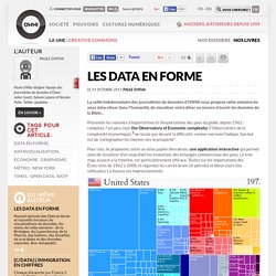
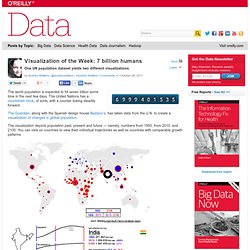
Présenter les volumes d’importations et d’exportations des pays du globe, depuis 1962 : complexe ? Un peu, mais the Observatory of Economic complexity (l’Observatoire de la complexité économique), ne recule pas devant la difficulté, comme son nom l’indique. Son but est de “cartographier les chemins vers la prospérité”. Pour cela, ils proposent, outre un atlas papier bien dense, une application interactive qui permet ainsi de visualiser d’un coup d’œil les évolutions des échanges commerciaux des pays. Le tree map, associé à la timeline, est particulièrement efficace. 7 billion humans. The world population is expected to hit seven billion some time in the next few days.
50 Great Examples of Data Visualization. Wrapping your brain around data online can be challenging, especially when dealing with huge volumes of information.

And trying to find related content can also be difficult, depending on what data you’re looking for. Historical Timeline of Computable Knowledge: 1900-1959. 1900: National Physical Laboratory; National Bureau of Standards Using physics to create standards NPL in the UK and NBS in the US are founded to make measurements and standards using methods from physics.

Visualizing.org : WEF Challenge. Visualization and Visual Communication. Simple Complexity — Making Simple Sense From Complex Data. Junk Charts. This post is part 2 of an appreciation of the chart project by Google Newslab, advised by Alberto Cairo, on the gender and racial diversity of the newsroom.
Part 1 can be read here. In the previous discussion, I left out the following scatter bubble plot. This plot is available in two versions, one for gender and one for race. The key question being asked is whether the leadership in the newsroom is more or less diverse than the rest of the staff. Accuracy&Aesthetics Blog. It can get pretty quiet here.
Hubs and Connectors: Understanding Networks Through Data Visualization. Yesterday a bunch of friends were tweeting about the new LinkedIn InMaps web app (part of LinkedIn Labs), so I had to check it out for myself.
Visualizing The Web & Social Networks. May 26, 2010 Posted by Suzanne Marlatt Edelman Digital, Chicago Follow on Twitter @edelmandigital Seeing is believing and visuals are powerful. I’ve collected a few visualization tools for Facebook, news feeds, and Twitter to let you view networks and conversations at a glance. Mentionmap Mentionmap is a web app for exploring the Twitter users and hashtags that mention your account most. Twitter Venn Twitter Venn is a Venn diagram based on three Twitter search terms. The Health Tweeder The Health Tweeder is a health specific visualization tool that displays the top discussed health keywords within certain Twitter networks.
Prezi - The Zooming Presentation Editor. Exoplanet Orbit Database. Lift 2011 : Visualisations des tweets. Well-formed data. WallStats - The Art of Information. Well-formed data. Datavisualization. Ideas, issues, knowledge, data - visualized! Data Visualization, Infographics, and Statistics.