
Conciselearning. Network Display Kit. DIY 2.4GHz ISM band RF spectrum analyzer using CYWM6935 and Noritake VFD. Processing.org. Ideas, issues, concepts, subjects - visualized!
Research Chronology - a chronological visualization of del.icio.us activity [by aaron siegel] A Periodic Table of Visualization Methods. Climate Change Deniers vs The Consensus. Read about the background to this image | Leave a comment | See more visualisations and info images | Home UPDATE 1 (12th Dec 09): There have been a few complaints about the legibility of the image.
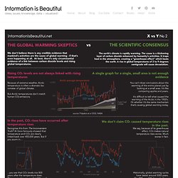
So I’ve created a version on white instead of black. UPDATE 2 (19th Dec 09): Thanks to amazing feedback, I’ve amended the language and wording and detail of the image. Thanks particularly to Arthur Smith and Jooil Kim for clarifying info. Nice! VUVOX - slideshows, photo, video and music sharing, Myspace codes. Welcome - Context Free Art. Prezi - The zooming presentation editor. 25+ Useful Infographics for Web Designers. Infographics can be a great way to quickly reference information.
Instead of pouring over figures and long reports to decipher data, an infographic can immediately make apparent exactly what a dataset actually means. Below are more than 25 infographics that can be useful to web designers. Some are incredibly practical, some provide information that might be of interest to designers and some just present data that might be interesting to those who design websites all day. If you know of any good ones that we may have missed, please add them in the comments section below. 1. Chartle.net - interactive charts online!
A multipurpose toolkit : vvvv : a multipurpose toolkit. The Omni Group - OmniGraphSketcher. A visual exploration on mapping complex networks. Timeline of Trends and Events (1750 to 2100) Processing 1.0 (BETA) Neighboroo. Datadreamer laboratories. BEN FRY - of processing fame. Asymptote Asymptote: The Vector Graphics Language. Solaas.com.ar Visualization guru. Data Visualization and Statistics. Breathing Earth.