

CSS.MaxDesign - CSS Tools & Tutorials. ! Layout-Palooza: Top CSS Layout Sites, Hacks, Galleries & Tricks. 15 Best Bootstrap Design Tools. Don't Forget to participate in a contest where you can win an amazing e-Commerce template from TemplateMonster.

In this post, we have gathered 10 best bootstrap design tools for the coming year. Bootstrap is the most commonly used front end framework in 2013 and many of you must have played with it. Therefore, we thought to compile a list of some useful bootstrap design tools for you. As a designer, it is always useful to look for some more design tools and options to make designing and developing tasks easier. Here, we are presenting 10 best bootstrap tools for 2014. Bootstrap Designer Bootstrap Designer is an online design tool, producing awesome HTML5 templates based on Bootstrap framework.
Get Kickstrap Kickstrap seamlessly combines Bootstrap with top-tier web technologies. Bootply Bootply is integrated with other popular Bootstrap plugins, micro-libraries and frameworks. Bootstrap Button Generator It’s easy. Easel Layoutit Bootswatch Boottheme Custome Font Tool. CSS Layout Reservoir - BlueRobot. About The Layout Reservoir Please feel free to borrow, steal, abduct, and/or torture the documents contained in the Layout Reservoir.
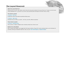
Though you need not give credit to BlueRobot.com, a comment in your source code would help other developers to find this resource. Enjoy. Dynamic Drive CSS Library: Free CSS Codes & Examples. CSS-P 3 Column Layout. 3 columns fluid layout This article on A List Apart has been a great source of inspiration for me.
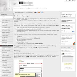
After taking this solution for a "test drive", I decided to implement negative margins the "other way around". I think the major advantage of this technique is that it uses fewer non-semantic elements and one less "float". It also seems to cure small issues not listed in the original ALA's demo: links inside the right column appear not to be clickable in Opera 6there are background painting problems in MSIEthere is one structural hack missing from the markup that makes NN6 unable to clear the left column. Three Column Centered Flexible Width Web Layout - Free Web Template - Three Column Centered Flexible Width Web Template.
About this Web Template: This is a free Web template showing how to create a centered, flexible width layout with three columns.
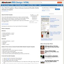
The width of the entire page is flexible upto a maximum size of 1000px, and the widths of the interior columns is flexible as well. Create CSS Layouts Without Using FLOAT. There are many CSS layouts out there.
Some rely on AP (Absolutely Positioned) elements, others use floats. The former method is considered bad practice for its lack of flexibility while the latter is a powerful solution in building robust layouts. Unfortunately, like most powerful tools, floats can be a dangerous method to employ or at least very frustrating. First of all, the float concept itself is not easy to properly understand, and second of all, floats are a source of many browser bugs (mainly IE bugs) which make float constructs difficult to master across browsers… and easy to break.
This article demonstrates an original solution that addresses semantics, construct, and design issues to deliver robust layouts. Sneak peek Starting with the usual markup Step 1 Check step 1. CSS Template Generator - 3 Col Layout, No Tables. This HTML - CSS template generator yields a three column layout without using any Tables.
This HTML & CSS Style Sheet template generator outputs a full featured 3 column template. Resulting in an instant web page with a customized template that can be used to control the look n feel of an entire site. The resulting CSS web template is not just a static template because the visitor can modify setting until he/she is happy with the design. Therefore, the template generator serves as a full function HTML - CSS editor for the popular 3 column layout. This is the perfect startup page for webmasters that are ready to move to a CSS column layout instead of the older (outdated) table layout. In this template generator, the user enters colors, size, width, banner, etc into a form that generates a complete template.
Basic Settings: Font Size, Font Style, Font Color and Border Color Banner: Height, Color, Header Image and Border. CSSplay - Experiments With CSS. CSS Layouts Listing - CSSPlay. Cross browser FIXEDFixed header and footer, scrolling content.
Nice & Free CSS Layouts. Freebiesbug: Free Fonts, CSS Snippets, Patterns, PSD. PHP, HTML & CSS Generators & CSS Tutorials. Free CSS Website Layouts and Templates. These free CSS website layouts give you a great starting point for your next website project.

All layouts were generated by CSS Sculptor and are just a small sample of the flexibility and power of the extension. CSS Sculptor gives you total control over every aspect of your page, and makes creating valid CSS layouts fast. We created all the following layouts in less than 30 minutes! Try accomplishing that with hand-coding! All layouts embed the CSS code into the page, so there is no external stylesheet to download. AcIS Web Template CSS Demo. In Search Of The One True CSS Layout. Pure CSS-based layouts have come a long way but they still have shortcomings [2] that fail to address certain design goals without compromising the true separation of content and presentation.
In short, the problematic design goals are these: Total Layout Flexibility That is, the ability to order columns logically in the source while displaying them in any order desired. For any number of columns. Equal Height Columns Or more accurately, equal height columns without having to rely on faux columns. Vertical placement of elements across grids/columns Designers face the choice of relying on elements being a particular height, resorting to tables or simply not bothering. This article shows how to achieve each of these goals, and then how to combine them, creating what could be called the One True Layout™ [3]. Problems with the Equal Height Columns method Several problems have been found with the Equal Heights method, detailed in Appendix J.
CSS Class. CSS Variable Fixed Width Layout - Clagnut. There’s an different approach to web page layout which is gradually getting some traction.
The idea is that the layout is changed to best accommodate the window size. As you might expect, it is accomplished by using JavaScript to change the CSS of the webpage.