
Making Music With D3 - Road to Larissa. Click to add a note; requires firefox or chrome.
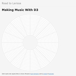
Remake of Jack Vishneski’s and my remake of tonematrix. Polar coordinates are pretty cool for displaying looping music! The music actually loops and larger boxes produce lower pitches, just like they do in real life. Other, smaller improvements: Log scaled sliders allow for finer control of large and small values.
Still todo: Customizable beats – both the raw number and their duration to allow for swinging and different time signatures.More scales and some sort of visualization of half and whole steps. QI. Stacked Radial Area. This plot might be suitable for showing cyclical trends, though I'm not sure it’s a great idea as the radial display has a number of limitations: The underlying data goes from Sunday to Saturday, but the chart shows continuity from Saturday through to the previous Sunday.
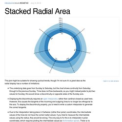
Time does not flow backwards, so you might instead prefer to plot two values for Sunday; this would show a discontinuity on opposite sides of the Sunday axis.Displaying the discontinuity requires an open interpolator, rather than cardinal-closed as used here. However, this causes the tangents of the incoming and outgoing lines to no longer be orthogonal to the axis. Polar charts are pretty. But when in doubt, it’s probably best to stick to Cartesian coordinates. Www.jeromecukier.net/projects/agot/events.html.
US Federal Budget Data Visualization. When politicians talk about “spending” have you ever wanted to know where our tax dollars actually go?

This visualization that was assembled with publicly available data from the Congressional Budget Office (www.cbo.gov) lets you do exactly that. The goal of this visualization is to allow a user to quickly see the major flows of spending in our government, at the federal, state, and local level. It’s interesting to see the relationship of spending between education and defense at both the Federal and Local level. [+] Click to Launch Interactive Project zoom [+] Click to Launch Interactive Project. Political Influence Data Visualization D3.js.
Weibo Visualization. Sylvia and I made this visualization as our final project in the fall 2012 Visualization course at Peking University.
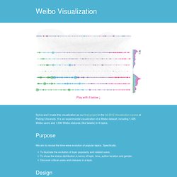
It is an experimental visualization of a Weibo dataset, including 1,425 Weibo users and 1,930 Weibo statuses (like tweets) in 4 topics. Purpose We aim to reveal the time-wise evolution of popular topics. Specifically: To illustrate the evolution of topic popularity and related users.To show the status distribution in terms of topic, time, author location and gender.Discover critical users and statuses in a topic. Design There are three views in this visualization: status chart, topic chart, and user chart. The main view is the 7-layer bubble chart of statuses.
On the right side is a stacked area chart to demonstrate a big picture of topic evolution, in either absolute value or in percentage. Visualization of Beijing Air Pollution. This interactive visualization demonstrates the intensity distribution of several major pollutants in Beijing during October 17 and October 30, 2012.
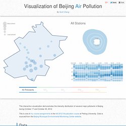
This is one of my course assignments in the fall 2012 Visualization course at Peking University. Data is sourced from the Beijing Municipal Environmental Monitoring Center website. Data The data that I have are hourly samples at 27 monitor stations over 14 days. In each record, there are concentration values of four types of pollutants (SO2, NO2, PM2.5, PM10). In order to draw the map, I also extracted the following spatial data from here: Rouge outline of Beijing (I know it looks kinda unprofessional, but it’s sufficient to serve my purpose)Coordinates of each monitor station. Line Tension. Journals. Word Cloud Generator. Hive Plots. Showing 764 dependencies among 220 classes.
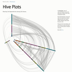
Many methods of graph drawing, such as force layouts, do not assign intrinsically-meaningful positions to nodes: the position is only approximate, in the hope that related nodes appear nearby. While intuitive, these methods arguably make poor use of the most effective visual channel (that is, position), and in the worst case produce an indecipherable hairball. Enter Krzywinski’s hive plot. Hive plots define a linear layout for nodes, grouping nodes by type and arranging them along radial axes based on some property of data. The explicit position encoding has the potential to better reveal the network structure while communicating additional information.
Each node above represents a class in a software library. This grouping immediately reveals much about the different classes. Want more? Special thanks to Rich Morin for assisting in the implementation of hive plots in D3! House Hunting All Day, Every Day - Trulia Insights. The Facebook Offering: How It Compares.