
Clippy — CSS clip-path maker. Getting Started with CSS Shapes: Wrapping content around custom paths. For a long time, web designers have been forced to create within the constraints of the rectangle.
Most content on the web is still trapped in simple boxes because most creative ventures into non-rectangular layout end in frustration. That is about to change with the introduction of CSS Shapes, available starting with Chrome 37. CSS Shapes allow web designers to wrap content around custom paths, like circles, ellipses and polygons, thus breaking free from the constraints of the rectangle. Shapes can be defined manually or they can be inferred from images. Let's look at a very simple example. Perhaps you've been as naïve as me when first floating an image with transparent parts expecting the content to wrap and fill the gaps, only to be disappointed by the rectangular wrap shape persisting around the element.
The shape-outside: url(image.png) CSS declaration tells the browser to extract a shape from the image. The float property is key here. Creating shapes manually The circle() function. Creating Non-Rectangular Layouts With CSS Shapes. Today we can create all kinds of shapes with CSS using CSS transforms, but all these shapes do not affect the flow of the content inside or around them.
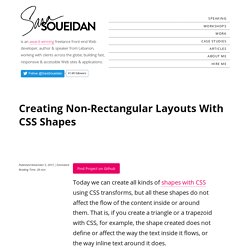
That is, if you create a triangle or a trapezoid with CSS, for example, the shape created does not define or affect the way the text inside it flows, or the way inline text around it does. With the introduction of CSS Shapes into the web, wrapping content in custom non-rectangular shapes, and recreating print designs and layouts on the web becomes a piece of cake! In this article we're going to go over the basics of declaring shapes, and creating some simple layouts using these new CSS technologies.
When more CSS Shapes features are implemented, more complex and awesome layouts will be possible, but even with what we have at hand now, some interesting and very creative layouts can be created with a little extra experimentation. The CSS technologies we’ll be covering in this article may not work in your browser. How, exactly? 3 outils pour créer des cartes personnalisées. Plus que jamais indispensables dans les applications web & mobile, les cartes font parti intégrante de nombreux projets.
Et si vous les rendiez encore plus belles et plus pratiques ? Au-delà du très gros Google Maps, des centaines de plug-in pour vos CMS, ou encore les librairies JS, il existe des services spécialisés dans la mise à disposition de cartes. Fonctionnant de manière OpenSource ou non, ils vous permettent d’imaginer toutes sortes de plans selon vos besoins. MapBox Pour vos gros projets où la map est centrale MapBox est le poids lourd du domaine. Auto-Hiding Navigation in CSS and jQuery. A simple navigation that auto-hides when the user scrolls down, and becomes visible when the user scrolls up.
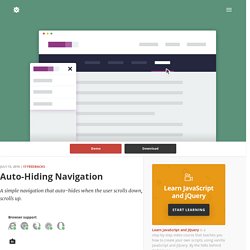
Browser support ie Chrome Firefox Safari Opera 9+ Auto-hiding navigations have been around for quite some time now, in particular on mobile devices. The idea behind this UX pattern is simple yet efficient: we want the navigation to be easy to reach all the time, so we stick it on top. However, we auto-hide it when the user scrolls down, to create more room for the content.
If the user scrolls up, we interpret his behaviour as a will to access the navigation, so we bring it back. Since we’ve been using this approach in several clients’ projects, we thought it would be handy to have a ready-to-use snippet here on CodyHouse. Images: Unsplash Creating the structure The HTML structure is composed of a header.cd-auto-hide-header element used to wrap the primary navigation (nav.cd-primary-nav) and a main.cd-main-content for the page main content. Adding style Events handling. AngularJS Tutorial. 4 Fun CSS Image Effects You Can Copy and Paste. 4 Fun CSS Image Effects You Can Copy and Paste Once upon a time we relied purely on Photoshop to create fancy image effects.
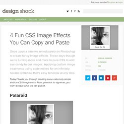
These days though we’re turning more and more to pure CSS to add eye candy to our images. Applying custom image treatments using code makes for an infinitely flexible workflow that’s easy to tweak at any time. Today I’ll walk you through creating some extremely simple and fun CSS image tricks. From polaroids to vignettes, you won’t believe what we can pull off. Polaroid Demo: Click here to view the demo on Tinkerbin. Our first image trick is a simple polaroid technique. Admittedly, this effect is super cheesy, but I’m sure you can come up with a decent application.
Our HTML for this effect is a div with the class “polaroid” applied. <div class="polaroid"><p>Sarah, Dec '02</p><img src=" /></div> Notice in the preview above that we’re using a custom handwritten font. Now it’s time to serve up the CSS to style this. Finally, it’s time to scoot that paragraph into place. Morphing Play/Pause SVG Icon.
Opacity On Scroll.