
Everything You Need To Know About CSS Margins. About The Author Rachel Andrew is not only Editor in Chief of Smashing Magazine, but also a web developer, writer and speaker. She is the author of a number of books, including … More about Rachel Andrew …
CSS masonry with flexbox, :nth-child(), and order. On the surface it seems fairly easy to create a masonry layout with flexbox; all you need to do is set flex-flow to column wrap and voilà, you have a masonry layout.
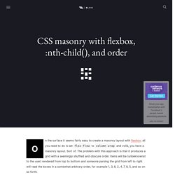
Sort of. The problem with this approach is that it produces a grid with a seemingly shuffled and obscure order. Items will be (unbeknownst to the user) rendered from top to bottom and someone parsing the grid from left to right will read the boxes in a somewhat arbitrary order, for example 1, 3, 6, 2, 4, 7, 8, 5, and so on so forth.
CSS conic-gradient() polyfill. To use directly in your CSS code like you would if it was supported, it requires -prefix-free.
Just include both scripts in order: Alternatively, you can use the API to directly get the SVG element generated and do whatever you want with it: Note that the generated image will always resize accordingly, you don’t have to provide a size. The size argument just controls the resolution of the bitmap image generated inside the SVG that will be scaled. Making it smaller will result in faster performance but less crisp gradients.
A Primer To Background Positioning In CSS. Applying background images to elements is probably one of the most used features in CSS, and many background properties exist that allow us to control different aspects of an element’s background.
An element can have more than one background image. If you want to apply more than one background image, you can provide them as a comma-separated list of values for the background-image property. The background-position property is used to specify the position of the background image, and this property is worth a deeper look because its different possible values have different results, some of which might be new to you if you are not very deep into CSS. To keep the code and concepts throughout this article simple, we’ll be positioning one background image throughout the examples. CSS Reference - A free visual guide to CSS. Paul Miller — Using dark mode in CSS with MacOS Mojave.
Text. Counters. Web Fonts. Media Queries. Tools. Blend Modes. Font Awesome. Grids. Animations. Shadows. Flexbox. Control Page Scroll in CSS Using Scroll Snapping. Pure-CSS Parallax Scrolling Effect. Advanced effects with CSS background blend modes. Combining CSS gradients with background-blend-mode The background property is where we can use CSS gradients.
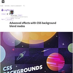
Functions like linear-gradient(), radial-gradient(), and the repeating-linear-gradient() and repeating-radial-gradient() varieties of the two have widespread support and more critically, a standardized syntax across browsers. But the background property can also accept more than one gradient rendered on top of each other, with each function separated by a comma. Lea Verou showcased impressive patterns that can be created with this technique, from checkerboards, to bricks, to stars. But now that we have the background-blend-mode property, we can create even more new gradients and patterns. Spectrum background Let’s overlay three gradients to make a background with nearly the full spectrum of colors that can be displayed on a monitor.
The effect above used to only be possible with an image, weighing in at many tens of kilobytes. How to create pure CSS illustrations and animate them - Part 1. I've always had a great interest in design, illustrations and colour palettes, but having spent the last few years focusing on becoming a better front-end developer, I've been left with little time to practice my creative skills.
When I was first introduced to CSS images, I couldn't wait to give it a try. At last I could play around with shapes and colors, and explore and develop my creativity while coding! Visual CSS flexbox builder. Layer Styles. 10 CSS3 Animation Tools You Should Bookmark. Getting Started With CSS Layout. Everything You Need to Know About HTML's 'pre' Element. HTML’s pre element is a simple and semantic way of displaying formatted content (such as source code) but it does have a few quirks.
Let’s talk about how this element works, potential issues to keep in mind, as well as some basic tips and tricks for enhancing it. How <pre> Works In an HTML document, the pre element represents preformatted text. This means your tab indents, double-spaces, newlines, and other typographic formatting will be preserved inside a pre element. By default, browsers will display the content inside a pre element using a monospaced (or fixed-width) font such as Courier or Monaco. Let’s look at an example of preformatted text. If you were to place that same text in another element, say a div, all of your extra spaces, new lines, and indenting will be ignored. <div> Jack: Hello. The browser will render it like this: See the Pen Div element ignores white space by SitePoint (@SitePoint) on CodePen.
<pre> Jack: Hello. See the Pen IpECf by SitePoint (@SitePoint) on CodePen. How To - Aspect Ratio / Height Equal to Width. CSS Reference - A free visual guide to CSS. Breakdown of a calc() for a square grid by Lasse Diercks on CodePen. Hey there!
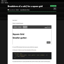
Today, I created this pen: It's one HTML element that turns every child into a square. In this post, I'd like to cover the calculation of the rows. CSS Shapes, clipping and masking – and how to use them. The release of Firefox 54 is just around the corner and it will introduce new features into an already cool CSS property: clip-path.
Magic of CSS — Adam Schwartz. What You May Not Know About the Z-Index Property. The z-index property in CSS seems simple enough, but there's a lot to discover beneath the surface if you really want to understand how it works.
In this tutorial we'll clarify the inner workings of z-index, by looking at stacking contexts and a few practical examples. CSS provides three different positioning schemes for the layout of boxes: normal document flowfloatsabsolute positioning The last completely removes an element from the normal flow and relies on the developer to tell the element where to display. You give it top, left, bottom, and right values to position the element in two-dimensional space, but CSS also allows you to place it in the third dimension using the z-index property. On the surface, z-index seems like an easy property to use. How to Make Magic, Animated Tooltips With CSS. Tooltips are a great way to enhance a UI when your users need some extra context for that fancy icon, or when they want some reassurance for clicking a button, or maybe an Easter Egg caption to go along with an image.
Let’s make some animated tooltips, right now, with nothing but HTML and CSS. Here’s what we’re working towards: Before we get immersed in the cauldron, let’s take a peek at what we’re actually brewing. Introducing CSS Scroll Snap Points. By Sarah Drasner On Before this new CSS I'm about to introduce existed, locking an element into the viewport on scroll required rigging up some JavaScript. Inner Shadows in CSS: Images, Text and Beyond.
Shadows in CSS are quick and easy, whether you’re slapping on a box-shadow or a text-shadow. But how comfortable are you with inner shadows? Can you pull off an inset box-shadow? How do you do the same thing on some text? Color Hex Color Codes. A Step by Step Guide to the Auto-Placement Algorithm in CSS Grid. In this tutorial, I’ll be going over all the steps the auto-placement algorithm of the CSS Grid Layout module follows when positioning elements. These steps are controlled by the grid-auto-flow property. In Introducing the CSS Grid Layout and Seven Ways You Can Place Elements Using CSS Grid Layout, I gave an overview of the CSS Grid spec and explained all the different ways Grid lets you arrange elements on the web. However, in my previous articles I explicitly specified the position of just one element in the grid.
As for the rest of the items, they got placed properly based on an algorithm. Position any background image with offsets in all corners. You can read and watch previous episodes here! What’s the problem? It’ll be an easy task if I told you to position a background image, 0.4em from the left border & 1em from the top border. Right ? The word “OR NAH.” is a background image. but, what about 1em from the bottom border and 0.2em from the right border ? Of course, you’ll have an answer, I did too. I used to calculate the width and the height of the box, then I use subtraction. That’s totally okay, but in responsive design this solution is useless. My next solution was to insert this background image as an actual <img />, so I could play with the layout.
A Beginner’s Guide to Pure CSS Images – dailycssimages – Medium. Clippy — CSS clip-path maker. Clip Path Generator - CSS Plant. Clip Path Generator - CSS Plant.