
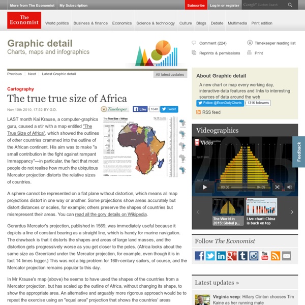
Are the Richest Americans Also the Best Educated? More Infographics on Good Commission on Mountain Cartography This Is What A World Map Looks Like When Scaled According To Population Size Where in the world did Australia go?! A new cartogram by Redditer TeaDranks rescales the world’s countries according to population size instead of geographic area. Reconstructing maps based on different variables can be a powerful tool for understanding the world we live in. In this case, certain regions almost disappear from the map while others expand considerably; Canada transforms into a thin, jagged line while India now takes up a massive amount of space. Other interesting tidbits: North Korea has a larger population than Australia, with 25.1 million people compared to 23.7 million, respectively. “I was inspired by this map which is now ten years old,” said TeaDranks. It is important to note that even modern world maps distort the Earth. To check out a high-resolution version of the map, click here. Credit: TeaDranks / Reddit Read this next: Improved Anti-HIV Antibodies Created Through Genetic Engineering
Video A NOTE ABOUT RELEVANT ADVERTISING: We collect information about the content (including ads) you use across this site and use it to make both advertising and content more relevant to you on our network and other sites. Find out more about our policy and your choices, including how to opt-out.Sometimes our articles will try to help you find the right product at the right price. We may receive payment from third parties for publishing this content or when you make a purchase through the links on our sites. A NOTE ABOUT RELEVANT ADVERTISING: We collect information about the content (including ads) you use across this site and use it to make both advertising and content more relevant to you on our network and other sites. A NOTE ABOUT RELEVANT ADVERTISING: We collect information about the content (including ads) you use across this site and use it to make both advertising and content more relevant to you on our network and other sites.
Income inequality, as seen from space Last week, I wrote about how urban trees—or the lack thereof—can reveal income inequality. After writing that article, I was curious, could I actually see income inequality from space? It turned out to be easier than I expected. Below are satellite images from Google Earth that show two neighborhoods from a selection of cities around the world. Rio de Janeiro Rocinha Zona Sul Oakland West Oakland Piedmont Houston Fourth Ward River Oaks Chicago Woodlawn Hyde Park Beijing Fengtai Chaoyang Boston metro area, Massachusetts Ball Square, Somerville West Cambridge Your examples Do you have other cities or neighborhoods in mind? Be sure to include the names of the cities and neighborhoods you’re highlighting and if you’d like me to mention your name. Your examples are now posted! Related posts: Urban trees reveal income inequality Income inequality in the Roman Empire Ghosts of geography
Choosing the best way to indicate map scale By Aileen Buckley, Mapping Center Lead In a previous blog entry, I asked, “Do all maps need a scale bar and north arrow?” I answered, “No” and talked a little about direction indicators like north arrows, but I didn’t really go into any detail about scale bars. Almost all maps are drawn to a scale, so it should be possible for these maps to indicate what the scale of the map is. Three primary scale indicators If the map is NOT drawn to scale (that is, the scale varies widely across the map), then it is even more important that you indicate that this is the case! All map scale indicators can be used 1) to determine the extent to which a geographic region has been reduced from its actual size and 2) to help the map reader determine distance on the map. Scale bars, also called bar scales, look like a small ruler on or near the map. A scale bar can be used like a small ruler to determine distances on maps. Example of a variable scale bar for a map using a Mercator projection. Design Uses
Word Map This experiment brings together the power of Google Translate and the collective knowledge of Wikipedia to put into context the relationship between language and geographical space. Please let us know if you have any suggestions. Note that not all languages are currently supported by Google Translate. To browse, just zoom in/out, pan around and click on the word to learn more. Enjoy! The Greek Kangaroo - Journal If the world’s population lived like… Shortly after I started Per Square Mile, I produced an infographic that showed how big a city would have to be to house the world’s 7 billion people. There was a wrinkle, though—the city’s limits changed drastically depending on which real city it was modeled after. If we all lived like New Yorkers, for example, 7 billion people could fit into Texas. If we lived like Houstonians, though, we’d occupy much of the conterminous United States. Here’s that infographic one more time, in case you haven’t seen it: What’s missing from it is the land that it takes to support such a city. It turns out that question is maddeningly difficult to answer. But what we can do is compare different countries and how many resources their people—and their lifestyles—use. Sources: Global Footprint Network. 2011. Wackernagel, M., Kitzes, J., Moran, D., Goldfinger, S. & Thomas, M. (2006). Related posts: If the world’s population lived in one city… 7 billion Spare or share?
Mapa: La geografía de las palabras - Los cartógrafos han sabido durante siglos la importancia de la organización de la información temática por el contexto geográfico para poder visualizarlo en un mapa. Un mapa temático le permite comprender la dinámica espacial de un tema dentro de una estructura que tiene fuertes puntos de referencia en la experiencia humana - una miríada de lugares y regiones de todo el mundo. Al mismo tiempo, un mapa temático nos puede mostrar las relaciones importantes entre estos lugares ya que son similares o difieren con respecto a alguna propiedad de interés. Pero Frankenplace no es sólo una herramienta de cartografía temática. El mapa de calor de arriba es el resultado de escribir ‘Santiago de Compostela’ en Frankenplace. Haz clic para accedera al mapa La versión actual de Frankenplace indexa más de 1,6 millones de artículos a partir de la versión en Inglés de Wikipedia y entradas de blogs de viajes en línea (octubre de 2014).
map_what_europe_would_look_like_if_all_the_separatist_movements_got_their This article originally appeared in Business Insider. The Scottish independence movement will embolden other active separatist groups in Europe to win their freedom, whether or not Scotland votes to secede from the UK on Thursday. From Catalonia and Basque Country in Spain to Veneto, South Tyrol, and the island of Sardinia in Italy to Flanders in Belgium, "the precedent of the vote on self-determination will reverberate around the Continent," the New York Times writes. European Free Alliance Advertisement See Also: If Scotland Votes “No”, It Might be Because of the Queen Powered by Livefyre Politics Meet the New Bosses How the Republicans would run the Senate. By David Weigel It Is Very, Very Stupid to Compare Hope Solo to Ray Rice By Amanda Hess The U.S. By Jordan Weissmann Even if You Don’t Like Batman, You Might Like Gotham Friends Was the Last Purely Pleasurable Sitcom The Eye This Whimsical Driverless Car Imagines Transportation in 2059 Medical Examiner Did America Get Fat by Drinking Diet Soda?
Vaccine-Preventable Outbreaks This interactive map visually plots global outbreaks of measles, mumps, whooping cough, polio, rubella, and other diseases that are easily preventable by inexpensive and effective vaccines. Red triangles indicate attacks on vaccinators and healthcare workers, as well as announcements from both governments and non-state actors that have had an impact—either positive or negative—on the successful implementation of vaccination programs. The Global Health Program at the Council on Foreign Relations has been tracking reports by news media, governments, and the global health community on these outbreaks since the fall of 2008. This project aims to promote awareness of a global health problem that is easily preventable, and examine the factors that threaten the success of eradicating preventable illnesses such as polio. Learn more about Global Health. On to the Vaccine-Preventable Outbreaks map
40 maps that explain the internet The internet increasingly pervades our lives, delivering information to us no matter where we are. It takes a complex system of cables, servers, towers, and other infrastructure, developed over decades, to allow us to stay in touch with our friends and family so effortlessly. Here are 40 maps that will help you better understand the internet — where it came from, how it works, and how it's used by people around the world. How the internet was created Before the internet, there was the ARPANET Before the internet, there was the ARPANETARPANET, the precursor to the modern internet, was an academic research project funded by the Advanced Research Projects Agency, a branch of the military known for funding ambitious research projects without immediate commercial or military applications. Initially, the network only connected the University of Utah with three research centers in California. The internet around the world Threats to the internet The geography of online services Twerking vs.