
The amazing, surprising, Africa-driven demographic future of the Earth, in 9 charts - The Washington Post. Traffic moves through downtown Lagos, Nigeria.
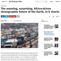
(Dan Kitwood/Getty Images) The United Nations Population Division, which tracks demographic data from around the world, has dramatically revised its projections for what will happen in the next 90 years. The new statistics, based on in-depth survey data from sub-Saharan Africa, tell the story of a world poised to change drastically over the next several decades.
Most rich countries will shrink and age (with a couple of important exceptions), poorer countries will expand rapidly and, maybe most significant of all, Africa will see a population explosion nearly unprecedented in human history. Science Literacy Isn’t As Bad As The Statistics Make It Look. The Last 200 Years Of U.S. Immigration In One Chart. Unusual Land Temperatures Reveal A Winter Of Stark Contrasts. Land Mammals. HhqlkMK.png (PNG Image, 7088 × 3008 pixels) - Scaled (14%) How Millennials Stack Up To The Generations Before Them. 8 Horrifying Things We Do When No One's Looking. Www.princeton.edu/~mgilens/Gilens homepage materials/Gilens and Page/Gilens and Page 2014-Testing Theories 3-7-14.pdf. DataIsBeautiful. No, Tech Adoption Is Not Speeding Up. In order for any graph like this to have any meaning, it needs to show three things.

How Americans Die. By Matthew C.

Klein / Bloomberg View / April 17, 2014How Americans Die The mortality rate fell by about 17 percent from 1968 through 2010, years for which we have detailed data.Almost all of this improvement can be attributed to improved survival prospects for men. It looks like progress stopped in the mid-1990s… Mortality rate per 100,000 people …but that’s only because the population has aged a lot since then.
Share of population This has a big effect on the overall mortality rate, because old people die sooner than the young. Mortality rate per 100,000 people by age If you divide the population into separate age cohorts, you can see that improvements in life expectancy have been broad-based and ongoing.Looking at mortality for each age cohort since 1968, we see that Americans under 25 have made the most progress. Mortality rate per 100,000 people by age (1968 = 100) But one line in this chart looks unusual!
Www.princeton.edu/~mgilens/Gilens homepage materials/Gilens and Page/Gilens and Page 2014-Testing Theories 3-7-14.pdf. Watch 10 seconds of high-frequency stock trading in super slow motion. Presumably, it will take them a bit of time to actually read out the resolution.

How do you know there weren't computers executing the trade before the news reached Chicago? A visualization showing just how thick air traffic is over Europe. You Are Here. Frequency. A map showing gender inequality around the world. I'm not questioning the validity of the entire study, but I would like to know what maternal mortality has to do with it.
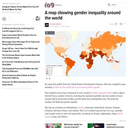
I know that in some cases, the woman isn't given the proper medical treatment because, well, she's a woman... But doesn't maternal mortality also have factors including overall health going into it? Or am I misinterpreting what maternal mortality is? I'm curious how representation in elected bodies factors in, myself. The only way you're going to guarantee a Parliament (or House of Representatives or Congress or whatever) with a 50-50 male-female split would be to either replace men/women who were voted in with women/men, as applicable, who weren't. How Many People Have Ever Lived on Earth? This map of gender segregation shows how New Yorkers live and die. It's not necessarily that females are dominant, they used a really poor color choice.

Black background with a muted blue and a brighter pink. Your eye is always going to see the pink before the blue against that background. But what I get from this is: if you want to meet chicks, go to Columbia or the Village/NOHO/NYU area. Check. Hans Rosling: The magic washing machine. Human Intelligence: The Flynn Effect. This page is now located at an updated address.

Please update your bookmarks! The new address is posted below. You will be redirected to the new page in 15 seconds or you can click the link below. Over half the world now live in cities according to UN Report. July 12, 2007 A United Nations report coinciding with World Population Day reveals that for the first time in history, more people now live in cities than rural areas.
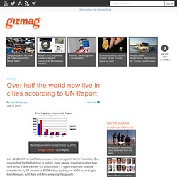
There are now 6.6 billion of us – a figure expected to surge dramatically by 37 percent to 9.076 billion by the year 2050 according to the UN report, with Asia and Africa leading the growth. World Population Day on July 11 is aimed at focusing on efforts to turn the challenges of population growth into opportunities. “What happens in the cities of Africa and Asia and other regions will shape our common future,” says Thoraya Ahmed Obaid, Executive Director of the UN Population Fund. “We must abandon a mindset that resists urbanization and act now to begin a concerted global effort to help cities unleash their potential to spur economic growth and solve social problems.”
“This wave of urbanization is without precedent. The key theme chosen for World Population Day 2007 is Men as Partners in Maternal Health. Gapminder: Unveiling the beauty of statistics for a fact based world view. Information Is Beautiful. Hans Rosling: Let my dataset change your mindset. 20th Century Death. Think Again: War - By Joshua S. Goldstein. "The World Is a More Violent Place Than It Used to Be.

" No way. The early 21st century seems awash in wars: the conflicts in Afghanistan and Iraq, street battles in Somalia, Islamist insurgencies in Pakistan, massacres in the Congo, genocidal campaigns in Sudan. All in all, regular fighting is taking place in 18 wars around the globe today. Public opinion reflects this sense of an ever more dangerous world: One survey a few years ago found that 60 percent of Americans considered a third world war likely.
SAT Scores and Family Income. Much has been written about the relationship between SAT scores and test-takers’ family income.

Generally speaking, the wealthier a student’s family is, the higher the SAT score. India To Biometrically Identify All Of Its 1.2 Billion Citizens. Biometric Identification - Science Fiction Meets Reality. Why Floatingsheep? A common question we get is, "Why FloatingSheep.org? " Like many complex social phenomenon there is not one simple answer. Business - Jordan Weissmann - Why Don't Young Americans Buy Cars? Auto makers are worried about the Millennials. They just don't seem to care about owning a car. How Different Groups Spend Their Day - Interactive Graphic.