
Untitled. THE FACES OF FACEBOOK. Pożar w Jankowie Przygodzkim. Jak podał Walczak prokuratura prowadzi śledztwo pod kątem możliwości popełnienia przestępstwa polegającego na sprowadzeniu zdarzenia zagrażającego życiu i zdrowiu wielu osób albo mieniu w wielkich rozmiarach.
Dotychczas przesłuchano w charakterze świadków 22 osoby, w większości pracowników firm realizujących budowę gazociągu. Walczak poinformował, że ofiary śmiertelne to 34-letni mieszkaniec województwa wielkopolskiego i 39-letni mieszkaniec województwa kujawsko-pomorskiego. IMMATERIALS. Pitch Interactive: The Holy Bible and the Holy Quran: A Comparison of Words. In order to understand a religion, we can refer to its holy book, which establishes guidelines and principles for followers to adhere to.
At the same time, followers, both radical and mild, interpret the holy text to provide a deeper and often more complex meaning of a particular verse, often to help explain issues that directly affect their personal beliefs. Unfortunately, people of one faith try to use the holy text of another faith to ridicule that faith or show its abominations by pointing to a particular text, often entirely out of context or misquoted. One such example is the Quran burning controversy stirred by Terry Jones in Florida. While claiming the Quran is a violent book of terror, Jones failed to make a comparison to the Bible, which also contains many violent passages. Looking at the opposite end of the spectrum, we are also curious about how each passage mentions love, tolerance and friendship. Shoes, Domestic Production, 1960-1998. Howold.periscopic. 512 Paths to the White House - Interactive Feature. Tracking American Poverty & Policy.
Interactive network analysis of companies involved in Wen Jiabao family. Data Visualization: Photo-Sharing Explosions. This is a series of videos that visualizes a single piece of content being shared between hundreds of thousands of individuals on Facebook.
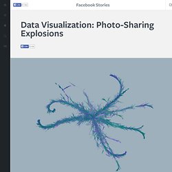
We've tried to capture the frenetic energy surrounding three of the most shared images, all of which were photos published on George Takei's Page. Each visualization is made up of a series of branches starting from a single person. As the branch grows, re-shares split off on their own arcs, sometimes spawning a new generation of re-shares, sometimes exploding in a short-lived burst of activity. The two different colors show gender, and each successive generation becomes more and more white as time goes by.
Interactive: Mapping the World's Friendships. Technology bridges distance and borders.
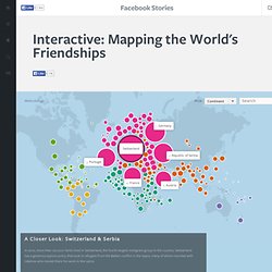
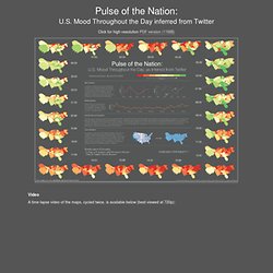
Individuals today can keep in touch with their friends and family in completely new ways — regardless of where they live. We explored these international connections through Facebook and found some trends — some predictable, some wholly unexpected, and some still inexplicable. Migrations Map: Where are migrants coming from? Where have migrants left? Project Cascade. Pulse of the Nation: U.S. Mood Throughout the Day inferred from Twitter. Click for high-resolution PDF version (11MB) Video A time-lapse video of the maps, cycled twice, is available below (best viewed at 720p):
Moodwall / Studio Klink and Urban Alliance. Media architecture collective Urban Alliance has recently finished the Moodwall: a 24 meter long interactive light installation in Amsterdam.

The Moodwall is situated in a pedestrian tunnel and interacts with people passing by, improving the atmosphere in the tunnel and making people happy and feel less unsafe. Debtris US. 3.14159265358979323846264338327950288419716939937510582097494459230781640628620899862803482534211706798214808651328230664709384460955058223172535940812848111. Debtris (UK version) Understanding Shakespeare / Process. World map of The Penis Size Worldwide (country) by Country. ProductsOfSlavery. Ontology Explorer. 24 hours of Flickr geotagged uploads. The Evolution of the Web. ABS Spotlight : Spotlight. England riots: an interactive timeline. Britain's Royal Navy in the First World War - animated.
Mapeas. SPRING SPREE - Spending patterns in Spain during Easter 2011. The Senseable City Lab together with leading Spanish bank BBVA has embarked on an examination of expenditure patterns and urban analysis at large, using an unprecedented dataset of financial transactions. The first in a series of studies, Spring Spree illustrates the purchasing patterns across Spain during Easter 2011. Using data gathered by the BBVA banking network, this visualization shows how 1.4 million. Sightsmap. The Web 2.0 Summit Map - The Data Frame. We live in a world clothed in data, and as we interact with it, we create more.
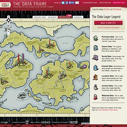
Welcome to the 2011 edition of the Web 2.0 Map. This map showcases the incumbents and upstarts in our network economy, gathered around various territories that represent the Web 2.0's Points of Control. We've removed last year's acquisition mode to make room for a newly minted data layer. Pan and Zoom to explore the map, and click the icons to get some insight about each player and their position. Then, turn on the comments view or data layer to discuss the map with others and add your own ideas! Also, bring the conversation to Twitter using hashtag #w2smap. Submap. OECD – Your Better Life Index. Average personal index for Germany, men, 15–24 How’s life?

There is more to life than the cold numbers of GDP and economic statistics – This Index allows you to compare well-being across countries, based on 11 topics the OECD has identified as essential, in the areas of material living conditions and quality of life. Download executive summary Download the index data Learn more about the index.
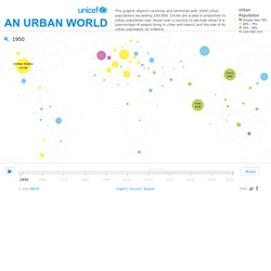
Urban Population Map. Close Source United Nations, Department of Economic and Social Affairs (UNDESA), Population Division special updated estimates of urban population as of October 2011, consistent with World Population Prospects: The 2010 revision and World Urbanization Prospects: The 2009 revision.
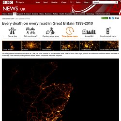
Graphic presentation of data based on The Guardian, 27 July 2007. This map is stylized and based on an approximate scale. Old Maps Online. YouTube - One Hour Per Second. In - A visualization of migration flows. The Value of Data Visualization. Infographic Data Visualization. A Brief History of Digital Data. Izing Empires' Decline. Google Demo Slam: Epic Docs Animation. Every death on every road in Great Britain 1999-2010. 2 December 2011Last updated at 17:52 The image below shows the location of 2,396,750 road crashes in Great Britain from 1999 to 2010.
Riot rumours: how misinformation spread on Twitter during a time of crisis. The Evolution of Western Dance Music! The Sexperience 1000 - Sexperience. Welcome to The Sexperience 1000, an interactive journey through the sexual experiences and preferences of one thousand British individuals.
What’s Your Economic Outlook? - Interactive Feature. Arab spring: an interactive timeline of Middle East protests. 24 hours of Flickr geotagged uploads. Wikipedia Gender.