
Obama Just Did What No Other President Before Him Has Done. It's about time.
It was fun to pretend climate change wasn't a problem, wasn't it? Now it's time to face the elephant in the room. On Monday, President Barack Obama did just that. In a new, major policy decision, Obama will bypass Congress with a plan forcing power plants to cut their emissions by 30% (from 2005 levels) over 15 years. Coal produced an estimated 74% of total CO2 emissions in the U.S. in 2012, compared to other forms of electricity generation like natural gas and petroleum.
In two lines, here's what you need to know: "Nationwide, by 2030, this rule would achieve CO2 emission reductions from the power sector of approximately 30% from CO2 emission levels in 2005," the proposed regulation says. Why is this important? Image Credit: NASA According to two new studies, the collapse of much of the West Antarctic Ice Sheet may now be irreversible. This is happening on the West Coast: Image Credits: NASA Snowpack in California mountains shrank by 86% in just one year.
Chris Miles. This Is Your Body On Anxiety (Infographic) What Countries Are Due East And West Of The Americas? Linguistic imperialism: The world according to Putin. 40 Maps That Explain The Middle East. Maps can be a powerful tool for understanding the world, particularly the Middle East, a place in many ways shaped by changing political borders and demographics.
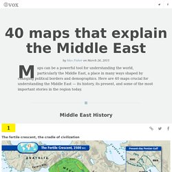
Here are 40 maps crucial for understanding the Middle East — its history, its present, and some of the most important stories in the region today. Middle East History The fertile crescent, the cradle of civilization The fertile crescent, the cradle of civilizationIf this area wasn't the birthplace of human civilization, it was at least a birthplace of human civilization. Called "the fertile crescent" because of its lush soil, the "crescent" of land mostly includes modern-day Iraq, Syria, Jordan, and Israel-Palestine. (Some definitions also include the Nile River valley in Egypt.) Wait but why: Putting Time In Perspective. Humans are good at a lot of things, but putting time in perspective is not one of them.

It’s not our fault—the spans of time in human history, and even more so in natural history, are so vast compared to the span of our life and recent history that it’s almost impossible to get a handle on it. If the Earth formed at midnight and the present moment is the next midnight, 24 hours later, modern humans have been around since 11:59:59pm—1 second. And if human history itself spans 24 hours from one midnight to the next, 14 minutes represents the time since Christ. To try to grasp some perspective, I mapped out the history of time as a series of growing timelines—each timeline contains all the previous timelines (colors will help you see which timelines are which). All timeline lengths are exactly accurate to the amount of time they’re expressing. Visualizing Which Countries People Are Trying To Get Away From, And Where They're Going.
The patterns of human migrations around the world are fascinating to think about.

Global movements reflect current events—whether war and strife, or economic opportunity and technological improvement—and these patterns also slowly reshape nations themselves. That’s why it’s worth taking a few minutes to play around with this new interactive graphic of global migration patterns. In an unprecedented amount of detail, the graphic captures the movements in and out of 196 countries over the last 20 years (see here for the interactive version).
Built with software normally used in the field of genetics, the visualization accompanies a new analysis published in the journal Science today that provides the most detailed look at migration patterns yet. The authors, from the Wittgenstein Centre for Demography and Human Capital in Vienna, combined country-level data and new census data from the United Nations to tease out how people moved between countries at five-year intervals. What the Internet looks like: The undersea cables wiring the ends of the Earth.