
Interactive News Graphics. La boite à outils. 10 Things You Can Learn From the New York Times’ Data Visualizations. Blog Archive » Escher VS Google Street View. Vous connaissez sûrement ce portrait de Maurits Cornelis Escher, grand artiste ayant utilisé la perspective et le trompe-œil dans toute son œuvre : Dernièrement, je suis tombé sur une expérimentation utilisant Google StreetView et réalisée par Onecm.
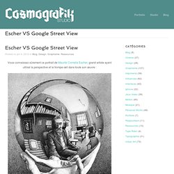
Elle permet de créer une vue 360° n’importe où sur Terre (du moins aux endroits ou Google est passé prendre des photos). Data Visualization made Fast, Fun and Easy. Mapping Stereotypes Project by alphadesigner. Visual Résumés. A couple of infographic résumé sites, vizualize.me and re.vu, sprouted up that use your LinkedIn data to show your career stats.
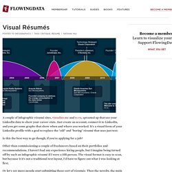
Just create an account, connect it to LinkedIn, and you get some graphs that show when and where you worked. It's a visual form of your LinkedIn profile with a goal to replace the "old" and "boring" résumé that uses just text. Vizualize.me: Visualize your resume in one click. 10 Awesome Free Tools To Make Infographics. Advertisement.

Sense of Patterns. Sense of Patterns is an on-going project, a series of printed data visualizations aiming to depict the behaviors of masses in different public spaces.
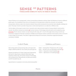
The visualizations have a focus on the patterns of moving entities in public like commuters, cars and public transportation vehicles as well as the interaction between these entities and physical structures like roads, sidewalks, buildings and parks. The project intends to provide strong visuals on what we all experience in our daily lives in different cities. The first edition of the project consists of six A1 size prints and a video animation based on the data related to Vienna and its suburbs. Two different datasets provided by AIT: Austrian Institute of Technology sorted with python and visualized by using processing. The front page of the internet. Metro Wine Map of France. The most amazing thing about this novel new wine map is how clearly it shows France's complex wine regions.
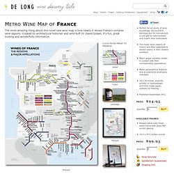
Created by architectural historian and wine buff Dr. David Gissen, it's fun, great looking and wonderfully informative. detail index package. Michael Jackson, Bruce Lee, Dark Vador – La vie des célébrités racontée en pictogrammes. Design View / Andy Rutledge - News Redux. Digital news is broken.

Actually, news itself is broken. Almost all news organizations have abandoned reporting in favor of editorial; have cultivated reader opinion in place of responsibility; and have traded ethical standards for misdirection and whatever consensus defines as forgivable. 33 Creative Negative Space Logos. Written by Inspiral On Friday, May 27th, 2011 with 6 Comments so far in Inspiration, Logo Design Negative space logos strategically use whitespace to create the illusion of an object in that space.
Negative space designs are effective in branding because they force the viewer to look twice to figure out what’s happening, though a well-executed negative space logo won’t require the viewer to look closely to have its effect. As of late the clever use of negative space has been a big trend in logo design. Check out these designs for your own inspiration. Conclusion. FontFont. Mental Disorder posters. Information graphics in context on the Behance Network. L’Infographicus Foirus. Démasqué, Disséqué, empaillé. The Four Icon Challenge. FonbT.jpg (Image JPEG, 1024x2132 pixels) Digital Nostalgia on the Behance Network. Flight & Expulsion. Scale_of_universe.swf (Objet application/x-shockwave-flash)
Designing Obama - Digital Edition. Fake Vintage Ads For Facebook, YouTube & Skype. Design daily news. The art of the 404 page. Abstract City Blog. Ideas, issues, concepts, subjects - v. REGARDS SUR LE NUMERIQUE : Blog - Sven Ehmann : « Visualiser une.
(visuel : éditions Gestalten) La production des Beatles résumée en camemberts, des empires coloniaux à la dérive sous forme de bulles, ou l'histoire de la musique électro animée dans une immense fresque interactive : ce n'est plus un scoop, la datavisualization – ou dataviz – a fait, depuis quelques années, une entrée de plus en plus remarquée dans le champ du design graphique.
Le principe est plutôt simple : il s’agit de visualiser des données, soit donner une représentation graphique à des informations riches et complexes, dont les mots ne parviennent pas à restituer toute la densité. Autrement dit : inventer une nouvelle écriture, où l’algorithme remplace la plume. Nous avons décidé de consacrer une série de plusieurs billets à ce phénomène, déjà abordé par ici. Mais, histoire d'y voir un peu plus clair, nous avons souhaité contextualiser un peu tout cela.
RSLNmag.fr : Est-ce que vous pourriez nous présenter l’équipe du projet Data Flow ? Sven Ehmann : Hum. Datablog. 30 Photos That Changed the World. A good photograph makes a point; a great one serves as a statement about culture, life, and everything that’s happening outside the image’s frame.

Photos have been inspiring people and showing them the truth for centuries now, so it’s hard to narrow the list of influential images to just 30, but here are some of the photos that have changed the world: 1. The Big Caption. Benkler_Shaw_Stodden_Tale_of_Two_Blogospheres_Mar2010.pdf (Objet. Binary clock in html, and javascript. Download Hundreds of Free @font-face Fonts. Current: A News Project. 8BDS4.jpg (Image JPEG, 1208x2579 pixels) Pulp_Fiction___infographic_by_dehahs.jpg (Image JPEG, 1869x879 p.