
Education Tools. Web tools. Tools for Teaching. Free Guides. The workspace for your life’s work. ePortfolio Examples. Welcome to the Auburn University ePortfolio Examples page.
Below are links to ePortfolios from Auburn students and alumni. Here you will find a variety of ePortfolios that include thoughtful reflections and relevant artifacts that showcase student learning to audiences outside the University. Geography, Digital Citizenship etc. 100 Ways You Should Be Using Facebook in Your Classroom. Facebook isn't just a great way for you to find old friends or learn about what's happening this weekend, it is also an incredible learning tool.
Teachers can utilize Facebook for class projects, for enhancing communication, and for engaging students in a manner that might not be entirely possible in traditional classroom settings. Read on to learn how you can be using Facebook in your classroom, no matter if you are a professor, student, working online, or showing up in person for class. Note: Check out our updated version of this article for even more suggestions on Facebook in your class. Class Projects The following ideas are just a starting point for class projects that can be used with Facebook in the classroom. Follow news feeds. Facilitate Communication An excellent way to ensure students are more engaged in the learning experience, whether in a traditional classroom or at accredited online colleges, is by strengthening the communication between students and student-to-teacher.
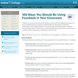
With Pictures, Puzzles and Games, Students Create Transmedia Stories. Digital Tools Teaching Strategies Inanimate Alice A scene from the transmedia storytelling site Inanimate Alice By Laura Fleming and John Connell Until just a few years ago, stories we were told mostly through a single medium – it might be a book, a movie, a radio program, a cartoon.
Today, we can tell stories across a wide variety of media, all at the same time. Transmedia is a new way of thinking about how stories are told: creating and consuming stories simultaneously through text, images, the spoken word, music, video, animation. Through embedded puzzles and games, Inanimate Alice makes the reader a direct participant in telling the story. Take Inanimate Alice, for example. With Inanimate Alice, the complexity and interactivity increases with each episode, directly correlating with Alice’s personal growth as the games designer she is set to become. A robot that flies like a bird. Forkly App Matches Your Tastes To Nearby Restaurants & Bars.
Where should I go to eat?
What should I order? Those two basic yet complex questions plague diners the world over. Forkly, a startup from veteran entrepreneurs Martin May and Brady Becker, may have the answers. Forkly for iPhone [iTunes link], released on the App Store Tuesday, seeks to understand your taste buds and the taste graph — how your tastes match up against the tastes of others — of the world in aggregate. "We want to give you personalized recommendations — to customize menus," Becker says.
The taste graph, as Forkly defines it, is comprised of the collection of food and beverage reviews — the app refers to reviews as "tastes" — from users, and how those reviews are connected. On Forkly, add a "taste" to say what you're eating or drinking and what you think about it. Your tastes are posted to the activity feed. You can use the Discover tab in the application to find out what's popular at nearby places, as determined by other Forkly users' tastes.
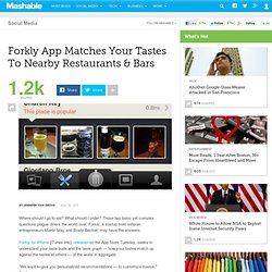
Tips, tricks and resources to make your own gorgeous infographics. Infographics (or Information Graphics) are graphic visual representations of data or information, presented in a way to make it easier to consume information.
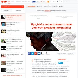
Infographics gained popularity in the mid-2000′s with the advent of sites like Digg and Reddit, and have quickly become one of the most popular methods to display researched data. There are three main types of infographics – where data is presented in a timeline, where statistical data is presented in graphs or with icons, or where data is presented on a map. In order to create an infographic which will be widely shared, think about your typography, colours, and layout. Make it easy for people to understand the information that’s being provided. Sometimes it’s best to keep things simple. You can also get very creative with how you display your information, and do something completely unconventional.