What Does a Well-Documented CSS Codebase Look Like? By Kaloyan Kosev On documentation In the front-end community, there is a lot of attention related to documenting JavaScript.
That's not so much the case with CSS. Often times I feel like lost when I join a project with minimal or no CSS documentation. Even though CSS is relatively easy to write, it can be quite hard to maintain. The specificity, the global scope of everything, and the lack of guidance can easily lead to inconsistency, code duplication, and over-complication.
10 Best Image Hover Effects Tutorials. Need to spruce up your website with some beautiful animation and transition effects? Here's a FREE collection of superb image hover effects in both pure CSS3 and jQuery. Bring your images to life. Hover Effects included: Image Zoom, Image Flips, Border Hover, Fading and Sliding Effects, Content Overlays and more... Animista. Autoprefixer CSS online – make your vendor prefixes is actual. Demo:CSS image hover effects. File: README — Sass Documentation. Sass makes CSS fun again.
Sass is an extension of CSS, adding nested rules, variables, mixins, selector inheritance, and more. Cubic-bezier(.17,.67,.83,.67) ✿ cubic-bezier.com. Funciones Easing Guía de Referencia. Comprehensive Guide: When to Use Em vs. Rem. You may have come to terms with using flexible units of measurement, but you still might not fully understand when to use rem and when to use em.
This tutorial will help you figure it out! Both em and rem are flexible, scalable units which are translated by the browser into pixel values, depending on the font size settings in your design. If you use a value of 1em or 1rem, it could translate in the browser as anything from 16px to 160px or any other value. On the other hand px values are used by the browser as is, so 1px will always display as exactly 1px. Try the slider out on this CodePen example to see how the value of rem and em units can translate into different pixel values, while explicitly set px units stay fixed in size: Using em and rem units gives us flexibility in our designs, and the ability to scale elements up and down, instead of being stuck with fixed sizes.
The difference between em and rem units is how the browser determines the px value they translate into. Transitioning Buttons - JavaScript. All CSS Properties Listed Alphabetically. Awesome Media Queries in JavaScript - enquire.js. The Lowdown What is it?
Enquire.js is a lightweight, pure JavaScript library for responding to CSS media queries. JavaScript callbacks for media queries matching and unmatching. Enquire.js - Media Query Callbacks in JavaScript. The following is a guest post Nick Williams.
Nick emailed me about a new library he created to assist in working with responsive design. Specifically, he was implementing an idea he found here on CSS-Tricks but wanted to do so more intelligently by only running the script when needed. Thus the birth of this new mini library! Hover.css - A collection of CSS3 powered hover effects. All Hover.css effects make use of a single element (with the help of some pseudo-elements where necessary), are self contained so you can easily copy and paste them, and come in CSS, Sass, and LESS flavours.
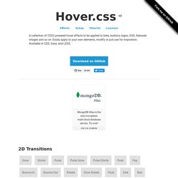
Many effects use CSS3 features such as transitions, transforms and animations. CSS-Only Hamburger Menu Icons Demo. Bourbon - Documentation - Mixins - SASS. The animation mixin supports comma separated lists of values, which allows different transitions for individual properties to be described in a single style rule.
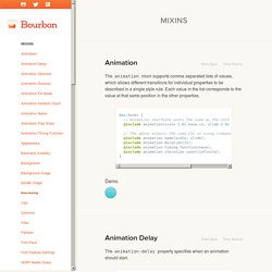
Each value in the list corresponds to the value at that same position in the other properties. box:hover { // Animation shorthand works the same as the CSS3 animation shorthand @include animation(scale 1.0s ease-in, slide 2.0s ease); // The above outputs the same CSS as using independent, granular mixins. The 14 Most Popular CSS Links of 2016 So Far — StatusCode. The 14 Most Popular CSS Links of 2016 So Far We’ve taken a look through all the stats for the 20 issues of HTML5 Weekly (our front-end development newsletter) published so far in 2016 and have collected together the most popular CSS articles, round-ups, tools and tutorials readers have clicked on.
HTML5 Weekly is a newsletter sent every Wednesday with the most important links in the front-end developer community — Join 70,000 other subscribers and sign up for free here. Useful :nth-child Recipes. Share this: Ship custom analytics today with Keen.io.
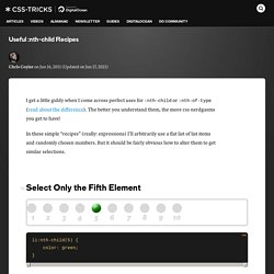
I get a little giddy when I come across perfect uses for :nth-child or :nth-of-type (read about the difference). The better you understand them, the more css nerdgasms you get to have! In these simple "recipes" (really: expressions) I'll arbitrarily use a flat list of list items and randomly chosen numbers. But it should be fairly obvious how to alter them to get similar selections. #Select Only the Fifth Element To select the first element, you can use :first-child, or I bet you can guess how to alter the above to do it as well. #Select All But The First Five If there were more than 10 elements here, it would select all of them beyond 5. Family.scss.
Will Change. Ordered List CSS Styles - codeitdown.com. Styling ordered list numbers with CSS is not as simple as one might think because there is no CSS selector to target list numbers.
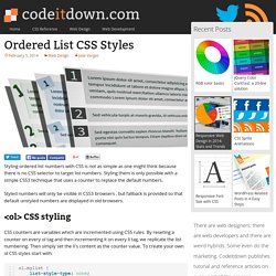
Styling them is only possible with a simple CSS3 technique that uses a counter to replace the default numbers. Styled numbers will only be visible in CSS3 browsers , but fallback is provided so that default unstyled numbers are displayed in old browsers. Accessible, Simple, Responsive Tables. There is no single solution to make any <table> appropriately responsive. That's what I like about this post by Davide Rizzo: it admits that, then gets on with some solutions. This is a great addition to territory we've been treading for a while. Content and Comparison tables There are many types of tables on websites where content can vary as wildly as the approaches used to make them responsive. The tables I find most frustrating are comparison tables or normal content layout tables, there are really no comprehensive CSS based solutions for making these types of tables responsive.
I set out to find a flexible and simple solution that could work as a reusable web component, regardless of the content within. Is table markup still working for us? Standard table markup seems to make semantic sense and does a pretty decent job of aligning cells. Styling Select Box with CSS3. Style a Select Box Using Only CSS. Can I use... Support tables for HTML5, CSS3, etc. About "Can I use" provides up-to-date browser support tables for support of front-end web technologies on desktop and mobile web browsers. The site was built and is maintained by Alexis Deveria, with occasional updates provided by the web development community. The design used as of 2014 was largely created by Lennart Schoors. May I use your data in my presentation/article/site, etc? 22 Essential CSS Recipes.
Hey there! Today we are going to talk about some useful tricks in CSS. Let's begin with... Blend Modes.