
How To Build A Pricing Table With CSS3 Animation. Quite often I'm given a PSD and asked to convert this into HTML/CSS for the graphic designer.
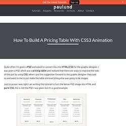
I was given a PSD which was a pricing table and realised that there are ways to improve the look of this just by using CSS. When I put this suggestion forward to the graphic designer they said no and want to me to just make the table and everything else was going to be images. Just to prove I was right I am writing this tutorial to turn the below PSD image into HTML and pure CSS, this is not the PSD I was given but it's a good example. This is just a simple PSD of a pricing table but the middle column is larger than the others. I thought this would be ideal to use CSS animation to scale the current column the mouse is hovering over. This tutorial is will teach you how to create this pricing table with the CSS scaling effects, view the demo to see what we will be making. Demo The HTML First we create a div which will hold the lists.Create 5 lists for different columns.Enter the column data.
The CSS. 17,.67,.83,.67) ✿ cubic-bezier.com. Nathansmith's gist: 1260785. Web standards, cutting edge front-end development and a sprinkle of web usability every now and then. CSS3 Patterns Gallery. Browser support The patterns themselves should work on Firefox 3.6+, Chrome, Safari 5.1, Opera 11.10+ and IE10+.

However, implementation limitations might cause some of them to not be displayed correctly even on those browsers (for example at the time of writing, Gecko is quite buggy with radial gradients). Also, this gallery won’t work in Firefox 3.6 and IE10, even though they support gradients, due to a JavaScript limitation. Submission guidelines If you have a new pattern to submit, please send a pull request. Does it present a new technique? Ceaser - CSS Easing Animation Tool - Matthew Lein.
CSS3 Keyframe Animation Demo. CSS Border Radius Generator. CSS Pivot - CSS3 Please! The Cross-Browser CSS3 Rule Generator. CSS3 property exposed: color. Extends the hsl (hue, saturation, lightness) color model to include an alpha (opacity) value which determines how translucent it is.
Compatibility hsla(H,S,L,a) Firefox 4+ Safari 5+, Chrome 10+ Internet Exlorer 9+ Opera 11+ iOS 3.2+ Android 2.1+ Opera Mini 5+ Blackberry 7+ IE Mobile 10+ Supported by all modern browsers. For detailed compatibility info see caniuse.com. Firefox 4+Safari 5+, Chrome 10+Internet Explorer 9+Opera 11+iOS 3.2+Android 2.1+Opera Mini 5+Blackberry 7+IE Mobile 10+ General description Can be used anywhere where color values are possible like background, border or color.
Background: hsla(1 56, 2 100%, 3 50%, 4 0.3) 1 The color value (hue). Examples 70% opaque, white tinted green background: hsla(1 120, 2 100%, 3 75%, 4 0.7) 1 Color value of 120.2 100% saturation. 80% opaque, 50% saturated red background: hsla(1 349, 2 50%, 3 50%, 4 0.8) Intro to CSS 3D transforms. Simple CSS3 framework for creating GitHub style button links. CSS3 Segmented Control. Pure CSS3 box-shadow page curl effect. Moving Highlight. I recently noticed a subtle and nice effect in the Google Chrome UI.
As you mouse over inactive tabs, they light up a bit, but also have a gradient highlight that follows your mouse as you move around on them. The guys from DOCTYPE told me it was their inspiration for the navigation on their website. They are doing it just like I would have, with CSS3 gradients and jQuery. So I decided to snag their code and play around with it.
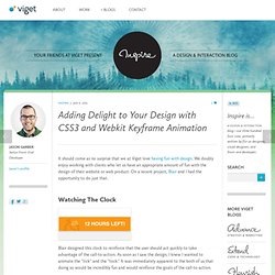
Radial Gradient The highlight itself will be created from a radial gradient. Webkit and Mozilla based browsers (only) can do radial gradients. Background: -webkit-gradient( radial, 500 25%, 20, 500 25%, 40, from(white), to(#ccc) ); background: -moz-radial-gradient( 500px 25%, circle, white 20px, #ccc 40px ); JavaScript Mouse Postion Now we know how to apply a CSS3 gradient, but the point of this is to apply the gradient highlight where the mouse is. We'll be using jQuery. The Trouble With Vendor Prefixes in Values Vendor prefixes as properties is fine. Share On. Adding Delight to Your Design with CSS3 and Webkit Keyframe Animation. It should come as no surprise that we at Viget love having fun with design.
We doubly enjoy working with clients who let us have an appropriate amount of fun with the design of their website or web product. On a recent project, Blair and I had the opportunity to do just that. Watching The Clock Blair designed this clock to reinforce that the user should act quickly to take advantage of the call-to-action. How to Control Your CSS3 Animations.