
Nik A.
Well-formed.eigenfactor.org : Visualizing information flow in science. Blyon.com. Data Mining: Text Mining, Visualization and Social Media. The Turing Test for artificial intelligence is a reasonably well understood idea: if, through a written form of communication, a machine can convince a human that it too is a human, then it passes the test.
The elegance of this approach (which I believe is its primary attraction) is that it avoids any troublesome definition of intelligence and appeals to an innate ability in humans to detect entities which are not 'one of us'. This form of AI is the one that is generally presented in entertainment (films, novels, etc.). However, to an engineer, there are some problems with this as the accepted popular idea of artificial intelligence. I believe that software engineering can be evaluated in a simple measure of productivity. We either create things that make the impossible possible - going from 0 to 1, or we create things that amplify some value, generally a human's ability to do something, - going from X to nX.
MusicMap - Visual Music Search Application. Mapping the Internet The increased use of peer-to-peer communications could improve the overall capacity of the Internet and make it run much more smoothly.
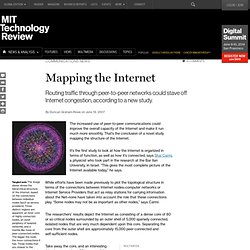
That’s the conclusion of a novel study mapping the structure of the Internet. It’s the first study to look at how the Internet is organized in terms of function, as well as how it’s connected, says Shai Carmi, a physicist who took part in the research at the Bar Ilan University, in Israel. “This gives the most complete picture of the Internet available today,” he says. While efforts have been made previously to plot the topological structure in terms of the connections between Internet nodes–computer networks or Internet Service Providers that act as relay stations for carrying information about the Net–none have taken into account the role that these connections play. “Some nodes may not be as important as other nodes,” says Carmi. With the core connected, any node is able to communicate with any other node within about four links. Network Performance Comparison. Real-time Web Monitor. Cambridge.
50 Great Examples of Data Visualization. Wrapping your brain around data online can be challenging, especially when dealing with huge volumes of information.

And trying to find related content can also be difficult, depending on what data you’re looking for. But data visualizations can make all of that much easier, allowing you to see the concepts that you’re learning about in a more interesting, and often more useful manner. Below are 50 of the best data visualizations and tools for creating your own visualizations out there, covering everything from Digg activity to network connectivity to what’s currently happening on Twitter. Music, Movies and Other Media Narratives 2.0 visualizes music. Liveplasma is a music and movie visualization app that aims to help you discover other musicians or movies you might enjoy.
Tuneglue is another music visualization service. MusicMap is similar to TuneGlue in its interface, but seems slightly more intuitive. Digg, Twitter, Delicious, and Flickr Internet Visualizations. Big History Project: Academic Disciplines. Science 2.0 - ® The world's best scientists, the Internet's smartest readers.
Help.