
Problème avec anciens Android. Code to get the webview default width. Viewport explained by safari. Safari on iOS displays webpages at a scale that works for most web content originally designed for the desktop.
If these default settings don’t work for your webpages, it is highly recommended that you change the settings by configuring the viewport. You especially need to configure the viewport if you are designing webpages specifically for iOS. Configuring the viewport is easy—just add one line of HTML to your webpage—but understanding how viewport properties affect the presentation of your webpages on iOS is more complex. Before configuring the viewport, you need a deeper understanding of what the visible area and viewport are on iOS.
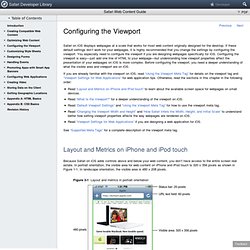
If you are already familiar with the viewport on iOS, read “Using the Viewport Meta Tag” for details on the viewport tag and “Viewport Settings for Web Applications” for web application tips. Read “Layout and Metrics on iPhone and iPod touch” to learn about the available screen space for webpages on small devices.Read “What Is the Viewport?” Viewport explained by mozilla. The upcoming release of Mobile Firefox (Fennec) 1.1 features improved support for the <meta name="viewport"> tag.
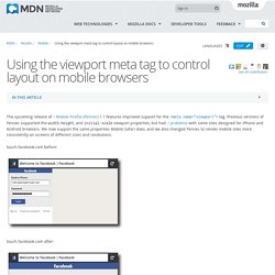
Previous versions of Fennec supported the width, height, and initial-scale viewport properties, but had problems with some sites designed for iPhone and Android browsers. We now support the same properties Mobile Safari does, and we also changed Fennec to render mobile sites more consistently on screens of different sizes and resolutions. touch.facebook.com before: touch.facebook.com after: You can see these changes for yourself in the latest Fennec 1.1 and trunk nightly builds for Maemo, Windows, Mac, or Linux. Background Mobile browsers like Fennec render pages in a virtual "window" (the viewport), usually wider than the screen, so they don't need to squeeze every page layout into a tiny window (which would break many non-mobile-optimized sites). Mobile Safari introduced the "viewport meta tag" to let web developers control the viewport's size and scale. Viewport explained by andrian. The viewport has become a new thing for developers and designers when creating web pages for mobile devices, aka smartphones, like iPhone, Android or even iPod and iPad.
However, the viewport is nothing real new and has been pretty much overlooked as a term and idea until recently. Here's the first little secret you need to know. The viewport is just a generic term in specification for what we usually know as a web browser. The only new thing is the viewport meta tag first seen with Apple's iPhone. If you like to know more about the "history" of the viewport you can read my other document titled Viewport History.
A few words first If your curiosity is spurred by an iPhone or Android project here's a first important thing to remember: The viewport has nothing to do with the device. If you have an iPhone or Android smartphone you can test things in my Viewport Demo pages. Viewport and media queries Now, this may come as a first surprise for you.
Browsers in Mobile Devices <meta> tag. Solution pour notre problème spécifique.