
SIPRI. The Functional Art: An Introduction to Information Graphics and Visualization. Data journalism syllabus: From numeracy to visualization and beyond - Journalist's Resource. The skills required to be a successful data journalist are many, ranging from numeracy and spreadsheet fluency to being able to create visualizations and interpret and perform statistical analyses.
In most moderate to large newsrooms, some data tasks are divided among desks and departments, with reporters, editors, designers and coders working in teams. Still, it is important for all team members to have some familiarity with what the others are doing. And the core skills of working with numbers and telling stories in the public interest are fundamental to all newsroom work. This syllabus covers these core skills while also giving students some familiarity with relevant software, statistical and visualization techniques and programming. Over all, issues of data ethics and valid interpretation are front and center here.
Scraping for… by Paul Bradshaw. Scraping - getting a computer to capture information from online sources - is one of the most powerful techniques for data-savvy journalists who want to get to the story first, or find exclusives that no one else has spotted.
Faster than FOI and more detailed than advanced search techniques, scraping also allows you to grab data that organisations would rather you didn’t have - and put it into a form that allows you to get answers. Scraping for Journalists introduces you to a range of scraping techniques - from very simple scraping techniques which are no more complicated than a spreadsheet formula, to more complex challenges such as scraping databases or hundreds of documents. At every stage you'll see results - but you'll also be building towards more ambitious and powerful tools. What I Learned Recreating One Chart Using 24 Tools. Back in May of this year, I set myself a challenge: I wanted to try as many applications and libraries and programming languages in the field of data visualization as possible.
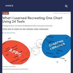
To compare these tools on a level playing field, I recreated the same scatterplot (also called a bubble chart) with all of them. Based on the results, I published two listicles: One for data vis applications and one for data vis libraries and programming languages. An overview of all the tools I tried can be found in this Google Spreadsheet. Now I’ll take a higher-level view and compare these tools with each other; mapping out my learnings. References for visualising uncertainty.
One of the increasingly frequent questions I get asked, particularly by people from a scientific or financial domain, is how to effectively visualise uncertainty of data and of statistics.
My response is usually to make suggestions around annotated markings and/or colour gradients to indicate increasing or declining certainties. I've been gathering bits evidence for these suggestions and any other sample solutions that might work in different contexts. Guesstimate. Index. Data. Data Desk - Los Angeles Times. Visualizing Data Uncertainty: An Experiment with D3.js. In this post, I'd like to discuss some different ways to use uncertain data in simple visualizations.
Although there can be value in data "vizzes" that tell a story, for this post I'll consider that the purpose of a data viz is to: Tell the truth, the whole truth, and nothing but the truth or more specifically, Visually convey the data as completely as possible, so not to mislead the viewer. Understanding Uncertainty. We have had a review paper published in Science called Visualising uncertainty about the future, although it primarily focuses on probability forecasts.
You may access the full paper by following the links below. Read the review paper published in Science: Visualising uncertainty about the future The Supporting Online Material is available here, but you may find it faster to view them as separate attachments below. Errata: A Critique of Radar Charts. This article presents a critique of radar charts, a chart type commonly used to display multivariate data, highlighting how they are poorly designed to effectively communicate information in the underlying data, and presents a number of more effective alternatives.
Introduction Radar charts, sometimes known as spider, start or web charts, are a two-dimensional chart type designed to plot one or more series of values over multiple common quantitative variables by providing an axis for each variable, arranged radially as equi-angular spokes around a central point. The values for adjacent variables in a single series are connected by lines, and, frequently, the polygonal shape created by these lines in filled with a colour.
Beyond this there are many subtle variations that have different consequences with respect to the efficacy of the chart. These variations will be covered at appropriate points in the following critique. Reports and Data. USAID is a business-focused development agency focused on results.
We understand that humanitarian assistance is both a gift and an investment on behalf of the American public. It contributes to a future that all of us will share. Sense about Science – Because evidence matters. Google News Lab. Data Visualization. Disinformation Visualization: How to lie with datavis. By Mushon Zer-Aviv, January 31, 2014 Seeing is believing.
When working with raw data we’re often encouraged to present it differently, to give it a form, to map it or visualize it. But all maps lie. Data Visualization Demo. How Data Visualization Drives Business Impact. The Data Visualisation Catalogue. Lisa Charlotte Rost · A world view. RSS Hub Home Page - Wiley Online Library. How to Use Excel’s Descriptive Statistics Tool - dummies. By Stephen L.
Nelson, E. C. Nelson Perhaps the most common Data Analysis tool that you’ll use in Excel is the one for calculating descriptive statistics. To see how this works, take a look at this worksheet. Jupyter Notebook Viewer. The first three lines of code import libraries we are using and renames to shorter names. Matplotlib is a python 2D plotting library which produces publication quality figures in a variety of hardcopy formats and interactive environments across platforms. We will use it for basic graphics Numpy is the fundamental package for scientific computing with Python. It contains among other things: a powerful N-dimensional array objectsophisticated (broadcasting) functionstools for integrating C/C++ and Fortran codeuseful linear algebra, Fourier transform, and random number capabilities. The Functional Art: An Introduction to Information Graphics and Visualization.
Clean Your Excel Data with the Data Interpreter. Quartz/bad-data-guide: An exhaustive reference to problems seen in real-world data along with suggestions on how to resolve them. Top ten ways to clean your data - Excel. You don't always have control over the format and type of data that you import from an external data source, such as a database, text file, or a Web page. Before you can analyze the data, you often need to clean it up. Fortunately, Excel has many features to help you get data in the precise format that you want. Sometimes, the task is straightforward and there is a specific feature that does the job for you. For example, you can easily use Spell Checker to clean up misspelled words in columns that contain comments or descriptions. Or, if you want to remove duplicate rows, you can quickly do this by using the Remove Duplicates dialog box.
Free Data Visualization Software. Welcome - Humanitarian Data Exchange. Community Portal. Datassist – Data Science Storytelling for a Nonprofit World. Welcome. Data Driven Journalism. Datajournalism.it – dati, non (solo) parole.