
Complex Selectors - Learn to Code Advanced HTML. Lesson 3 Selectors are one of, if not, the most important parts of CSS.
They shape the cascade and determine how styles are to be applied to elements on a page. Up until recently the focus of CSS never really touched on selectors. Occasionally there would be incremental updates within the selectors specification, but never any real ground breaking improvements. Fortunately, more attention has been given to selectors as of late, taking a look at how to select different types of elements and elements in different states of use. CSS3 brought new selectors, opening a whole new world of opportunities and improvements to existing practices. Common Selectors#common-selectors Before diving too deep into some of the more complex selectors, and those offered within CSS3, let’s take a quick look at some of the more common selectors seen today. The type selector identifies an element based on its type, specifically how that element is declared within HTML.
Common Selectors Overview Descendant Selector. The Ultimate Flexbox Cheat Sheet. Flexbox Froggy - A game for learning CSS flexbox. Master2-vciel/index.html at master · shulard/master2-vciel. CSS3 Flexbox Layout module. Vous connaissez certainement le modèle de boîte classique en CSS et ses dispositions de type “block” ou “inline”, sachez que Flexbox CSS3 a été conçu pour étendre ce périmètre en introduisant un nouveau modèle de boîte distinct, que l’on appellera “le Modèle de boîte flexible”.
En février 2016 est sorti mon livre entièrement dédié à Flexbox. Il se nomme "CSS3 Flexbox : plongez dans les CSS modernes" et je vous recommande bien évidemment sa lecture afin de comprendre tous les rouages de ce positionnement révolutionnaire, et d'en maîtriser tous les aspects. Au sein de ce schéma, on ne raisonne plus en “block” ou “inline”, ni même en float ou autres types de boîtes “classiques” CSS, mais en “Modèle de boîte flexible”, dont les quatre possibilités principales sont : Note : ce tutoriel a été initialement rédigé en octobre 2010.
Il a subi une refonte intégrale en décembre 2014 pour se mettre à jour. En action ! Démonstration display: flex Compatibilité Tableau des compatibilités Standardisation. Susy. All Susy3 API functions draw on the same shorthand syntax, which consists of two parts, seperated by the word of.

The first part describes a grid-spanwidth, location (if needed), and spread (in any order): // <width> at <location><spread> $span: span(2);$span-spread: span(3 wide); // location is only needed with asymmetrical grids $span-location-spread: span(3 at 2 narrow); The second half describes the grid-contextcolumns, container-spread, and gutters in any order: Introduction to the CSS box model. SummaryEdit In a document, each element is represented as a rectangular box.
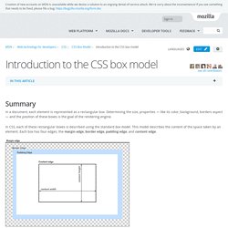
Determining the size, properties — like its color, background, borders aspect — and the position of these boxes is the goal of the rendering engine. In CSS, each of these rectangular boxes is described using the standard box model. This model describes the content of the space taken by an element. Box-sizing. Twbs/bootstrap. Box model. Contents The CSS box model describes the rectangular boxes that are generated for elements in the document tree and laid out according to the visual formatting model. 8.1 Box dimensions Each box has a content area (e.g., text, an image, etc.) and optional surrounding padding border , and margin areas; the size of each area is specified by properties defined below.
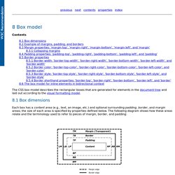
The margin, border, and padding can be broken down into top, right, bottom, and left segments (e.g., in the diagram, "LM" for left margin, "RP" for right padding, "TB" for top border, etc.). Methodology / BEM. Block, Element, Modifier / BEM. Object-oriented CSS. Cascading Style Sheets (CSS) Snapshot 2010. Abstract This document collects together into one definition all the specs that together form the current state of Cascading Style Sheets (CSS) as of 2010.
The primary audience is CSS implementors, not CSS authors, as this definition includes modules by specification stability, not Web browser adoption rate. Status of this document This section describes the status of this document at the time of its publication. Other documents may supersede this document. Publication as a Working Group Note does not imply endorsement by the W3C Membership. The document was produced by the CSS Working Group (part of the Style Activity). This document was produced by a group operating under the 5 February 2004 W3C Patent Policy. The (archived) public mailing list www-style@w3.org (see instructions) is preferred for discussion of this document. This document represents the state of CSS as of 2010. Table of contents 1. 1.1. This section is non-normative. Working Draft (WD) Last Call Working Draft (LC or LCWD)