
27 Diagrams That Make Cooking So Much Easier. Data Visualization: Modern Approaches. About The Author Vitaly Friedman loves beautiful content and doesn’t like to give in easily. When he is not writing or speaking at a conference, he’s most probably running … More about Vitaly Friedman … Data presentation can be beautiful, elegant and descriptive. There is a variety of conventional ways to visualize data - tables, histograms, pie charts and bar graphs are being used every day, in every project and on every possible occasion. However, to convey a message to your readers effectively, sometimes you need more than just a simple pie chart of your results. Data presentation can be beautiful, elegant and descriptive. So what can we expect? Let’s take a look at the most interesting modern approaches to data visualization as well as related articles, resources and tools. 1.
Trendmap 2007 Informationarchitects.jp presents the 200 most successful websites on the web, ordered by category, proximity, success, popularity and perspective in a mindmap. 2. 3. 10 Awesome Free Tools To Make Infographics. Advertisement Who can resist a colourful, thoughtful venn diagram anyway?

In terms of blogging success, infographics are far more likely to be shared than your average blog post. This means more eyeballs on your important information, more people rallying for your cause, more backlinks and more visits to your blog. In short, a quality infographic done well could be what your blog needs right now. Designing An Infographic Some great tips for designing infographics: Keep it simple!
Ideas for infographic formats include: Timelines;Flow charts;Annotated maps;Graphs;Venn diagrams;Size comparisons;Showing familiar objects or similar size or value. Here are some great tutorials on infographic creation: Creating Your Infographic Plan and research.If required, use free software to create simple graphs and visualisations of data.Use vector graphic software to bring these visualisations into the one graphic. Free Online Tools For Creating Infographics Stat Planet Hohli Creately New York Times Many Eyes Wordle.
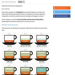
40 Useful and Creative Infographics. Six Revisions Menu Main Categories CSS HTML JavaScript Web Design WordPress Web Development Design Inspiration UX Design UI Design Freebies Tutorials Tools Links About Contact Advertise RSS Twitter Facebook 40 Useful and Creative Infographics By Jacob Gube.
14 Ways to Present Information Visually. Lots of information to share?
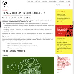
Making an infographic? Here are 14 ways to visually organize your information, with examples and tips on when to use them. There are two ways to discover the best way to go about presenting information or a story visually: Get to know your data or story intimately. Rake your zen garden, and ask yourself “what does my data want to look like?” For this post, I’ve tried to do the latter for you (if you want to cultivate your zen garden, I can’t do anything for you). The process: I went to Visual.ly (an excellent source for infographics, and the community around them) and reviewed a couple hundred of the most popular infographics by pageviews. When does a particular visual approach really work? Anatomy An anatomy visual or infographic provides an annotated exploration of the contents of a large and complicated object or idea.
When do you use it? Some examples: SEOMoz Anatomy of a Search Marketer, Anatomy of a Perfect Website Timeline When do you use it? Taxonomy Map. The 83 best infographics. Every picture tells a story, as they say, but sometimes it takes a clever combination of words and pictures to tell a story quickly, concisely and in an entertaining fashion.
The best infographics may look like they were simple to create in Photoshop, but designing an effective piece of data visualization is usually anything but. There are several great tools to create infographics, but these examples of infographics from around the web will show you how you can take it a step further and add a bit of style and personality to your data. Some are older than others, but they can still provide some inspiration for those of you looking to create an infographic from scratch.
Some are funny, some more serious, and all are inspiring examples of the art. If Star Wars: The Last Jedi has put you in the mood to immediately watch the original movie, hold your horses just one second. 02. 03. Are you reading this slumped at your desk? 04. Do you know your aperture from your apex? 06. 07. Patterns in nature. Natural patterns form as wind blows sand in the dunes of the Namib Desert.
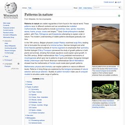
The crescent shaped dunes and the ripples on their surfaces repeat wherever there are suitable conditions. Patterns in nature are visible regularities of form found in the natural world. These patterns recur in different contexts and can sometimes be modelled mathematically. Natural patterns include symmetries, trees, spirals, meanders, waves, foams, arrays, cracks and stripes.[1] Early Greek philosophers studied pattern, with Plato, Pythagoras and Empedocles attempting to explain order in nature. The modern understanding of visible patterns developed gradually over time. In the 19th century, Belgian physicist Joseph Plateau examined soap films, leading him to formulate the concept of a minimal surface.
Mathematics, physics and chemistry can explain patterns in nature at different levels. History[edit] The American photographer Wilson Bentley (1865–1931) took the first micrograph of a snowflake in 1885.[10] Design Tips, Tutorials and Inspiration - Hongkiat.com.