
How Flexbox works — explained with big, colorful, animated gifs. Flexbox promises to save us from the evils of plain CSS (like vertical alignment).
Well, Flexbox’s deliver on that goal. But mastering its new mental model can be challenging. Understanding Flexbox: Everything you need to know – freeCodeCamp. Doesn’t that look pretty?
I’ll get into the inner workings of Flexbox while you learn to build the music app layout. You’ll also get a feel for the role Flexbox plays in responsive web design, too. I’m excited to show you all this. But before you get started building user interfaces, I’m going to walk you through some drills, first. This may seem boring, but it’s all part of the process of getting you adept at Flexbox. Let’s get started. Introduction CSS has evolved a lot over the past few years. Crafting Intelligent page layouts with CSS seemed to have persisted for too long, and this got many of us writing hacky CSS.
We always had to deal with floats, table display hacks, and the consequences they brought. It seems like our prayers as designers and front-end developers have finally been heard. Now we can all ditch those hacky CSS tricks. Understanding Flexbox: Everything you need to know – freeCodeCamp. CSS Grid, Flexbox And Box Alignment: Our New System For Web Layout. Advertisement Meet the new Sketch Handbook, our brand new Smashing book that will help you master all the tricky, advanced facets of Sketch.

Filled with practical examples and tutorials in 12 chapters, the book will help you become more proficient in your work. Get the book now → Editor’s note: Please note that this article is quite lengthy, and contains dozens of CodePen embeds for an interactive view. The page might take a little while to load, so please be patient. Layout on the web is hard. CSS Flexbox Explained by Road Tripping Across the Country.
Learn CSS Flexbox in 3 Minutes – Learning New Stuff – Medium. In this post you’ll learn the most important concepts of the flexbox layout in CSS, which will make your life easier if you find yourself struggling with CSS layouts from time to time.
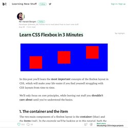
We’ll only focus on core principles, while leaving out stuff you shouldn’t care about until you’ve understood the basics. 1. The container and the item The two main components of a flexbox layout is the container (blue) and the items (red). In the example we’ll be looking at in this tutorial, both the container and item are div’s. Flexbox Cheatsheet Cheatsheet. While I am no stranger to the magic of Flexbox, I find that I am not using it very often just yet.
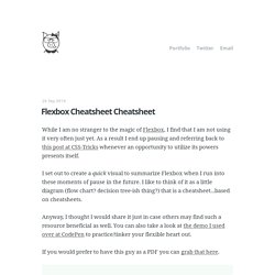
As a result I end up pausing and referring back to this post at CSS-Tricks whenever an opportunity to utilize its powers presents itself. I set out to create a quick visual to summarize Flexbox when I run into these moments of pause in the future. I like to think of it as a little diagram (flow chart? Decision tree-ish thing?) That is a cheatsheet...based on cheatsheets. Anyway, I thought I would share it just in case others may find such a resource beneficial as well. If you would prefer to have this guy as a PDF you can grab that here.
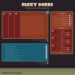
Flexy Boxes — CSS flexbox playground and code generation tool. Flexbox browser support Three versions of the flexbox spec – each with different syntax – have been implemented in browsers.
The two 2012 specs are roughly equivilant in terms of features, differing mainly in syntax. The earlier 2009 spec is less comprehensive though covers a lot of the same ground. Flexbox 2012 — W3C Candidate Recommendation, September 2012 Opera 12.1+, Firefox 22+. Chrome 21 -webkit- Flexbox early 2012 — W3C Working Draft, 22 March 2012 Internet Explorer 10 -ms- Flexbox 2009 — W3C Working Draft, 23 July 2009 Firefox 2+ -moz-, Chrome 4+ -webkit-, Safari 3.1+ -webkit-. iOS Safari 3.2+ -webkit- More browser support info available on caniuse.com.
Known issues. Vadimyer/Ecligrid: Flexible Mobile First Grid System Based on Flexbox. Flexplorer. A Complete Guide to Flexbox. Background The Flexbox Layout (Flexible Box) module (a W3C Candidate Recommendation as of October 2017) aims at providing a more efficient way to lay out, align and distribute space among items in a container, even when their size is unknown and/or dynamic (thus the word “flex”). The main idea behind the flex layout is to give the container the ability to alter its items’ width/height (and order) to best fill the available space (mostly to accommodate to all kind of display devices and screen sizes). A flex container expands items to fill available free space or shrinks them to prevent overflow. Most importantly, the flexbox layout is direction-agnostic as opposed to the regular layouts (block which is vertically-based and inline which is horizontally-based).
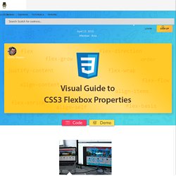
While those work well for pages, they lack flexibility (no pun intended) to support large or complex applications (especially when it comes to orientation changing, resizing, stretching, shrinking, etc.). Basics & Terminology display. The Ultimate Flexbox Cheat Sheet. Html - Flexbox: center horizontally and vertically. Flexbox Froggy - A game for learning CSS flexbox. A Visual Guide to CSS3 Flexbox Properties. The Flexbox Layout officially called CSS Flexible Box Layout Module is new layout module in CSS3 made to improve the items align, directions and order in the container even when they are with dynamic or even unknown size.
The prime characteristic of the flex container is the ability to modify the width or height of its children to fill the available space in the best possible way on different screen sizes. Many designers and developers find this flexbox layout easier to use, as positioning of the elements is simpler thus more complex layouts can be achieved with less code, leading to simpler development process.