
Software Development - PaintTool SAI. Before downloading the software, you should accept the license agreement linked below.
Downloading this software signifies your agreement to the "Software License Agreement". And this agreement is adapted to previous beta release of this software too. *** Software License Agreement *** Installation Note: The full installer of Ver.1.2.0 or later will install SAI into "C:\PaintToolSAI" in default settings. You can preserve brushes, textures, swatch and license certificate through which of following way. - Overwrite Ver.1.2.0(or later) to Ver.1.1.0 folder by installer of update files only. - Copy all folders, *.conf files, *.ssd files, *.slc file from Ver.1.1.0 folder to Ver.1.2.0(or later) folder.
On Windows Vista or later, please avoid installation into "Program Files" folder because SAI may take malfunctions through the influence of UAC. On high DPI settings on Aero(DWM), please disable display scaling. Update History. Phil Straub Composition Tutorial. Art Tutorials at Epilogue. When I comment on other people’s work, digital work in particular, one of the most frequent phrases I use is “Do not use neutral gray together with color”. Unless you know exactly what you are doing, don’t ever use neutral gray together with color. It is too easy to get a neutral gray on the computer (fortunately, it’s not as easy with physical media), and its effect when used as if it were any other color is disastrous. But, since knowledge cannot be harmful, and in light of the sayings “Rules are made to be broken” and “Know thy enemy”, I am going to look at neutral gray and its cousins in detail, to show exactly why it does not live well with color.
I will also discuss what can be done to fix problems with neutral gray, what subtle traps lie beneath the quiet water, and, ultimately, when and how to break the rules. Science of color. Digital Artform: Painting with Photoshop. The two most important brushes in Photoshop are the hard-edged circle and the soft-edged circle.

The most important tool is a tablet with a pen. Set your brush's opacity to respond to pen pressure. Most things in the world have hard edges. You'll use your hard-edged brush a lot. Many color transitions on or within objects are soft. You can get a huge amount (maybe even most) of your work done with with a pressure-sensitive hard-edged circle. How do you blend one color into another with a hard-edged brush? Use a light touch (low pressure) and paint this color into that, and that color back into this.
Your two best hot keys are the size changers, ] for bigger size and [ for smaller size, and the eye dropper key (alt on Windows) Don't eye-dropper colors from photos. Personally, I prefer not to let pressure control brush size; only opacity. If you use the pressure sensitivity feature for any brush settings, take the time to go into the Wacom software and adjust the pressure sensitivity of the tip. Zdzislaw Beksinski - Official web site presented by Belvedere Gallery. Willem de Kooning. Willem de Kooning (April 24, 1904 – March 19, 1997) was a Dutch American abstract expressionist artist who was born in Rotterdam, the Netherlands.
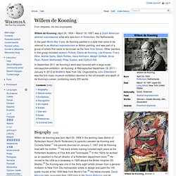
In the post-World War II era, de Kooning painted in a style that came to be referred to as Abstract expressionism or Action painting, and was part of a group of artists that came to be known as the New York School. Other painters in this group included Jackson Pollock, Elaine de Kooning, Lee Krasner, Franz Kline, Arshile Gorky, Mark Rothko, Hans Hofmann, Adolph Gottlieb, Anne Ryan, Robert Motherwell, Philip Guston, and Clyfford Still. In September 2011 de Kooning's work was honored with a large-scale retrospective exhibition: de Kooning: A Retrospective September 18, 2011 – January 9, 2012 at MoMA in New York City. Organized by John Elderfield it was the first major museum exhibition devoted to the full breadth and depth of de Kooning's career, containing nearly 200 works.
Biography[edit] Mature works[edit] Exhibitions[edit] Recognition[edit]