
DataParis - Des données sur Paris et les Parisiens localisées par le biais du réseau métropolitain. Plateforme de visualisation de données ouvertes. The carbon map. A Day in the Life. Digital Geography. 20.
July 2015 agol arcgis online cartoDB comparison CSV easy mangomap Mapbox simplemappr webmaps Working with a desktop GIS might be a good choice for geodata-experts, GIS-people in general and everyone who is inside the fields of geosciences. If you don’t want to struggle with a desktop mapping software or you “just want to create a map” for your publication, business data, website or professional service the following online mapping solutions might be the one-stop-shop for your needs.
Shortlinks to results: Prior our short “overview” let’s explain the setting. The “crucial” part: We only have a csv file with city names and attributes (incl. coordinates) and a kmz from Google Earth where we “digitized” provinces. We will try to export the map as an image and try to embed into our blog post as an interactive map. Attention: This is not a professional, in-depth analysis of current webmapping platforms.
ArcGIS Online But now comes the tricky part: sharing it on an own website. Wait! Pros. How We Made the 3D Tour de France Interactive. WebGL and GPS data recreate an iconic stage of the race In sports coverage, interactives can convey an event's intensity while also allowing the user to participate.
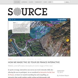
As we considered an interactive for the Tour de France, we knew we wanted something fun and compelling, an interactive that would combine quality writing and photography with real-world data. So we thought about a 3D representation of the most grueling stage, Alpe D'Huez. It’s a 13.8 km climb up 21 hairpin bends to the finish at an altitude of 1,850 m. With some of the steepest climbs in the entire race, including an incline of 13 percent, Alpe D'Huez was the perfect choice for this type of interactive. Exploring the Data We started by exploring GPS data of the route by importing it into QGIS. Sans titre. Regarder les données. À quelle mise en forme du social devrions-nous nous fier ?
Comment représenter la société lorsque les outils numériques nous donnent des capacités accrues de représenter les êtres et les collectifs dans des espaces digitaux aux paramètres si flexibles que tout leur semble permis ? L’intérêt d’une confrontation des débats sociologiques avec les figurations que projettent l’art contemporain, dans l’exposition Multiversités créatives, est de mettre en tension de nouvelles façons d’architecturer le monde et les manières de penser le social à l’heure des big data.
Les machines numériques sculptent désormais des objets en référant leurs formes aux flux de données qui jaillissent de l’incessante activité des bases de données du web. Big data and mapping – a potent combination. Related topicsBig data Data Models Networks Open Data Tools Related articles Share article 1062 25 94 341googleplus6 Short of time?

Print this pageEmail article There are many potential competitive advantages to using location analytics For many organisations and businesses, big data is an integral part of their information strategy, to help drive operational efficiencies and competitive advantage. This presents a serious challenge for many. Organisations therefore have to learn how to manage multiple information sources and adapt to the growth, speed and complexity of big data.
Why location matters In the past, the location element of data has been under-utilised. > See also: Ordnance Survey maps the UK in Minecraft The emergence of Location Analytics tools is driving desire for the ability to discover location-based patterns and relationships from data that may exist in many disparate places, streams or web logs. There are huge potential benefits. Moving forward. Data visualization: Science on the map. Illustration by the Project Twins When linguist Lauren Gawne roams the valleys of Nepal documenting endangered Tibetan languages, she takes pains to distinguish each dialect's geographical origin.
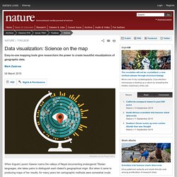
But when it came to producing maps of her results, for many years her cartographic methods were somewhat crude. “My old maps were [made] using MS Paint on top of some copyrighted map that I really shouldn't have been using,” she says. Her next solution wasn't much better: “My mum tracing a map off an atlas so that I had something a bit cleaner to work with.” The one after that — “using Google Earth and dropping pins on it” — was generic, ugly and “looks horrible in a PowerPoint”. Lauren Gawne Lauren Gawne's maps: with mother's help (A) and in TileMill (B). So in 2013, she jumped at the chance to join a workshop on mapping and visualization at the University of Melbourne in Australia, where she was working on her PhD. Get on the map The new mapping landscape Mapbox first released TileMill in 2011.
La 3D à l'IAU - Conférence ESRI 2015 by Xavier Opigez on Prezi. Réseau de transport de Berlin en direct.