
Visualization Types - Introduction to Data Visualization. This taxonomy is based on a data taxonomy from: Shneiderman, B. (1996).
The eyes have it: A task by data type taxonomy for information visualizations. Proceedings of IEEE Symposium on Visual Languages - Boulder, CO (pp. 336-343). The taxonomy is heavily weighted toward the more abstract information visualization techniques and is less representative of scientific visualizations, which can be highly specialized by domain and are more difficult to generalize.
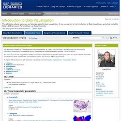
(A slightly different taxonomy with examples is available at Visual Analytics Digital Library - Visualization Types) Examples: lists of data items, organized by a single feature (e.g., alphabetical order)(not commonly visualized) back to top 2D/Planar (especially geospatial) Examples (geospatial): Examples (artificial planes): self-organizing mapTools: Synapse, MatlabExamples: Last.fm, In Terms of GeographyImage created in Matlab from sample data set.
Broadly, examples of scientific visualization: See also: Wills, G. (2012). Vizualize.me Beta: Turning Your LinkedIn Resume in Infographics. There seems to be a commercial market emerging around the idea of automizing the creation of infographics.
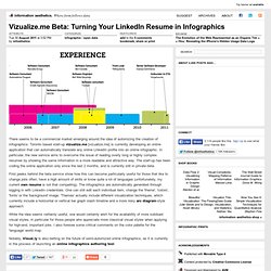
Toronto based start-up vizualize.me [vizualize.me] is currently developing an online application that can automatically translate any online LinkedIn profile into an online infographic. In particular, the new service aims to overcome the issue of reading overly long or highly complex resumes by showing the same information in a more readable and attractive way. The start-up has been coding the online application only since the last 2 months, and is currently still in private beta. First peeks behind the beta service show how this can become particularly useful for those that like to change jobs often, have a high amount of skills or know quite a lot of languages (unfortunately, my current own resume is not that compelling). The infographics are automatically generated through logging in with LinkedIn credentials. Data Visualization for the Web.
Quid, Inc. Honest Signals, Reality Mining, and Sensible Organizations. Click to see video Professor Alex "Sandy" Pentland directs the MIT Connection Science and Human Dynamics labs and previously helped create and direct the MIT Media Lab and the Media Lab Asia in India.

He is one of the most-cited scientists in the world, and Forbes recently declared him one of the "7 most powerful data scientists in the world" along with Google founders and the Chief Technical Officer of the United States. He has received numerous awards and prizes such as the McKinsey Award from Harvard Business Review, the 40th Anniversary of the Internet from DARPA, and the Brandeis Award for work in privacy. Information is Beautiful. A generative data-visualisation of all the scientific evidence for popular health supplements by David McCandless and Andy Perkins.
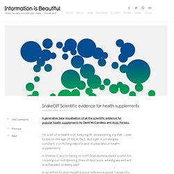
I’m a bit of a health nut. Keeping fit. Streamlining my diet. I plan to live to the age of 150 in fact. But I get frustrated by constant, conflicting reports and studies about health supplements. Is Vitamin C worth taking or not? In an effort to give myself a quick reference guide, I dove into the scientific evidence and created a visualization for my book. Play with interactive version | See the still image This visualisation generates itself from this Google Doc. This image is a “balloon race”. You might also see multiple bubbles for certain supps.
We only considered large, human, randomized placebo-controlled trials in our data scrape – wherever possible. The Hive Group. Data Visualization. Data Visualization "A good sketch is better than a long speech.
"—Napoléon Bonaparte “Program a map to display frequency of data exchange, every thousand megabytes a single pixel on a very large screen. Manhattan and Atlanta burn solid white. A visual exploration on mapping complex networks. Online diagramming application. Infographics & Data Visualizations - Visual.ly. Visualized Resume. Business Innovation Factory. Mapping the Experience. RSA - Home.
Stanford Visualization Group. Inspire UX. None. Although you may not want to admit it, your customers have probably at one time or another experienced some type of pain while doing business with your company.
It could’ve been a minor inconvenience, rather than a huge deal-breaking issue, but any way you look at it, it’s pain. So, ask yourself these questions: Can you clearly pinpoint where the customer pain points are in your organization? Do you and your employees have a clear picture of the process different types of customers go through when interacting with your company? Have you recently asked your customers if and where they experience pain? Visual Analytics Digital Library. Semantic Foundry » Design Ethnography & Mood Maps. Over the last years I have noticed that many books and articles talk about the usefulness (or not) of personas, delving a little into the actual production and design of the persona as well as defending it’s usage.
Very few explicitly define some of the activities that occur within the design research phase. It was Jared Spool that mentioned the real value of personas being the actual process of engaging with users and developing empathy towards their circumstances and experience interacting with a product.1 The following article grew out of a conversation with Nathan Curtis of Eight Shapes (author of “Modular Web Design“) when I offered to contribute what I called a “Mood Map” to the Unify Documentation System. Let’s start.