
Visualizations That Really Work. Executive Summary Not long ago, the ability to create smart data visualizations (or dataviz) was a nice-to-have skill for design- and data-minded managers.
But now it’s a must-have skill for all managers, because it’s often the only way to make sense of the work they do. Decision making increasingly relies on data, which arrives with such overwhelming velocity, and in such volume, that some level of abstraction is crucial. Thanks to the internet and a growing number of affordable tools, visualization is accessible for everyone—but that convenience can lead to charts that are merely adequate or even ineffective. By answering just two questions, Berinato writes, you can set yourself up to succeed: Is the information conceptual or data-driven? This article is adapted from the author’s just-published book, Good Charts: The HBR Guide to Making Smarter, More Persuasive Data Visualizations. Visualization. All the buildings in Manhattan in 3-D map Taylor Baldwin mapped all of the buildings in Manhattan using a 3-D layout.… Get all caught up with The Avengers using this timeline It’s been a decade since the first Iron Man movie, and some 30… Waiting Game, through the steps of asylum seekers Sisi Wei for ProPublica and Nick Fortugno of Playmatics made a game to… Umpire strike zone changes to finish games earlier When watching baseball on television, we get the benefit of seeing whether a… Shapes we make, seen from the sky Look from the above at the shapes and geometry we use for cities,…
Information is Beautiful. Data Visualization Fundamentals. Ready to watch this entire course?
Become a member and get unlimited access to the entire skills library of over 4,900 courses, including more Design and personalized recommendations. Start Your Free Trial Now Overview Transcript View Offline Exercise Files Released Got a big idea? Visual. System Mapping.
System mapping, the process of creating visual tools that describe a system, is a critical step in systems change that brings together stakeholders from across organizations and sectors to develop a common understanding of a given system.
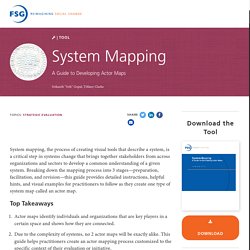
Breaking down the mapping process into 3 stages—preparation, facilitation, and revision—this guide provides detailed instructions, helpful hints, and visual examples for practitioners to follow as they create one type of system map called an actor map. Top Takeaways Actor maps identify individuals and organizations that are key players in a certain space and shows how they are connected.Due to the complexity of systems, no 2 actor maps will be exactly alike. This guide helps practitioners create an actor mapping process customized to the specific context of their evaluation or initiative.Creating a comprehensive actor map requires both explicit data from evaluations and studies, and implicit knowledge from the participants. t552site. Bite Sized Reports: Moving from Bland to Delicious in Evaluation Reporting - ExposeYourMuseum. Visual Voice. Guide to Dashboard Design.
A podcast on data visualization with Enrico Bertini and Moritz Stefaner. Infographic of the Day. Data Visualization Best Practices 2013. DataIsBeautiful. Visualization. Visualizing data through charts, graphs, and diagrams helps you deliver bite-sized information that viewers will understand at a glance and retain for the long run.
During my workshops, webinars, and training videos, we focus on researcher-specific considerations: designing with stakeholders’ information needs front and center, using readily available software like Microsoft Excel, and thinking through dozens of chart types—dot plots, small multiples, heat maps, and more—that can be applied to the social sciences. My goal is to equip you with critical thinking skills and technical know-how create visualizations faster and easier than you ever thought was possible.
Read my latest articles about selecting appropriate chart types, applying best practices to your charts, and more. View excerpts from my latest conference presentations and read my articles that are guest-published through other organizations’ blogs. Is your team overdue to step up your data game? Sample Agenda Length Location. Darkhorse Analytics. Extreme Presentations. Mapping the 2010 U.S. Census. Intentional Data Visualization & Evaluation Reporting. Expert Evaluation and Statistical Consulting.
Storytelling with data. The Functional Art: An Introduction to Information Graphics and Visualization. Data visualisation: Hans Rosling's greatest hits. Visual Business Intelligence. We typically think of quantitative scales as linear, with equal quantities from one labeled value to the next.
For example, a quantitative scale ranging from 0 to 1000 might be subdivided into equal intervals of 100 each. Linear scales seem natural to us. If we took a car trip of 1000 miles, we might imagine that distance as subdivided into ten 100 mile segments. The Work of Edward Tufte and Graphics Press. Edward Tufte is a statistician and artist, and Professor Emeritus of Political Science, Statistics, and Computer Science at Yale University.

He wrote, designed, and self-published 4 classic books on data visualization. The New York Times described ET as the "Leonardo da Vinci of data," and Business Week as the "Galileo of graphics. " He is now writing a book/film The Thinking Eye and constructing a 234-acre tree farm and sculpture park in northwest Connecticut, which will show his artworks and remain open space in perpetuity. He founded Graphics Press, ET Modern gallery/studio, and Hogpen Hill Farms LLC. Visual Display of Quantitative Information 200 pages Envisioning Information 128 pages Visual Explanations 160 pages Beautiful Evidence 214 pages Same paper and printing as in original clothbound editions. All 4 clothbound books, autographed by author $150 Available directly from Graphics Press.
Innovate and communicate with graphic recording & facilitation. Data Visualizations in Evaluation field and others. Visual CV. Visual strategic planning and outcomes tool. Visualising Data.