
Composants de Power BI - Microsoft Learn. Chacune des tâches que vous pouvez effectuer dans Microsoft Power BI peut être décomposée en quelques composants de base.
Une fois que vous maîtrisez ces blocs de construction, vous pouvez les développer en vue de créer des rapports complexes et élaborés. Après tout, même les choses apparemment complexes sont générées à partir de blocs de construction de base. Par exemple, les bâtiments sont construits avec du bois, de l’acier, du béton et du verre, et les voitures sont fabriquées à partir de métal, de tissu et de caoutchouc. Bien sûr, les bâtiments et les voitures peuvent être plus ou moins élaborés : tout dépend de l’organisation de ces éléments de base. Trouvez la bonne application. Tips for designing a great Power BI dashboard - Power BI. Qu'est-ce que Power BI. Direct Query in Power BI - What, When & Why? - Data Mozart. When working with Power BI, one of the first decisions you need to make is the following: As soon as you plan to get some data to work with, Power BI asks you to choose Data Connectivity mode.
If you’ve read this article, or even better, started with this one, you should probably be familiar with the Import option, and how the Tabular model works in the background of Power BI to support your queries and generate lightning fast reports. In this article, I want to go more in-depth on the DirectQuery option, as I have a feeling that this option is still underused (for good or for bad, we’ll try to examine in this article). WHAT is DirectQuery? As its name suggests, DirectQuery is a method of retrieving data, that pulls the data directly from the data source, at the query time! So, data resides within its original source before, during, and after the query execution! Once you’ve chosen the DirectQuery option, Power BI will not import data from the underlying tables.
WHEN to use DirectQuery? Power Query tips for every Power BI Developer - Data Mozart. If someone asks you to define the Power Query, what should you say?
If you’ve ever worked with Power BI, there is no chance that you haven’t used Power Query, even if you weren’t aware of it. Therefore, one could easily say that Power Query is the “heart and soul” of Power BI… In more official wording, Power Query is Microsoft’s technology for connecting and transforming data from multiple sources. As Microsoft’s official documentation states, you can connect to hundreds of different data sources and perform more than 300 transformations on your data. The key advantage of Power Query is that you can perform complex data transformations with little or no coding skills! Out of those 300+ transformations, it’s extremely hard to choose the most useful ones, but I will share my top 3 tips related to Power Query (and its powerful M language). Skills Required To Become Data Analyst.
A Tour of Artificial Intelligence Features in Power BI. I recently had the pleasure of attending the Artificial Intelligence (AI) & Machine Learning (ML) in Power BI track at the Microsoft Power BI Bootcamp for partners.

The two-day track was a deep dive into the various AI and ML capabilities currently available in Power BI. Partner attendees got to share the room with members of the Power BI product team over the two days. It was really fun to be able to hear directly from the team why features were designed a certain way, and even offer up feedback of how we think the platform could be further improved. The Power BI team has been working tirelessly to integrate AI capabilities into traditional BI scenarios. Because Power BI is constantly evolving, it’s easy to miss, or be unaware of, specific features. Facilitation graphique. Outils décisionnels de visualisation interactive des données. Power BI, bien plus qu’un outil de Data Visualization - AEROW. Formation guidée sur Microsoft Power BI - Power BI.
Microsoft Power BI Review & Rating. Microsoft Power BI is a prime example of Redmond's stellar offerings in the self-service business intelligence (BI) space.
When a platform is this strong, however, the product must match expectations, and Microsoft Power BI does exactly that. Microsoft Power BI does a fantastic job of combining power analytics with a user-friendly user interface (UI) and remarkable data visualization capabilities. Customers have the choice between a limited free version or the Professional version (which begins at $9.99 per user per month). The free service is designed for individual users and offers just 1 gigabyte (GB) of storage along with daily refresh cycles. Enterprises will want to go with the Professional version, which has more data storage (10 GB), faster data fresh cycles (hourly), streaming data consumption (1 million rows per hour compared to the 10,000 rows per hour offered in the free tier), and collaboration features. The UI is highly intuitive and will be familiar to Microsoft users. Power BI Tips and Tricks. Power BI : la solution Business Intelligence Cloud de Microsoft. Outils décisionnels de visualisation interactive des données.
Microsoft BI. What is a Business Intelligence Dashboard (BI Dashboard)? A business intelligence dashboard, or BI dashboard, is a data visualization and analysis tool that displays on one screen the status of key performance indicators (KPIs) and other important business metrics and data points for an organization, department, team or process.
Dashboards are an integral component of most BI software platforms and are widely used to deliver analytics information to business executives and workers. Also sometimes referred to as business dashboards and data dashboards, BI dashboards typically contain multiple data visualizations to give business users a combined view of relevant KPIs and trends for both operational decision-making and strategic planning. They're more interactive than static reports, usually enabling users to access the data that underlies charts and graphics for further analysis.
In some cases, dashboards are designed by the members of a BI team; in others, they're created by business analysts and other users of self-service BI tools. The Art and Science of Effective Dashboard Design. By Jen Underwood and Jaimie Fox Dashboards can be a powerful way to communicate insights.
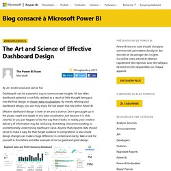
All too often dashboard potential is not fully realized as a result of little thought being put into the final design or chosen data visualizations. By merely refining your dashboard design, you can truly enjoy the full power that lies within Power BI. Effective dashboard design is both an art and a science. Don’t get caught up in the pizazz, razzle and dazzle of any data visualization just because it is slick, colorful, or you just happen to like the way that it looks. Not So Good This “Not So Good” example suffers from a lot of common design mistakes. Dashboard Design with the User in Mind - Tableau YT. Dashboard Design - Considerations and Best Practices. Listen to the audio version of this article Dashboards are a unique and powerful way to present data-based intelligence using data visualization techniques that display relevant, actionable data as well as track stats and key performance indicators (KPIs).

Dashboards should present this data in a quick, easy-to-scan format with the most relevant information understandable at a glance. The term was born from the traditional automobile dashboard, and they have evolved to serve the same function in the digital world. In his book, Stephen Few put it best: Dashboard Design Guide: The Definitive How-To for Dashboard Design. According to a study by Microsoft, human beings have an attention span of just eight seconds.

That means you have about seven seconds to get your point across. Consider this: You could use those seven seconds on text alone – which gives your user time to read about 13 words. Dashboard Design User Experience Guidelines. Uxplanet. Dashboard design is a frequent request these days.
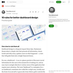
Businesses dream about a simple view that presents all information, shows trends and risky areas, updates users on what happened — a view that will guide them into a bright financial future. For me, a dashboard — is an at a glance preview of the most crucial information for the user at the moment he is looking at it, and an easy way to navigate directly to various areas of the application that require users attention. The term “dashboard” is a metaphor for a car dashboard, sometimes also called the cockpit area, usually near the front of an aircraft or spacecraft, from which a pilot controls the aircraft. Working on enterprise projects for years, I have designed countless dashboards.
And every new one is the next challenge for me. Like any other view in your product, the dashboard has a specific purpose that it’s undertaken to serve. Dashboard Design: best practices and examples. Dashboard Design Best Practices - 4 Key Principles. Blog Building an effective dashboard according to best practices for dashboard design is the culmination of a comprehensive BI process that would usually include gathering requirements, defining KPIs, and creating a data model. However, the importance of proper dashboard design should not be understated — poorly designed dashboards could fail to convey useful information and insights and even make the data less comprehensible than it was originally.
Blog.prototypr. Designers often confuse data with insights. A user is not just concerned about reviewing his data in a beautiful way, they want to see what they can do with this data. For example, If I am creating a section of a dashboard for a recruitment firm, where the CEO is reviewing the number of people hired, A simple approach could show ‘Total applications’, ‘People hired’, ‘Application in process’ and the ‘Applications rejected’. But showing only the data would probably not help the user and the insight that would really help is to show that there has been an increase/decrease in the number of people hired as compared to the last month, along with the following scenario (if possible): Dashboard Design: Best User Dashboard UI Examples. Dashboard design. Is it easy? Far from it. Great dashboard UI designs are developed daily to remind us of the unlimited possibilities we have to present data in a creative way.
Rather than getting heaped with information we can’t understand, dashboard UX designs help us understand what is really important, and open up a data wonderland where we can understand everything, interpret everything, and make use of the story it is telling us. User dashboards are becoming increasingly important as the digital age showers us with more and more data. They help to prevent us from drowning in that sea of data, or at least the good ones do.
Dashboard Design: Top 7 Best Practices and Examples. 10 guidelines for great Dashboard design. 7 minutes read If you’re into professional cycling, then you might have heard the term ‘Domestique’ before. For those unfamiliar with this strange world of lycra, shaved legs and punishing bike rides, a domestique is a term used to describe a particular role within a cycling team. Like a lot of the terms used in professional cycling ‘domestique’ is a French word and translates as ‘servant’, which pretty much sums up the lot of a domestique rider. Domestiques truly are the unsung heroes of the cycling world. They are the riders who collect the water bottles from the team car and hand them out to the rest of the team. Top 20 Dashboard Design Principles, Best Practices & How To's. Top 12 Best Practices in Dashboard Software in 2020. ETL : Qu’est-ce que l’Extract Transform Load ?
Les termes « Extract, Transform, Load (ETL) » désignent une séquence d’opérations portant sur les données : collecte à partir d’un nombre illimité de sources, structuration, centralisation dans un référentiel unique. Dans la plupart des entreprises, les données potentiellement utiles sont inaccessibles ; une étude a même révélé que les deux tiers des entreprises retiraient « peu d’avantages concrets » de leurs données, parfois même « aucun avantage ». Les données ont tendance à être enfermées dans des silos cloisonnés, des systèmes legacy ou des applications rarement utilisées. ETL est le processus qui consiste à rendre ces données disponibles en les collectant auprès de sources multiples (cf. schéma ci-dessus) et en les soumettant à des opérations de nettoyage, de transformation et, au final, d’analytique métier. Certaines personnes préparent leurs opérations ETL en les codant manuellement en SQL ou Java, mais il existe de nombreux outils pour simplifier ce processus.
ETL with Power BI Dataflows. Présentation de DAX - Power BI. Fonctions DAX DAX offre de nombreuses fonctions pour mettre en forme, former ou analyser vos données.With DAX, there are many functions available to shape, form, or otherwise analyze your data. Principes fondamentaux de DAX dans Power BI Desktop. Data Analysis Expressions (DAX) Reference - DAX. Démarrage rapide : découvrir les fondamentaux de DAX en 30 minutes. Nous allons aborder DAX autour de trois concepts fondamentaux très importants : syntaxe, fonctions et contexte. Quelques fonctions DAX les plus souvent utilisées. Calculating day/time difference. GENERATESERIES – DAX Guide.