
Tracking The Junk Food The World Eats After Dark : The Salt. Map of Life goes live : Nature News & Comment. Map of Life. Emission Scenario Explorer Annual Average Temperature 2071-2100 (HadCM3, Bern) Worldmapping beyond mere description. AFP-Videographie - 7 milliards d'habitants en 2011.
The World at 7 Billion - Population and the Environment. We are proud to be participating in the “7 Billion Actions” campaign, a call to action to highlight the challenges, opportunities and actions that will shape our common future. The goal of the 7 Billion Actions campaign is to promote dialogue about what it means to live in a world with so many people and to encourage action on issues that affect us all as global citizens. Over the next 7 days, we will provide you with 7 infographics that provide a multitude of information about the world’s population. No simple relationship exists between population size and environmental change. Demand for land, water, food and fossil fuels will only increase as world population grows, increasing the stress on the Earth’s limited resources.
Today’s graphic shows the different dynamics in this relationship, highlighting emissions, consumption, food, water and more. Click to enlarge. The World's Ageing Population. ECLAIRAGE PUBLIC, l'enseigne lumineuse { Information et Communication Plurimedia . Production Editoriale et Graphique } Home - Population Action International. What's Your Number? World Population Prospects, the 2010 Revision. 7 Billion, National Geographic Magazine. A Younger World That Is Also Ageing. Fab's Themes in Twitter & Blogs - Filed under 'maps' The UN predicts the world's population explosion: visualised. 7 Billion Actions. Mapping Population and Climate Change - Population Action International. The UN predicts the world's population explosion: visualised.
Turn autoplay off Edition: <span><a href=" Sign in Beta About us Today's paper Subscribe Custom Search The UN predicts the world's population explosion: visualised With the population hitting 7bn this month Spanish design house Bestiaro's has produced this visualisation of the UN population data for us using its Impure design language.
World news Population Global development Series More from Datablog on World news Population More blogposts More interactives Facts Are Sacred by Simon Rogers From the war in Afghanistan to the London riots, Facts Are Sacred is a full-colour collection of the most interesting findings from the Guardian datablog. <h2 style="font-size: 20px; margin-bottom: 10px; font-weight: bold">Comments</h2><div style="padding: 10px; background: #ededed; font-size: 14px; margin-bottom: 10px;"><p style="margin-bottom: 10px;"><a href=" here to join the discussion</a>.
Hot topics © 2014 Guardian News and Media Limited or its affiliated companies. Send to a friend Your IP address will be logged. Submarine Cable Map. Interactive. The World of Seven Billion The map shows population density; the brightest points are the highest densities.
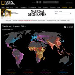
Each country is colored according to its average annual gross national income per capita, using categories established by the World Bank (see key below). Some nations— like economic powerhouses China and India—have an especially wide range of incomes. But as the two most populous countries, both are lower middle class when income is averaged per capita. Atlas historique. StepMap - Create your personal map for free.
1814-1819. 10000+ online newspapers in the world, translate with one click.