
Gapminder: Unveiling the beauty of statistics for a fact based world view.
DataMaps. Others. Resources. WebSites. Visualizations. Soft Drink Industry Structure. The illusion of diversity: visualizing ownership in the soft drink industryPhil Howard,1 Chris Duvall2 and Kirk Goldsberry3August, 2010 BackgroundThree firms control 89% of US soft drink sales [1].
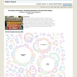
This dominance is obscured from us by the appearance of numerous choices on retailer shelves. Steve Hannaford refers to this as "pseudovariety," or the illusion of diversity, concealing a lack of real choice [2]. To visualize the extent of pseudovariety in this industry we developed a cluster diagram to represent the number of soft drink brands and varieties found in the refrigerator cases of 94 Michigan retailers, along with their ownership and/or licensing connections. Click for zoom.it (scroll in and out) version or extra large versionPDF version of Soft Drink Industry Structure, 2008 ResultsWe recorded 993 varieties of soft drinks. The most successful competitors in these new categories may eventually be bought out. Coca-Cola’s 25 brands and 133 varieties Pepsi’s 17 brands and 161 varieties. Timeline of Major Events & Trends on Datavisualization. Peter von Stackelberg designed this complex timeline of social, technological, economic and political events and trends from 1750 to 2100.
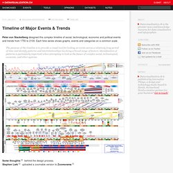
Each time series shows graphs, events and categories on a common scale. The purpose of the timeline is to provide a visual tool for looking at events across a relatively long period of time and identify patterns and interrelationships involving a broad range of factors. Identification of patterns is particularly important when attempting to look at the future of complex social, technological, economic, and other systems. Some thoughts behind the design process.Stephen Lark uploaded a zoomable version to Zoomorama. Visuwords™ online graphical dictionary and thesaurus. Visualizing Economics. Business Networks. Visual Economics. Visualizing Economics: Designing a Persuasive Argument.
An Interesting Way to Visualize Economic Distress – UMW Economics. Resources to help your students visualize economics, CCEE. Looking for opinions on the economy or economic indicators? California Council on Economic Education, CCEE, offers these links to blogs, well-known economists and news sources to help you sort through current events and provide context for your students.
Register for CCEE’s weekly economic updates for timely information and ideas to help explain economics to your middle and high school students using real information that connects with what’s going on in their world today. Concept Link Brief Description Micro Economics Economic systems Map of North Korea/South Korea at night Supply and demand Calvin and Hobbs and other cartoons by topic Economic systems and policy, political and market freedom, trade and global markets economic growth commandingheights/lo/index.html Video series with a comprehensive overview of global economic history from WWI through 2002; Six-hour video narrative divided into short chapters Human capital Macro Economics Income inequality Unemployment/ employment Economic data U.S. Economics on Datavisualization. 09 Jun 2011 Notes Competition , Economics , Visualizing.org UN Global Pulse, an initiative by the United Nations and Visualizing.org have teamed up to challenge you to visualize the voices of vulnerable populations in times of global crisis.
Read more 19 May 2011 Showcases Economics , Politics , Processing Jan Willem Tulp, a freelance information visualizer based in The Netherlands has recently published his submission for the Eyeo data visualization challenge by Visualizing.org that analyzes the numbers of homes in proportion to the population in the USA. Read more 13 Dec 2010 Showcases Economics , Flash For GE, Lisa Strausfeld from Pentagram shows with the CFO Outlook Survey how financial executives view the world today and their outlook for the months ahead. Statistical Visualization.
Socio-economics. Economics in Pictures.