
GLYPHICONS - library of precisely prepared monochromatic icons and symbols. Beautiful Buttons for Twitter Bootstrappers. This is an extension to the Twitter Bootstrap framework.
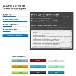
It makes creating pretty buttons easy. (Send improvements to @charliepark.) First, monkey with the sliders on the left. Use your arrow keys for extra precision. (Button Puffiness might not affect all browsers.) Second, copy the CSS in the box below. You should be able to just pop it into your CSS file. Bootsnipp.com. The ultimate guide to Bootstrap. Bootply - Bootstrap Editor and Playground.
Font Awesome, the iconic font and CSS toolkit. Bootstrap · The world's most popular mobile-first and responsive front-end framework. Bootstrap 4: Media Queries using Sass. Bootstrap 4 is currently under construction and will most likely hit the scene very soon.
This is a comprehensive rewrite and major changes are being made. There is no definite release date just yet. But before it ships, let us explore some tricks with the new expanded grid framework and media queries. If you are not yet familiar with Bootstrap 4, start with these: What’s New in Bootstrap 4? At the time of writing, Bootstrap 4 is still in alpha and definitely not be ready for production use just yet. Bootstrap 4 Breakpoints Bootstrap 4 has moved entirely from pixel based units to relative em/rem based units with the base font-size of 16 pixels.
Understanding the grid breakpoints within Bootstrap 4 is quite important before we move on to our Sass files. Notice how BS4 does not have a lowest value, which means xs is now the default style – and you would use sm, md, lg and xl breakpoints as overrides. CSS Media Queries. Using Bootstrap 4 Flexbox. The CSS3 Flexible Box, or Flexbox, is a new layout mode to improve arrangement of items on a page that can also manage directions and order within a container to accommodate different screen sizes and different display devices.
It works like a box model which modifies the width or the height of its child items filling up the space available without the use of floats. A lot of designers and developers use a Flexbox layout to easily position elements on different screen sizes by just using a small bit of code. This saves a lot of time in the development process. Fortunately, Bootstrap 4 added Flexbox support. In today’s tutorial, we’re going to work with Bootstrap 4 Flexbox and how to activate it within your Bootstrap grid components. Enabling Flexbox via _variables.scss Using the core Sass files inside the Bootstrap 4 package, navigate to the $enable-flex variable in the _variables.scss file.
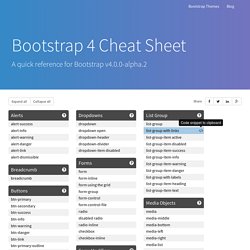
Let’s try that now. By default, you will have the output like the image below. See image below. Bootstrap 4 Cheat Sheet. Visible-print-inline-block <div class="visible-print-inline-block"> This will be printed as "inline-block" and hidden in the browser </div> This will be printed as "inline-block" and hidden in the browser text-*-left.
Bootstrap. 1 Introduction 1.1 Présentation de Bootstrap Bootstrap est un framework front-end (HTML5, CSS et JavaScript) spécialement conçu pour le développement d'application web "responsive", c'est-à-dire qui s'adaptent automatiquement à différents dispositifs et tailles d'écran (desktop, tablettes, smartphones, ...).
Les avantages principaux de Bootstrap sont : Facilité et vitesse de développement : les éléments mis à disposition par Bootstrap permettent de créer en peu de temps des pages avec un layout soigné et moderne ; Facilité d'installation : Bootstrap se compose seulement de deux fichiers à inclure dans le code d'une page HTML. Composants disponibles "out of the box" : les éléments qu'on retrouve plus fréquemment dans une page (e.g. menu de navigation, boutons, etc.) sont déjà disponibles et facilement adaptables. Bootstrap - Page d'inscription. Le framework Bootstrap a été développé par Twitter afin d’avoir un développement de leur réseau social plus normalisé.
Aujourd’hui, il est utilisé par la plupart des développeurs afin de produire des sites web en responsive design. Le responsiv design permettant d’adapter le contenu d’un site web par rapport à la taille de l’écran de l’utilisateur (écran d’ordinateur, tablette, smartphone). Avant de commencer, placez ces deux lignes dans votre balise <head> : <!
jQuery – Gestion d’un formulaire HTML ⇒