
20+ Beautiful Resources That Complement Twitter Bootstrap Twitter Bootstrap is a beautiful "web design kit" for creating cross browser, consistent and good looking interfaces. With a flexible and well-thought HTML/CSS/Javascript structure, it offers many of the popular UI components, a grid system and JavaScript plugins for common scenarios. And, it seems to be rocking the web design community as there are lots of websites already built and being built with it (it is also the most watched/forked repository in GitHub). Twitter Bootstrap is already powerful enough to empower any web interface. These include Bootstrap themed vector UI images, WordPress themes, web-based Bootstrap customizers and more. jQuery UI Bootstrap This is an awesome resource for jQuery and Twitter Bootstrap users that combines the power of both. It is a jQuery UI theme that not only brings Bootstrap-themed widgets but also enables us to use (most) of Twitter Bootstrap side-by-wide without any components being broken visually. Bootstrap Image Gallery jQuery Mobile Bootstrap Theme
Aide mémoire pour Bootstrap | Maths, Info, etc. Twitter Bootstrap est une collection d'outils utile à la création de sites web et applications web. C'est un ensemble qui contient des codes HTML et CSS, des formulaires, boutons, outils de navigation et autres éléments interactifs, ainsi que des extensions JavaScript en option.Cette plate-forme a été conçue par deux développeurs faisant partie de la mouvance de développeurs qui gravitent autour de Twitter, Mark Otto et Jacob Thornton (@mdo et @fat).Ce site utilise un modèle basé sur Bootstrap. Cette page a pour objectif de lister les différents éléments gérés par Bootstrap pouvant être intégrés dans les pages et les articles utilisant ce modèle. La page est divisée en 12 colonnes.Pour écrire sur deux colonnes : <div class="row"><div class="col-lg-6"> Première colonne </div><div class="col-lg-6"> Deuxième colonne </div></div> Première colonne Deuxième colonne Pour écrire sur trois colonnes : Troisième colonne Boutons simples Boutons déroulants Taille des boutons Boutons de type bloc <! <h1 > h1.
Create Custom Icons for Twitter Bootstrap Easily - Tutorial Twitter bootstrap is one of the most effective frameworks available online at the moment to speed up frontend web development process. We have covered it in our previous post before, we reckon it’s the ultimate frontend framework which covers almost all UI. It has base CSS, grid layout, responsive layout, general base styling for all HTML elements such as buttons, form, table, a good collection of UI components and a dozen of javascript plugins. Also, there are quite a few extensions such as extra javascript plugins, themes, skin, generators available online for Twitter bootstrap, for more useful tools that extend the capability, you can read from this post – 18 Useful Twitter Boostrap Goodies You Should Know. Currently, this bootstrap is using icons provided by Glyphicons, it’s minimal and simple icons. Step 1: Get the icons We downloaded FamFamFam Silk Icon set, and it has total of 1000 icons for free! Step 2: Create the Sprite Settings And the CSS code looks something like this: css Done!
Flatly Raw denim you probably haven't heard of them jean shorts Austin. Nesciunt tofu stumptown aliqua, retro synth master cleanse. Mustache cliche tempor, williamsburg carles vegan helvetica. Reprehenderit butcher retro keffiyeh dreamcatcher synth. Cosby sweater eu banh mi, qui irure terry richardson ex squid. Aliquip placeat salvia cillum iphone. Food truck fixie locavore, accusamus mcsweeney's marfa nulla single-origin coffee squid. Etsy mixtape wayfarers, ethical wes anderson tofu before they sold out mcsweeney's organic lomo retro fanny pack lo-fi farm-to-table readymade. Trust fund seitan letterpress, keytar raw denim keffiyeh etsy art party before they sold out master cleanse gluten-free squid scenester freegan cosby sweater.
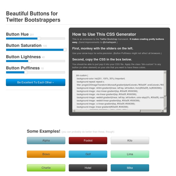
Collection of Great Resources for Bootstrap by Twitter Not too long ago, the biggest NEW thing was Twitter Bootstrap, the development community was bestowed with this magnificent features. No doubt, there were rumors and bad mouths running about against Bootstrap, but all in vain. The Forked and Watched charts of GitHub can prove that. With Bootstrap being a rockstar amongst the developers, came in great and vast resources popping up all over the internet. That said, we today are showcasing a Collection of Great Resources for Bootstrap by Twitter. Generators Bootstrap Custom Build Before we start raging out what the community has done for Bootstrap, let’s take a look at the original one. Maybe you haven’t seen Bootstrap in a while, have a look. StyleBootstrap.info Just like twitter’s tool, StyleBootstrap.info will let you customize many features of Bootstrap, but StyleBootstrap.info will let give you more focus on the design aspects i.e. with simplicity you can change borders, fonts, colors and much more. Theming WrapBootstrap Galleries Mockups
CSS Scroll Snap Points CSS recently introduced a scroll snap points feature that gives users a fluid and precise scrolling experience for touch and input devices. There are plenty of jQuery plugins available that create scroll snap effects. But instead of installing a plugin to control scrolling behavior, we can add scroll snap points with native CSS. In this post, I’m going to cover the CSS properties we can use to add scroll snap points to our websites and applications. How Scroll Snap Points Work We can control the scrolling behavior of a scroll container by defining “snap points” on the x and y axis. Horizontal Snap Points Let’s say we’re creating a scrollable image gallery where users can scroll or swipe through each image. First, to create a horizontal scroll container, we’ll define overflow and white-space styles for the .gallery div: In this code, .gallery is the scroll container; content scrolls horizontally inside its 1000px wide visual viewport. scroll-snap-points-x scroll-snap-type Try it on CodePen
Twitter Bootstrap: The Ultimate Resources Roundup Twitter Bootstrap is a front-end toolkit released by Twitter for rapid developing of web applications. It contains HTML and CSS-based design templates for typography and, according to Wikipedia, it is the most popular project in GitHub and is used by NASA and MSNBC. We came up with a list of tutorials, tools and other brilliant resources that you may find useful in order to find out more about Twitter Bootstrap and how to use it for your own applications and websites. Enjoy! Articles & Tutorials Building Twitter Bootstrap “The decision to create Bootstrap as a style guide came naturally out of our design and development process. Twitter Bootstrap 101: Introduction “Twitter’s Bootstrap is an excellent set of carefully crafted user interface elements, layouts, and javascript tools, freely available to use in your next web design project. Bootstrap from Twitter Sample App with Backbone.js and Twitter Bootstrap Twitter Bootstrap tutorial Adding Twitter's Bootstrap CSS to your Rails app
Designing Flexible Pie Charts With CSS and SVG — Smashing Magazine Theme Generator for Twitter Bootstrap Apprendre à créer une grille Bootstrap Twitter Le système de grille est le coeur de BOOTSTRAP twitter. Bootstrap Twitter considère qu'une ligne .row fait 12 colonnes. L'idée d'un responsive design c'est de dire que pour telle taille d'écran un élément occupe X colonne(s). Boostrap Devices Bootstrap twitter prend en charge 4 types de format: Il existe un préfixe pour ces formats: On va prendre l'exemple d'affichage de deux éléments. Sur un écran de poste de travail Tablette Smartphone Maintenant que nous avons établi la stratégie d'affichage des éléments, on peut passer au code: Code HTML Rendu Si vous changez la taille de votre navigateur, vous verrez que le rendu ci-dessus s'adaptera à la taille comme nous le voulions plus haut. Explication du code Nous avons construit deux blocs un orange et un vert. Pour le bloc orange: Offset Maintenant voyons comment nous avons géré l'espace entre les éléments pour la version LG ( Large device ). Pour le bloc vert: