
Goldee - Smart Light Controller. Product listing - LEDbow. Audrey Azoura : Architecte d’intérieur - Paris. Mike Tucker - Info. Themes. HeapBlogging BorderPhotography BucketMagazine LensPhotography FusePortfolio SennaCreative BlivMinimal.
Ghost Games is a new EA Games studio. Food-Based Web Design Tips to Make Visitors Hungry. It’s the same routine every date night: “where are we heading for dinner?”

To the web we go, looking for restaurants around us that whet our appetites. And the places we always seem to hit after this dinner search are the locations with websites that just make us hungry. Certain techniques, from color to photos to imagery, are common among the best food-based websites. These sites employ a specific strategy designed to make you hungry.
Today we’ll look at how photography, colors, shapes, vivid copy and simple design are used to make mouths of website visitors water. Photography.
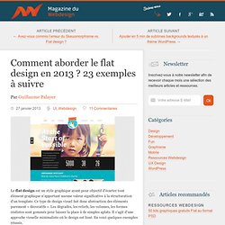
Paralax. Derek Boateng. Community of Dreamers. Flat design. Digital Frog / Mathieu Pieralli : Directeur Artistique digital, Webdesigner et Flasheur Freelance. Sites. A showcase of flat UI design. Build a Website - Squarespace. Comment aborder le flat design en 2013 ? 23 exemples à suivre. Le flat design est un style graphique ayant pour objectif d’écarter tout élément graphique n’apportant aucune valeur significative à la structuration d’un template.

Ce type de design visuel fait donc abstraction des éléments purement « décoratifs ». Les dégradés, les reliefs, les volumes, les formes réalistes sont gommés pour laisser la place à de simples aplats. Il s’agit d’une approche visuelle minimaliste où le design est lissé. En voici quelques exemples réussis. Les exemples de flat design présentés ci-dessous font suite à l’article concernant le débat Skeuomorphisme vs. Imavex 2012 Year on Twitter Harvest rdio Squarespace Grooveshark Combadi Finely Layer Vault Kera Microsoft Circles Conferences The Noun Project So World Wide Women and Tech SpellTower Manos Skype Artsy Build Conf 2012 One Pager New MySpace Nest. Soworldwide.
The Learning Thermostat. Annual Report. 21 Inspiring Examples of Texture Use in Web Design. Using texture is a great way of adding personality and depth to a webdesign. It doesn’t matter if you choose to use texture only in the navigation menu, the header or if you go with a totally textured background, as long as you pick the right texture and don’t over use it, the result, most of time, will be elegant and beautiful, as the examples we’re showing you in this post. Alxandr Grain & Mortar. 21 Awesome Bright and Colorful Websites.
Finding the right color scheme for a website design can often be a real challenge.

Bright colors are sometimes not favored by designers, but in the right situation they can be very effective. In this post we’ll showcase examples of 21 different bright and colorful websites. Hopfully, seeing these examples will give you some inspiration when you’re considering color schemes in your own work. By seeing what other designers are doing and how they are able to make colorful web designs work, you may get some ideas of your own. Looking for hosting? 30 Sites with Great (and Not So Great) Mascots. All professional websites include a logo, and sometimes that logo is also a character.

Yet, this logo character is not necessarily what we would label a "mascot. " With a graphic logo, you will find that graphic everywhere, including in designs for brochure and business card printing. However, a website mascot may only land online, especially if the character is too detailed or large-scale to fit onto smaller print materials.
More and more we are seeing a trend in web design to include both a logo and a character or mascot. Sometimes, this mascot is used to help guide visitors through the website. In this collection, we found 30 sites with mascots – and couldn’t help but notice the monkey theme. Which of the mascots below work to build and which distract? Lift Interactive: Web Design & Web Development Edmonton, Alberta. Envy Labs. Beercamp 2012. Good Design Taste Test: Three Fast Casual Restaurant Websites Compared. Fast food restaurants are notoriously bad with web design, but the emerging market of “fast casual” eateries thus far is proving to be much better in this area.

Today we’re going to look around the web at the websites for some of the most popular fast casual restaurants to see who is doing the best work and what we can learn from them. Warning: this post will make you hungry! Qdoba The first site we’re going to hit up is Qdoba.com, the homepage for a restaurant that serves up some delicious burritos and other southwest offerings.
It’s a lot like Chipotle, which we already looked at in another post. So far so good! Strong Branding Their current branding strategy is that Qdoba is “food for people who love food.” This is a great psychological trick. “They’re subtly forcing me to form connections with the brand by associating it with things that I love.” Menu Home Page Content.
— Marco Rosella, Interactive Designer. Jmore Design. Café Evoke // Coffee, Wine, Beer, Eats, and Catering in Edmond & Oklahoma City. Weyland Industries.