
Low Earth Orbit Visualization. En-ROADS. Browse All : Images of France. Coronavirus 2020-nCoV. Lancet Inf Dis Article: Here. Mobile Version: Here. Data sources: Full list. Downloadable database: GitHub, Feature Layer.
Lead by JHU CSSE. Technical Support: Esri Living Atlas team and JHU APL. Cases and Death counts include confirmed and probable (where reported).Recovered cases are estimates based on local media reports, and state and local reporting when available, and therefore may be substantially lower than the true number. Point level: Admin2 Level (County) - US only; Admin1 Level (Province/State); Admin0 Level (Countries/Regions/Sovereignties). Time Zones: lower-left corner indicator - your local time; lower-right corner plot - UTC.
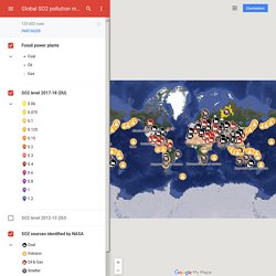
Note: All cases of COVID-19 in repatriated US citizens from the Diamond Princess are grouped together. *The names of locations included on the Website correspond with the official designations used by the U.S. Terms of Use: Lancet Inf Dis Article: Here. Lead by JHU CSSE. Sans titre. Mind The Map - Cartes, Géopolitique. Global SO2 pollution map – Google My Maps. Bayswater power station Callide power station Eraring power station Gladstone power station Kogan Creek power stat...
Liddell power station. Ancient Earth globe. Stuff in Space. Cancers, malformations, AVC...Découvrez les données de santé région par région! Vendredi, l’agence sanitaire Santé publique France a lancé un site interactif qui permet de visualiser en quelques clics toutes les données de santé françaises sous la forme de cartographies.
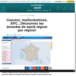
Vous avez envie de connaître le taux de mortalité du cancer du sein dans le Vaucluse ou la proportion de fumeurs quotidiens en Bretagne? L’agence sanitaire Santé publique France a lancé vendredi un site qui permet de visualiser ses données sous la forme de cartes régionales. Baptisé Géodes (pour Géo Données Épidémiologiques de Santé), cet outil est consultable à l’adresse Il permet d’avoir accès à plus de 300 indicateurs, qui concernent à la fois des maladies (différents types de cancer, allergies, AVC, dépression, grippes, etc.) et des déterminants de santé (alcool, tabac, perturbateurs endocriniens, vaccination, etc.). Même s’il s’adresse en priorité à des spécialistes, le site est librement accessible au grand public.
Mind The Map - Cartes, Géopolitique. La carte - TRANSISCOPE. Browse All. Le jour du dépassement pays par pays. L'humanité a épuisé les ressources de la planète pour 2018. L'humanité a consommé au 1er août l'ensemble des ressources que la nature peut renouveler en un an et vivra "à crédit" pendant cinq mois, selon l'ONG Global Footprint Network, qui souligne que cette date survient de plus en plus tôt.
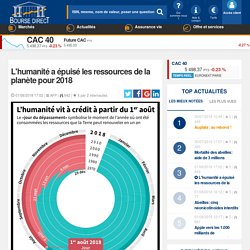
Le 1er août est "la date à laquelle nous aurons utilisé plus d'arbres, d'eau, de sols fertiles et de poissons que ce que la Terre peut nous fournir en un an pour nous alimenter, nous loger et nous déplacer et émis plus de carbone que les océans et les forêts peuvent absorber", explique Valérie Gramond de WWF, partenaire du Global Footprint Network. "Il nous faudrait aujourd'hui l'équivalent de 1,7 Terre pour subvenir à nos besoins", souligne WWF dans un communiqué. Cette date est la plus précoce jamais enregistrée depuis le lancement du "jour du dépassement" au début des années 1970, où la date retenue était celle du 29 décembre.
En 2017, il était intervenu le 3 août. La situation diffère fortement selon les pays. The Ocean Cleanup. Plastics in the marine environment have become a major concern because of their persistence at sea, and adverse consequences to marine life and potentially human health.
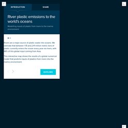
Implementing mitigation strategies requires an understanding and quantification of marine plastic sources, taking spatial and temporal variability into account. Here we present a global model of plastic inputs from rivers into oceans based on waste management, population density and hydrological information. Our model is calibrated against measurements available in the literature. We estimate that between 1.15 and 2.41 million tonnes of plastic waste currently enters the ocean every year from rivers, with over 74% of emissions occurring between May and October.
The top 20 polluting rivers, mostly located in Asia, account for 67% of the global total. Worldometers. Air Pollution in Europe: Real-time Air Quality Index Visual Map. Emergency and Disaster Information Service. Nature Soundmap. 40 more maps that explain the world. Maps seemed to be everywhere in 2013, a trend I like to think we encouraged along with August's 40 maps that explain the world.
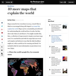
Maps can be a remarkably powerful tool for understanding the world and how it works, but they show only what you ask them to. You might consider this, then, a collection of maps meant to inspire your inner map nerd. I've searched far and wide for maps that can reveal and surprise and inform in ways that the daily headlines might not, with a careful eye for sourcing and detail. I've included a link for more information on just about every one.
Enjoy. 1. Data source: Oak Ridge National Laboratory, World Bank. Those dots represent people: the brighter the dot, the more people. 2. Click to enlarge. Human beings first left Africa about 60,000 years ago in a series of waves that peopled the globe. 3.