
Better Know a Visualization: Motion Charts. What problem does this solve?
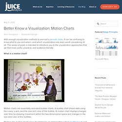
Advanced visualization methods exist for three reasons: To show more dimensions of data simultaneously, therefore revealing more interesting stories in the dataTo show high level patterns as well as the individual elements that make up the patternTo dazzle viewers Motion charts accomplishes all three. First, it brings the time-dimension into a chart that would otherwise represent a snapshot in time. Motion charts can help in an analysis if you find that you are asking yourself, how did I get here? Secondly, Hans Rosling’s talk beautifully demonstrates the ability to see big picture patterns (flows of bubbles from one quadrant to another) while also focusing on the individual components. What to watch out for when using motion charts? The masterful hands of a pro like Hans Rosling make motion charts look powerful and intuitive. As an analysis tool, motion charts ask a lot of our visual pattern recognition skills.
"Great bubble chart solution. In search of the perfect Tag Cloud « WordWorks. Tagging has become an essential part of browsing the internet these days.
If you have read my previous two posts on tagging you would now know why I am not a big fan of the concept and I am not alone in this regard. Natbib reference sheet. Reference sheet for natbib usage(Describing version 7.0b from 2002/02/27) For a more detailed description of the natbib package, LATEX the source file natbib.dtx.
Overview The natbib package is a reimplementation of the LATEX \cite command, to work with both author-year and numerical citations. It is compatible with the standard bibliographic style files, such as plain.bst, as well as with those for harvard, apalike, chicago, astron, authordate. Loading Load with \usepackage[options]{natbib}. Patent iNSIGHT Pro - Blog: Overview and use of Correlation Maps. We recently introduced a new method to display network mode maps in VizMAP and this blog focuses on discussing details of this map. First, a recap on network mode maps. Let us look at a very simple table of 5 companies vs IPC Main classes on a random sample of patents an applications on antivirus. The data in the tabular format is shown below. If we represent that in network mode of VizMAP it appears as: Key IPCs in the map are automatically placed in the center and company portfolios are organized around the Assignee-IPC relationship.
Clicking on HO4L IPC Node will highlight all records that fall under this category: As you can see few records of each Company are classified under the H04L. The map clearly shows how many records relate two nodes and the thickness of the line is also proportional to the number of correlating records. Statistics Glossary - presenting data. Discrete Data A set of data is said to be discrete if the values / observations belonging to it are distinct and separate, i.e. they can be counted (1,2,3,....).
Examples might include the number of kittens in a litter; the number of patients in a doctors surgery; the number of flaws in one metre of cloth; gender (male, female); blood group (O, A, B, AB). Compare continuous data. Main Page - WikiViz. Statistics Glossary - presenting data. Discrete Data A set of data is said to be discrete if the values / observations belonging to it are distinct and separate, i.e. they can be counted (1,2,3,....). A Periodic Table of Visualization Methods.
The Work of Edward Tufte and Graphics Press. Graphics Press LLC P.O.

Box 430 Cheshire, CT 06410 800 822-2454 Edward Tufte is a statistician and artist, and Professor Emeritus of Political Science, Statistics, and Computer Science at Yale University. He wrote, designed, and self-published 4 classic books on data visualization. Data visualization. Data visualization or data visualisation is viewed by many disciplines as a modern equivalent of visual communication.
It is not owned by any one field, but rather finds interpretation across many (e.g. it is viewed as a modern branch of descriptive statistics by some, but also as a grounded theory development tool by others). It involves the creation and study of the visual representation of data, meaning "information that has been abstracted in some schematic form, including attributes or variables for the units of information".[1] A primary goal of data visualization is to communicate information clearly and efficiently to users via the information graphics selected, such as tables and charts.
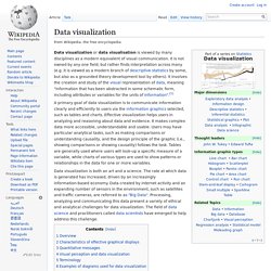
Effective visualization helps users in analyzing and reasoning about data and evidence. It makes complex data more accessible, understandable and usable. Information visualization. Graphic representation of a minute fraction of the WWW, demonstrating hyperlinks Information visualization or information visualisation is the study of (interactive) visual representations of abstract data to reinforce human cognition.
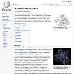
The abstract data include both numerical and non-numerical data, such as text and geographic information. However, information visualization differs from scientific visualization: "it’s infovis [information visualization] when the spatial representation is chosen, and it’s scivis [scientific visualization] when the spatial representation is given".[1] Overview[edit] Partial map of the Internet early 2005, each line represents two IP addresses, and some delay between those two nodes. Patent visualisation. Patent visualisation is an application of information visualisation.
The number of patents has been increasing steadily,[1] thus forcing companies to consider intellectual property as a part of their strategy.[2] So patent visualisation like patent mapping is used to quickly view patents portfolio. Patent visualisation dedicated software began to appear in 2000 like Aureka from Aurigin now owned by Thomson Reuters.[3] Many patent and portfolio analytics platforms, such as Relecura, Innography and Patent iNSIGHT Pro,[4] offer options to visualise specific data within patent documents by creating Topic Maps,[5] Priority Maps, IP Landscape reports[6] etc. Visualization Options. Many Eyes.