
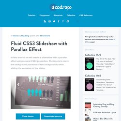
Convert a Menu to a Dropdown for Small Screens. The Five Simple Steps website has a responsive design with a neat feature. When the browser window is narrow, the menu in the upper right converts from a regular row of links into a dropdown menu. When you're on a small screen (iPhone shown here) and click the dropdown, you get an interface to select an option where each option is nice and big and easy to choose. That sure makes it easier to pick a place to go than a tiny link.
Yeah, it's two taps instead of one, but that's arguable since you'd probably have to zoom in to tap the right link otherwise. The HTML The HTML for these two menus is different. Let's go with that for now. The CSS By default we'll hide the select menu with display: none;. Then using media queries, we'll do the switcheroo at some specific width.
Overthrow. A tiny, no-frills, framework-independent, targeted overflow: auto polyfill for use in responsive design.

Disable Overthrow What is this all about? You want to use CSS overflow in your designs, but overflow doesn't work properly in many browsers, particularly mobile ones. Many popular mobile browsers treat overflow: auto the same as overflow: hidden, cropping overflow content from view, and leaving users no way to access it. Fluid CSS3 Slideshow with Parallax Effect. In this tutorial we will create a slideshow with a parallax effect using several CSS3 properties.
The idea is to move the background positions of two backgrounds while sliding the container of the slides. View demo Download source In this tutorial, we are going to create a slideshow with a parallax effect with the help of some CSS3 properties. We’ll use radio buttons and sibling combinators for controlling which slide is shown.
There will be two backgrounds and the idea is to change the background positions and the position of the slider with transitions in order to create a slight parallax effect. The graphics used in the demo are by: 5Milli (Global Vector Map) and by WeGraphics (Free Vector Infographic Kit). Please note: the result of this tutorial will only work as intended in browsers that support the respective CSS properties. The Markup. CSS3 Shapes Resource. CSS3 Solutions for Internet Explorer. Advertisement Experienced developers understand that CSS3 can be added to new projects with progressive enhancement in mind.

This ensures that content is accessible while non-supportive browsers fall back to a less-enhanced experience for the user. But developers could face a situation where a client insists that the enhancements work cross-browser, demanding support even for IE6. In that case, I’ve collected together a number of options that developers can consider for those circumstances where support for a CSS3 feature is required for all versions of Internet Explorer (IE6, IE7, & IE8 — all of which are still currently in significant use). Opacity / Transparency. 3D Ribbon Generator - CSS3d.net. Cssarrowplease. CSS3 Responsive Slider / Carousel Using Radio Buttons. Select catcher Created by Ian Hansson (@teapoted) Art from Brendan Zabarauskas (@bjzaba_).
Icons from the iconSweets set. Browser Support: Best In Test: Firefox (transition performance) Full Support: Chrome, Firefox, Opera, Safari (latest versions of all browsers) Partial Support: IE9 (Functional, but does not support transitions) *No JavaScript Functionality (1 compatability fix though) iOS devices don't handle labels properly. You can view this page without the js iOS fix here. CSS3 Generator. Learn CSS Positioning in Ten Steps: position static relative absolute float. 1. position:static The default positioning for all elements is position:static, which means the element is not positioned and occurs where it normally would in the document.
Normally you wouldn't specify this unless you needed to override a positioning that had been previously set. 2. position:relative If you specify position:relative, then you can use top or bottom, and left or right to move the element relative to where it would normally occur in the document. Let's move div-1 down 20 pixels, and to the left 40 pixels: The Shapes of CSS. How to Build a Fully Functional CSS3-Only Content Slider. Content sliders are a great way to make a website more dynamic.
They add flair, and if used correctly, could be the difference between a purchase and a back button. Normally, they would be built with jQuery or some other Javascript library. However, with the advent of CSS3, I will show you how to build one using only CSS. The result won’t be the most semantic thing to ever be made, but it will be completely functional nonetheless. Demo & Source Files View the DemoDownload the Source Files Screenshot Some simple HTML to start with Granted, that looks scary. CSS button, 110 best! Tired of turning upside down the internet and not finding what you’re looking for?
Well, here we’re providing you the best of our CSS buttons search. Here you’ll find over 100 buttons, among pure CSS and image + CSS made. All of them great looking, with neat effects and really easy to include them in your code. Some people says there’s nothing new under the sun, however, we can always come up with new and exciting ways of apply and use things we already have, so the results will be a mind blower. Animate.css - a bunch of plug-and-play CSS animations.