
Downloads - google-code-prettify - syntax highlighting of code snippets in a web page. CSS3 transform property. Ignacio Valdés sur Twitter : "#HTML #CSS Faltan algunos detalles para terminar... Blueplate Plugin. Menu to cross icon. Center and crop images with a single line of CSS. SUIT CSS: style tools for UI components. PubCSS: Formatting Academic Publications in HTML & CSS. You have two choices when it comes to formatting academic papers for conferences and journals: Microsoft Word and LaTeX.
Word is familiar and easy for anyone to pick up. But the WYSIWYG interface that makes it so easy also makes it easy to create inconsistent, amateur-looking documents that are tough to maintain and fine-tune. On top of this, you get a file format that isn’t friendly to revision control, diminishing collaboration through a system like GitHub. LaTeX is powerful and produces beautiful documents, but requires installing a hefty toolchain, learning a new syntax, and familiarizing yourself with its powerful abstractions. This is a significant front-end investment, one that may not pay off. PubCSS is an exploration of HTML and CSS as a third option. So how’s PubCSS’s output look? You can compare the actual PDF output for the following formats: Designing For Print With CSS. Advertisement If you mention printing with CSS to many people who work on the web, print style sheets1 are the use that comes to mind.
Css - Media queries: max-width OR max-height. Css - Fixed element disappears in Chrome. 8 puntos claves para generar CSS escalable y modular — Productividad y metodologías. Web Components & the Future of CSS. 8 puntos claves para generar CSS escalable y modular — Productividad y metodologías. Ignacio Valdés. Cssarrowplease. CSS: Elastic Videos. While I was coding the Elemin Theme (a responsive WordPress theme that I recently designed), one of the challenges that I faced was to make the embedded videos elastic.
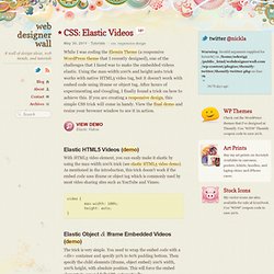
Using the max-width:100% and height:auto trick works with native HTML5 video tag, but it doesn't work with embed code using iframe or object tag. After hours of experimenting and Googling, I finally found a trick on how to achieve this. If you are creating a responsive design, this simple CSS trick will come in handy.
View the final demo and resize your browser window to see it in action. View Demo Elastic Videos Elastic HTML5 Videos (demo) With HTML5 video element, you can easily make it elastic by using the max-width:100% trick (see elastic HTML5 video demo). Elastic Object & Iframe Embedded Videos (demo) The trick is very simple. How to Create Fixed Width & Elastic To restrict the width of the video, an additional <div> wrapper is required. Compatibility Credits This trick was found on tjkdesign.com. CSS Architectures: Refactor Your CSS.
The top scalable and modular approaches I covered in the previous article in my CSS Architectures series all have pieces of brilliance that can help you change the way you think about and structure your CSS.

They also overlap in many areas, which indicates which aspects of the process of improving your CSS are truly critical. Although you could follow any single approach while constructing a new site to great success, the fact of the matter is that what most of us are doing is trying to make sense of existing CSS run amok. So, while the approaches I described are great on their own, what we really need is a way to combine the superpowers from them all to combat the evil of crazy code – a sort of “Justice League” of scalable and modular techniques.
Furthermore, just as Rome wasn’t built in a day, it’s a fool’s errand to try to correct in one fell swoop thousands of lines of code that lack rhyme or reason. Photo by ignaciovaldesme. Button with icon hover. Background Video Fullscreen solo con HTML5 y CSS. Pen. A grouped pure CSS parallax demo by Keith Clark. Text-rendering: optimizeLegibility; - CSS-Tricks. # March 5, 2014 at 12:56 pm So I am using the Foundation 5 framework from Zurb to help with a RWD.
I needed to find the occurrence of a persons name in all of the content and then link it to their bio. So I opened the pages in chrome (version 33) and did CTRL + F to find the persons name. The search bar said 1 of 4, but no text was highlighted on the page. I was a bit perplexed at first and thought maybe I spelled the name wrong.
Foundation includes two style sheets: foundation.css and normalize.css. So I opened up the inspector and began looking at the properties applied to the p tag, which is when I ran across this “text-rendering: optimizeLegibility”. Also, my boss, when viewing the site, would occasionally have the font disappear. How to Center Anything with CSS. Updated March 24, 2016.
If you've ever had to build a webpage, you have likely needed to center something in that page. Using Cascading Style Sheets (CSS) is the proper way to center images, blocks of text, and even your entire layout for a Web page. Most of the properties for centering have been in CSS since version 1.0, and they work great with CSS3 and modern Web browsers. Multi-Device Layout Patterns. Through fluid grids and media query adjustments, responsive design enables Web page layouts to adapt to a variety of screen sizes.
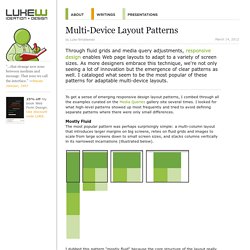
As more designers embrace this technique, we're not only seeing a lot of innovation but the emergence of clear patterns as well. I cataloged what seem to be the most popular of these patterns for adaptable multi-device layouts. To get a sense of emerging responsive design layout patterns, I combed through all the examples curated on the Media Queries gallery site several times. Flexible CSS cover images. I recently included the option to add a large cover image, like the one above, to my posts.
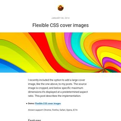
The source image is cropped, and below specific maximum dimensions it’s displayed at a predetermined aspect ratio. This post describes the implementation.
CSSO/Optimizers/Tools/BEM. Type Rendering Mix. Simple, Lightweight & Fast jQuery Slider. Prefix free: Break free from CSS vendor prefix hell! -prefix-free lets you use only unprefixed CSS properties everywhere.
It works behind the scenes, adding the current browser’s prefix to any CSS code, only when it’s needed. The target browser support is IE9+, Opera 10+, Firefox 3.5+, Safari 4+ and Chrome on desktop and Mobile Safari, Android browser, Chrome and Opera Mobile on mobile. If it doesn’t work in any of those, it’s a bug so please report it. Just before you do, please make sure that it’s not because the browser doesn’t support a CSS3 feature at all, even with a prefix. In older browsers like IE8, nothing will break, just properties won’t get prefixed. Normalize.css: Make browsers render all elements more consistently.