
Infographic of the Day: Google's Wiz of Data Viz Creates High Tech Weather "Cloud" The next time you fly into the San Jose airport on a trip to pump VCs for cash, look up and you might see eCloud, a new data visualization that shows weather patterns from around the world.
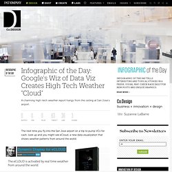
The hanging installation, created by Aaron Koblin, Nik Hafermas, and Dan Goods, is composed of a series of LCD-embedded plastic panels, which collectively look something like an 8-bit cloud shifting under the weather's influence -- at certain times, for example, it can appear to be an angry thundercloud, at others it looks like fog. Every few minutes, the cloud depicts the weather in a different city, and a nearby computer gives you precise details about what's going on. The shimmering effect arises because each panel turns opaque when electricity passes through it.
These are controlled by 100 circuit boards, rigged to the computer kiosk nearby, which is constantly downloading weather data from NOAA. It sends weather pattern data that controls the e-cloud. [Pics via Dan Goods] Autodesk University 2010 Showcases Impact of Great Design. SAN RAFAEL, Calif.

Nature by Numbers. New Visualization Tool from Google With Data From 5.2 Million Digitized Books. We've written a lot this year about the boom in e-readers and the benefits that e-books have over print.
And often, discussions surrounding the move to digital texts involves our enhanced ability to read and store our libraries, particularly via mobile devices. But a new project available in Google Labs today - Books Ngram Viewer - highlights some of the other benefits of digitizing texts beyond better reading and storage. So let me invoke my former life as a literature PhD student here to say, "This is incredibly farking cool.
" Visualizing the History of the Usage of 500 Billion Words Using Google's Books Ngram Viewer, you can now visualize how language and literature have changed over time, by searching a subset of the more than 15 million books that Google has digitized since 2004. And now Google has put that visualization tool into everyone's hands, along with the ability to download the raw data. The Boom of Big Infographics. Big information graphics have been around for a long time. They've come in the form of maps, visualization, art, signs, etc. That was all on paper though. In the past couple of years, humongous, gigantic, and often really long infographics have found their way onto the computer screen, through blogs and news sites.
Some are great. Some really suck. Let's take a look at when this all got started, where the trend is headed, and how much we should really read into these things. The Beginning. Twitter maze - chronotext.org. A spiral shaped maze is generated using the top trending topics from Twitter during the last 24 hours.
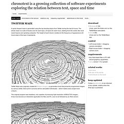
The whole maze is a suite of blocks (one for each topic, 20 topics for each hour), starting from the center (the most recent topics) and spiraling outwards. The height of each block is relative to the frequency of appearance (24 hours wise) of the topic it represents.
Cosmographies. Science and Popular Science magazines, 1872-2007. William Huber, Tara Zepel, Lev Manovich. 2010.

This project explores changing strategies in use of images, layout, and content of two magazines: Science (1880-) and Popular Science (1872-). By arranging thousands of magazine pages into s single high resolution image, we are able to reveal gradual temporal changes over long historical periods. This visualization shows evolution of Popular Science over 125 years (1882-2007): Data: Popular Science magazine - one issue per every five years from the beginning of magazine publication.
Timescale: 1882 to 2007. Now lets zoom and compare the first few decades of Time and Popular Science magazines. Data: All issues of Science magazine from the beginning of publication in 1880 to 1906. In the first three decades of its publication, Popular Science used very few images. The-Blog-Tree.jpg 1200×1747 pixels. Scale Independent Thought. Emergent Futures Mapping with Futurescaper. Futurescaper is an online tool for making sense of the drivers, trends and forces that will shape the future.
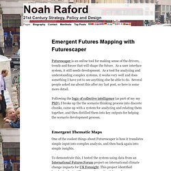
As a user interface system, it still needs development. As a tool for analyzing and understanding complex systems, it works very well and does something I have yet to see anything else be able to do. Several people asked me about this after my last post, so here is some more detail. Following the logic of collective intelligence (as part of my my PhD), I broke up the the scenario thinking process into discrete chunks, came up with a system for analyzing and relating them together, and then distilled them into key outputs for helping the scenario development process. Emergent Thematic Maps One of the coolest things about Futurescaper is how it translates simple input into complex analysis, and then back again into simple insights.
To demonstrate this, I tested the system using data from an International Futures Forum project on international climate change impacts for UK Foresight. Places and Spaces. A visual exploration on mapping complex networks. Gapminder: Unveiling the beauty of statistics for a fact based world view. Zeitgeist 2010. Data Visualization, Infographics, and Statistics. Visualizing.org. Aaron Koblin. Microsoft Pivot: Dead or Alive?