
5 Great, Easy to Use Tools for Infographics. An infographic is a great way to go viral, earn links and social media shares as well as to give your content wings by re-packaging it.

When done well, infographics work like magic for driving traffic and exposure. From presentation data, to visual resumes and just fun items to share through social networks, you can make intricate infographics in minutes. These five tools are an excellent way to do so. Tools for Data Visualization One of the most frequent questions I get is “How can I start creating infographics? If you are worried that creating an infographic will be too hard, you should be pleasantly surprised by these tools. Visual.ly Utilized frequently by high school students who want visuals for projects as well as by website owners who are looking for dynamic blog charts, this is a great infographic creator.
Creately If you want a more basic – but still attractive – style of graph without registering for a site, Creately is probably more your style. Vizify Visualize.me Re.Vu Conclusion. A Beautiful Timeline Visualisation: TimelineJS by VéritéCo. Datavisualization.ch Selected Tools. The Power of Maps. Maps are both necessary tools for analysis and crucial delivery visuals for foresight and warning products.

They constitute a very powerful type of delivery form, as they change both the world and the mind. The pivotal importance of maps and of the process of mapping has notably been shown, in the case of the birth of nations and of nationalism, by two remarkable books: Imagined Communities by Benedict Anderson and Siam Mapped: A History of the Geo-Body of a Nation by Winichakul Thongchai. Building upon the findings of those master-works, as well as on my own (PhD) research, this post explains the power of maps and then outlines contemporary evolutions, examples and possibilities.
As maps influence our way to perceive the world, they also allow for the creation of new political actions, and make possible what hitherto had been unthinkable of. What you would get is something like this, where only the most salient geographical features that allow for bearings are marked: Guest Post: The Future of Data Visualization.
Data is everywhere - and readily accessible The open data movement is finally beginning to have some real impact.

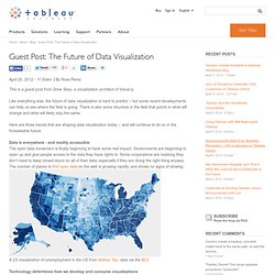
Governments are beginning to open up and give people access to the data they have rights to. Some corporations are realizing they don’t need to keep closed doors on all of their data, especially if they are doing the right thing anyway. The number of places to find open data on the web is growing rapidly, and shows no signs of slowing. A D3 visualization of unemployment in the US from Nathan Yau, data via the BLS Technology determines how we develop and consume visualizations The devices we use to view data visualizations have changed drastically with the advent of tablets, smartphones and other portable computing devices.
Other technologies in the visualization chain are constantly evolving, as well. These trends set the stage for some pretty impressive changes in data visualization -- yet some things will not change. The chart types that exist are not going to change much. Data Visualization. 5 ways SlideShare can rock your company, from Slides That Rock. A visual exploration on mapping complex networks. Infographics & Data Visualizations - Visual.ly. A squinty-eyed look at population densities. (Click through!

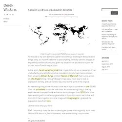
– Javascript/HTML5/Canvas support required.) I’ve moved to my own domain! Aaand I’ve been busy working on thesis-related things lately, so I haven’t had time to post anything. I initially saw this blog as an expanded portfolio of sorts, but given my situation I’ve decided to try aim for shorter, more Tumblr-esque posts. In that spirit, here’s something small that I made to brush up on Javascript.
An interesting thing about this map is that each layer is contained in one 23,000 pixel tall spritesheet to reduce load time. Let me know what you think! EDIT: I incorrectly listed the data as density per square miles originally, but it looks like the GPW data is in fact in kilometers. Pearltrees: a multifunction visual bibliographic tool. While preparing the bibliography on energy security foresight, I was wondering if it would be useful to also apply a visually appealing approach to bibliographies, which would then be conceptualized as a product.

As usual, there is no simple answer to this question, and if the classical bibliography will most probably have to be kept for a while, Pearltrees also appears as a perfect bibliographic tool. Because delivery of product must consider both the product’s material support and the recipient or customer, then the traditional way to write a bibliography will probably have to be kept for some time. Indeed, for anything that uses paper and print as support, the usual, alphabetical bibliography is best.It is furthermore the most practical way to find a reference as quickly as possible, especially for long bibliographies.
Indeed, for long and complex topics and thus references, we enter the categorization problem, as usual. The potential improvements could be Related.