background preloader

UX Research

Facebook Twitter

Clear, Consistent, Capable, NICE» Blog Archive » Calculating ROI on UX & Usability Projects. From time to time, we hear about teams who are asked to deliver metrics that demonstrate the value of UX. Unfortunately, the basic metrics of the web like click-through-rates and subscriptions aren’t applicable to most software development. Oftentimes the request comes on the heels of a successful, but expensive, initial UX initiative when the team goes back to management for funding for future phases. Defining one “correct” formula to calculate ROI can be a bit tough since the components of ROI change with every company/project.

For example, the metrics of success for an oil trading platform are measured in absolute dollars ($), while the metrics of success on a usability for electronic healthcare record project might be measured in terms of $ and lives. Our engagement with the Department of Veterans Affairs in Houston, for example, was designed to save $5-10 million/year AND 50-100 veteran lives. That said, ROI is always calculated in terms of increase or decrease of a key variable. Data Visualization and Infographics. Advertisement The main goal of data visualization is its ability to visualize data, communicating information clearly and effectivelty. It doesn’t mean that data visualization needs to look boring to be functional or extremely sophisticated to look beautiful. To convey ideas effectively, both aesthetic form and functionality need to go hand in hand, providing insights into a rather sparse and complex data set by communicating its key-aspects in a more intuitive way.

Yet designers often tend to discard the balance between design and function, creating gorgeous data visualizations which fail to serve its main purpose — communicate information. In both print and web design infographics — visual representations of information, data or knowledge — are often used to support information, strengthen it and present it within a provoking and sensitive context, depending on designer’s creativity. Data Visualization and Infographics Virtual Water11Simple, clean, elegant and effective.

George W. How to Design Content Filters for Better User Browsing. By anthony on 10/24/11 at 9:51 pm Where does one start when they visit a website and want to find content that interests them? They could start from the beginning and browse through all the content until they find something they like. But that can take a lot of time if what they’re looking for isn’t on the home page. To give users more flexibility and speed in browsing, you can use content filters. A content filter classifies content and displays them in unique ways. Believe it or not, there are only five dimensions to classifying content. Location Location is a dimension you can use if you have content that comes from several different sources. iTunes Movie Trailers gives users the ability to browse movies by the different movie studios they come from.
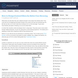
Alphabet Classifying content by alphabet is another dimension that most sites can use. Time Time is a popular dimension to use for content filters because time is a dimension that all content shares. Category Hierarchy. Online usability testing software | Optimal Workshop. Smashing Magazine. Official Usability, UX & UI Guidelines From Companies. How to Design a Great User Experience. User Experience. UI-Patterns.com. UX Booth: User Experience & Usability Blog. User Interface Engineering - Usability Research, Training, and Events - UIE. Persona Cheat Sheet - LUXr. Persona Templates - Designer, author, speaker, and foodie. Usability Testing: Top 8 Tips for Designing Usability Tests. Pagination Gallery: Examples And Good Practices.

Advertisement Structure and hierarchy reduce complexity and improve readability. The more organized your articles or web-sites are, the easier it is for users to follow your arguments and get the message you are trying to deliver. On the Web this can be done in a variety of ways. In body copy headlines and enumerations are usually used to present the information as logically separated data chunks. An alternative solution is pagination, a mechanism which provides users with additional navigation options for browsing through single parts of the given article.

Search engines almost always use pagination; newspapers tend to make use of it for navigation through the parts of rather large articles. In most cases pagination is better than traditional “previous – next” navigation as it offers visitors a more quick and convenient navigation through the site. Let’s take a look at the good practices of pagination design as well as some examples of when and how the pagination is usually implemented. The Secret to Designing an Intuitive UX. Imagine that you’ve never seen an iPad, but I’ve just handed one to you and told you that you can read books on it. Before you turn on the iPad, before you use it, you have a model in your head of what reading a book on the iPad will be like. You have assumptions about what the book will look like on the screen, what things you will be able to do, and how you will do them—things like turning a page, or using a bookmark. You have a “mental model” of reading a book on the iPad, even if you’ve never done it before.
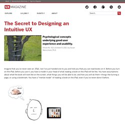
What that mental model in your head looks and acts like depends on a lot of things If you’ve used an iPad before, your mental model of reading a book on an iPad will be different than that of someone who has never used one, or doesn’t even know what iPads are. Mental models have been around for a long time I’ve been talking about mental models (and their counterparts, conceptual models, which we’ll get to shortly) since the 1980s.

Just how long? So what is a mental model, then? Drop-Down Usability: When You Should (and Shouldn't) Use Them - Articles. Drop-down lists are great – when used correctly. If there’s anywhere between 7 and 15 options, a drop-down list is usually a really good fit. You can put a healthy amount of information in your form without cluttering the entire page, because the list’s options are hidden when you don’t need them. However, many sites are using drop-down lists with too many options (more than 15) or too few (less than 7), resulting in a poor user experience. Drop-down lists with too many options When drop-down lists grow larger than 15 options they become difficult to scan and navigate.

A good example of this is a country-selector with more than 100 options! Like most e-commerce stores, Amazon force you to select your country from a massive drop-down list. As a user, you first have to figure out the sorting pattern – are the options listed alphabetically, or by some other logic? Drop-down lists with too few options On Yahoo! Share your thoughts in a comment. Don’t Put Hints Inside Text Boxes in Web Forms. By Caroline Jarrett Published: March 21, 2010 This is my first Good Questions column for UXmatters. In this column, I’ll be writing about questions. When communicating with users in one direction, we typically ask them questions—often through forms or surveys. “Hint text is rarely effective as a way of helping users, but instead becomes a default input.”

In January 2010, Janet Six’s column, Ask Matters, “Label Alignment in Long Forms,” included extensive discussion of one of the most frequently asked questions about forms design: where to put labels in relation to their fields. Don’t worry. The short version of my advice: Don’t do it! Read on, and I’ll explain. An Example of a Hint Inside a Text Box I live in the UK and travel by train approximately twice a month, so I often use the UK National Rail Plan your journey form. Figure 1—Part of the Plan your journey form on UK National Rail Of course, my irritation alone doesn’t make a case for a usability policy. You’ll find this checkpoint: Hand Gestures Dramatically Improve Learning.

Kids asked to physically gesture at math problems are nearly three times more likely than non-gesturers to remember what they've learned. In the journal Cognition, a University of Rochester scientist suggests it's possible to help children learn difficult concepts by providing gestures as an additional and potent avenue for taking in information. "We've known for a while that we use gestures to add information to a conversation even when we're not entirely clear how that information relates to what we're saying," says Susan Wagner Cook, lead author and postdoctoral fellow at the University. "We asked if the reverse could be true; if actively employing gestures when learning helps retain new information.

" It turned out to have a more dramatic effect than Cook expected. Cook used a variation on a classic gesturing experiment. However, even when children discard that final integer, they will often point to it momentarily as they explain how they attacked the problem. Why ‘Ok’ Buttons in Dialog Boxes Work Best on the Right. By anthony on 05/25/11 at 11:30 pm Designers often question where to place their ‘Ok’ and ‘Cancel’ buttons on dialog boxes.
The ‘Ok’ button is the primary button that completes the task action. The ‘Cancel’ button is the secondary button that takes users back to their original screen without completing the action. Based on their functions, what is the best order to place them? Should the ‘Ok’ button come before the ‘Cancel’ button or after? Platform Consistency Is Not Good Enough Many have referred to following platform conventions as the answer. “Consistency” is a popular word used among designers. What if a certain design convention is harmful to users? There are certain platform design conventions that are widely used today because they work for users. Button Placement Matters One could argue that making your action buttons prominent by giving it more visual weight and a clear and distinct label is more important than its placement.

Why ‘Ok’ Buttons Work Best on the Right Conclusion. Hnad gesture specs. Explaining Personas used in UX Design – Part 2 « Melbourne, as in the city. Out of the entire UX toolkit, personas are the tool that I find myself having to explain and justify the most. Everyone that I’ve introduced them to recently, as part of the overall UX process, seems to have a negative association with them that is usually based upon some Marketing driven personas that they’ve been exposed to previously and have seen little value in.
So in this 2-part piece, here’s how I explain the how they are created and differences in how they are used. Creating UX Personas using research-based insights Done properly personas are created after conducting qualitative research with the target users of a product. After talking in-depth to these users about their mindsets, motivations and behaviours, the research findings are analysed to identify common behaviour trends between the users. These commonalities are then summarised and used to create individual personas that represent that group of participants. Here’s the steps involved in creating them: 1. 2. 3. 4. 5. 6. 7.

In Defense of Eye Candy. We’ve all seen arguments in the design community that dismiss the role of beauty in visual interfaces, insisting that good designers base their choices strictly on matters of branding or basic design principles. Lost in these discussions is an understanding of the powerful role aesthetics play in shaping how we come to know, feel, and respond. Consider how designers “skin” an information architect’s wireframes. Or how the term “eye candy” suggests that visual design is inessential. Our language constrains visual design to mere styling and separates aesthetics and usability, as if they are distinct considerations. Yet, if we shift the conversation away from graphical elements and instead focus on aesthetics, or “the science of how things are known via the senses,” we learn that this distinction between how something looks and how it works is somewhat artificial. Why aesthetics? #section1 Aesthetics and cognition#section2 Cognition is “the process of knowing.”
Aesthetics and affect#section3. Designing User Interfaces For Business Web Applications. Advertisement Business Web application design is too often neglected. I see a lot of applications that don’t meet the needs of either businesses or users and thus contribute to a loss of profit and poor user experience. It even happens that designers are not involved in the process of creating applications at all, putting all of the responsibility on the shoulders of developers. This is a tough task for developers, who may have plenty of back-end and front-end development experience but limited knowledge of design. This results in unsatisfied customers, frustrated users and failed projects. So, we will cover the basics of user interface design for business Web applications. While one could apply many approaches, techniques and principles to UI design in general, our focus here will be on business Web applications. Websites vs. Confusing Web applications and websites is easy, as is confusing user interface design and website design.

Different Types of Web Applications First, Know Your Users. UX, It's Time to Define CXO. What is a Chief Experience Officer (CXO)? We’ve been singing its praises when the title started cropping up in boardrooms. “Thank the gods, UX has finally made C-level!” There were riots in the streets, free sharpies were given out on every city block, and colored pencils rained from the sky... Okay, obviously none of that happened. However, we were all elated to know that experience was finally being represented at an executive level. But now that the CXO title has been around for a few years, I ask you: what does the CXO really do and how have things changed for us?

How have we, as a profession, taken ownership of this role? I think that this role needs some serious examination. Let’s start by looking at how CXO is defined today. Corporate leadership in UX strategy software and hardware design management creative reviews and concept development intellectual property positioning and protection Even this seems a little bit sketchy, but we’re progressing. Designing With Audio: What Is Sound Good For?

Advertisement Our world is getting louder. Consider all the beeps and bops from your smartphone that alert you that something is happening, and all the feedback from your appliances when your toast is ready or your oven is heated, and when Siri responds to a question you’ve posed. Today our technology is expressing itself with sound, and, as interaction designers, we need to consider how to deliberately design with audio to create harmony rather than cacophony. The cacophony is beautifully captured in Chris Crutchfield’s video, in which he interprets the experience of receiving email, SMS texts, phone calls, Facebook messages and tweets all at the same time: In this article, we’ll explore some of the uses of audio, where we might find it and when it is useful. Audio is a form of feedback that can be used either in combination with other forms, such as haptics, visual displays and LEDs, or on its own.

Audio is not always warranted. Where We Find Audio (Image credit: Fey Ilyas) Mobile Gaming. Agile Experience Design: A Digital Designer's Guide to Agile, Lean, and Continuous. UX Magazine | Defining and Informing the Complex Field of User Experience (UX) The Difference Between Agile Themes, Epics and User Stories : Agile101 – Agile Project Management and Digital Publishing. QR-Code Generator. Datamatrix Generator. On Web Usability: Mouse Cursors and Actionable Page Elements | engfer(s) Whether we realize it or not, the displayed cursor image tells us about the area of the screen below our mouse cursor; it tells us whether or not we need to click, drag, move, resize, or even wait. Now, I know that we all know this, but I believe that sometimes as developers (especially web developers) we forget that not all items in an application have the correct default cursor for the action that is assigned for that item.

The Web Standard For years we lived without JavaScript in our browsers; it wasn’t used by developers, or it was turned off or disabled by the user because there were so many security flaws with the JavaScript engine; however, as those security flaws are fixed and JavaScript’s functionality increases, the age of no-script is quickly coming to a close. One of the side-effects from living without JavaScript for so long is that users are now used to relying on the mouse pointer to signal whether or not something on the page is clickable or actionable.

Taken For Granted. Information Architects – The 100% Easy-2-Read Standard. 16 Pixels: For Body Copy. Anything Less Is A Costly Mistake - Smashing Magazine. 14 Golden Eggs of Good UI Design. Detect and Set the iPhone & iPad's Viewport Orientation Using JavaScript, CSS and Meta Tags. UIFont - iPhone Development Wiki. Corporation: Software, Smartphones, Online, Games, Cloud Computing, IT Business Technology, Downloads. UI/UX. Expert Connect - Capgemini Worldwide.

Articles

Smokey Bones - Home. One Page Love. How To Create a Horizontally Scrolling Site. Rune Werner | CSS GALLERY - Web Gallery & Web Design Resources, Tutorials, Online Community, CSS, jQuery, Mootools, Photoshop, Illustrator, and more. Academics | Bentley University.