
Free Carlsberg Sans Light Fonts. $40$ at MyFonts.com | 128 fonts $16$ at MyFonts.com | 32 fonts $18$ at MyFonts.com | 12 fonts $26$ at MyFonts.com | 20 fonts.
Column (typography) Practical Tips for Utilizing Columns of Text in Your Layouts. Designing around large blocks of type can be tough and more designers are taking the “fewer-is-better” approach when working with columns and large blocks of text.
When using a mass of type, such as in a book, text-laden website or print project, much of the emphasis is more on the readability than the actual look of the type. Typefaces are important but even more important can be the number of columns used in combination with the words. Book Design. Thinking with Type. Font-DB. 15 top typography resources. If you are looking for help with fonts or type, these typography resources are for you.
Fonts. Typography Keyboard Layout: Download Now! Advertisement In January we commissioned Ilya Birman, a Russian designer with passion for typography, to adapt his typography keyboard layout (which has become a common typographer’s tool in Russia) to create a version for English-speaking designers, artists and, of course, typographers across the globe.
The main idea was to provide the web design community with a handy tool that would let designers enter characters that are usually unavailable on a keyboard easier and quicker. Readability. Update: On February 1, 2011, Readability was re-launched into a full-fledged reading platform that includes mobile support, queuing articles for reading later and a greatly improved reading view.
In addition, the platform provides a unique model for supporting publishers and writers through your reading activity. Visit to learn more. Reading anything on the Internet has become a full-on nightmare. As media outlets attempt to eke out as much advertising revenue as possible, we’re left trying to put blinders on to mask away all the insanity that surrounds the content we’re trying to read. It’s almost like listening to talk radio, except the commercials play during the program in the background. Recently, Mandy Brown wrote a wonderful article for A List Apart called In Defense Of Readers. Despite the ubiquity of reading on the web, readers remain a neglected audience. Typograph – Scale & Rhythm. This page falls somewhere between a tool and an essay.
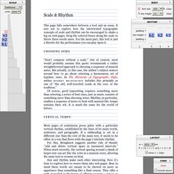
It sets out to explore how the intertwined typographic concepts of scale and rhythm can be encouraged to shake a leg on web pages. Drag the colored boxes along the scale to throw these words anew. For the most part, this text is just a libretto for the performance you can play upon it. Beginners Guide to OpenType. OpenType (OT) is a cross-platform type format that includes expert layout features to provide richer linguistic support and advanced typographic control.
Using OT technology you can substitute your characters for different glyphs1 using many different methods; Ligatures, Small Caps, Oldstyle Figures, Fractions, Superscript/Subscript, Ordinals, Alternates, Titling Characters and many more. On Choosing Type. First Principles Typography is not a science.
Typography is an art. How To Choose A Font. Font Newsletter Archive. Font Newsletter Archive. iOS Fonts. Typographic Marks Unknown. There are many typographic marks which are familiar to most, but understood by few.

Most of these glyphs have interesting histories and evolutions as they survived the beatings given to them through rushed handwriting of scribes and misuses through history. They now mostly live on our keyboards and in our software, and a few are used often, so it seems only fitting to know where they come from and how to correctly use them. The Pilcrow History of the Pilcrow Replacing another symbol, the paragraphos, to become the new mark representing a paraph—a new line of thought or break in text—it evolved over time through the natural development of handwriting.
Typeface Anatomy and Glossary. Here’s a glossary of common type terminology, which along with the FAQs may answer many font related questions.
If the information you need isn’t here, call us. Abbreviations Many fonts have abbreviations in their names. Some relate to glyph sets and font formats, others to design traits and foundries, and so on. A comprehensive list of these abbreviations and their explanation can be found in The Abbreviated Typographer from Unzipped. Adobe Type Manager (ATM) 50 Helpful Typography Tools And Resources. Advertisement We love beautiful typography, and we appreciate the efforts of designers who come up with great typographic techniques and tools or who just share their knowledge with fellow designers.
Type Classification. Type Classification There are thousands of different typefaces and fonts available to designers, printers, publishers, artists and writers (as well as the general public) today. There are all types of display and text typefaces and everything in between. Typeface Classification. Un travail de classification des caractères typographiques par l’artiste Martin Plonka. Nick Sherman > Senior Degree Project > Research. Once I knew what problems I wanted to solve, I had to familiarize myself with anything that might aid me in my solution. I love this stage in any design project—it makes full use of my infinite attention span. For some reason I tend to throw myself head first into any subject that I'm even remotely interested in, so when it was time to research something I'm as passionate about as typographic classification or the visual display of complex information, etc, I went a little overboard.
Classification Systems.