
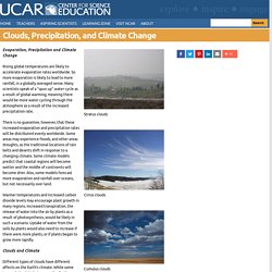
016 3783 Climate Change Fact Sheet. NASA: Climate Change and Global Warming. Climate Impacts Graph Matching. Climate and Ice. Clouds, Precipitation, and Climate Change. Evaporation, Precipitation and Climate Change Rising global temperatures are likely to accelerate evaporation rates worldwide.
So more evaporation is likely to lead to more rainfall, in a globally averaged sense. Many scientists speak of a "spun up" water cycle as a result of global warming; meaning there would be more water cycling through the atmosphere as a result of the increased precipitation rate. There is no guarantee, however, that these increased evaporation and precipitation rates will be distributed evenly worldwide. Some areas may experience floods, and other areas droughts, as the traditional locations of rain belts and deserts shift in response to a changing climate. Warmer temperatures and increased carbon dioxide levels may encourage plant growth in many regions. In a new music video, Earth’s climate is baroque. Climate change is a pressing issue, but it can often feel distant and abstract.
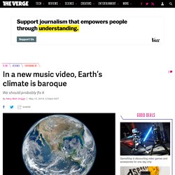
To make it resonate in people’s minds, one scientist turned dry data points into achingly beautiful music, making the frightening changes to our planet audible. The short piece, In Nomine Terra Calens, translates to “In the Name of a Warming Earth.” It’s by seismologist Lucy Jones, who turned temperature data from 1880 to the present into music to illustrate the speed at which the world is warming. Jones spent decades of her professional life studying earthquakes with the United States Geological Survey, but she’s also a gifted musician. In Nomine Terra Calens: In the name of a warming Earth.
Scripps.ucsd. How to visualize one part per million - Kim Preshoff + The TED-Ed Community. Graphics and Multimedia. Climate Science - Climate Science, Risk & Solutions. Progress in climate science dates from more than 200 years ago.
By the middle of the 19th century, scientists understood that the earth is heated by sunlight and would keep warming up indefinitely unless it had some way of losing energy. They knew that all objects radiate energy and that the earth radiates it in the form of infrared radiation. Infrared radiation is a form of light but with longer wavelengths than can be seen by the human eye. However, it can be measured by instruments, including infrared glasses that combat soldiers use to “see” in the dark. Illustrated Graphs: Using Art to Enliven Scientific Data. The success of your illustrated graph will likely correlate with the amount of time you spend brainstorming.
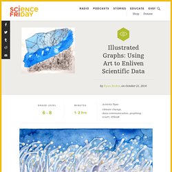
Pelto often spends as much time planning her pieces as she does actually creating them. You should try arranging visual elements in various ways, perhaps by sketching different compositions that will inform your final piece. Brainstorming Process If you’re using one of the Original Climate Change Graphs from above, print a copy of the Brainstorm Template that matches your graph.Use the three boxes containing just the curve of the original graph to create thumbnail sketches of different ways to illustrate your piece.It is easy to fall into a narrow line of thinking when brainstorming how to turn a scientific graph into an illustrated graph. Climate Change Data — Jill Pelto. Climate Change Data uses multiple quantities: the annual decrease in global glacier mass balance, global sea level rise, and global temperature increase.

I wanted to convey in an image how all of this data must be compared and linked together to figure out the fluctuations in Earth’s natural history. One of the reasons scientists study what happened in the past is to understand what may happen now as a result of human-induced climate change. I represented this by illustrating that glaciers are melting and calving, sea levels are risings, and temperatures are increasing. The numbers on the left y-axis depict quantities of glacial melt and sea level rise, and the suns across the horizon contain numbers that represent the global increase in temperature, coinciding with the timeline on the lower x-axis.
References: Science On a Sphere: A Global Tour of Precipitation from NASA. NASA Climate Kids. Where Greenhouse Gases Come From Ener...ed, Your Guide To Understanding Energy. Climate Change Indicators in the United States. Indicator StoryMap Website refresh coming in April!
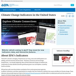
Stay tuned for new indicators, data, and interactive features. About EPA's Indicators The Earth's climate is changing. Temperatures are rising, snow and rainfall patterns are shifting, and more extreme climate events – like heavy rainstorms and record high temperatures – are already happening. EPA partners with more than 40 data contributors from various government agencies, academic institutions, and other organizations to compile a key set of indicators related to the causes and effects of climate change.
Explore Climate Change Indicators. Sea Level Rise - Map Viewer. What If All The Ice Melted On Earth? ft. Bill Nye. What If All The Ice Melted On Earth? ft. Bill Nye. The Impacts of Climate Change on Water and Ice. Warmer conditions are having an impact on our planet.
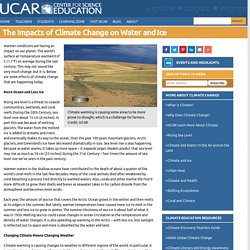
The world's surface air temperature warmed 0.6° C (1.1°F) on average during the last century. This may not sound like very much change, but it is. Below are some effects of climate change that are happening today. More Ocean and Less Ice Rising sea level is a threat to coastal communities, wetlands, and coral reefs. The Water Cycle and Climate Change. Clouds, Precipitation, and Climate Change. Unit2 ToxtownBook final 508 5 10 2012. Dairy Digester Development in California. California’s dairy community continues to be a leader in developing dairy methane reduction technologies that have the dual benefit of reducing greenhouse gas emissions and creating renewable energy.
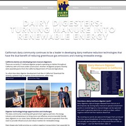
California dairies are developing more manure digesters. There are currently 21 methane digester projects operating on dairies throughout California, with one more under construction. Another 18 digester projects recently were awarded grants from the California Department of Food and Agriculture. So, what does dairy digester development look like in California? Download the recently-updated map or explore via the interactive, online map. Udder Confusion: Dairy Digester Development in California. California is by far the No. 1 dairy state in the U.S. with roughly 1.8 million head, concentrated mostly in the Central Valley.
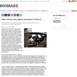
According to the California Milk Advisory Board, about one in every five U.S. dairy cows resides in California on some 1,500 to 1,600 farms. On average, each dairy cow produces about 27 to 29 tons of manure a year, meaning annual manure generation from California’s dairy industry reaches an astounding 52.2 million tons annually. And with this much cow manure comes voluminous methane emissions, a potent greenhouse gas (GHG). Michael Boccadoro, executive director of the organization Dairy Cares, says 48 percent of California’s methane emissions come directly from the dairy industry. Not only does California lead the nation in dairy production, but it is also a trailblazer in GHG reduction legislation with programs such as cap-and-trade and the low carbon fuel standard (LCFS), both fostered under the California Global Warming Solutions Act of 2006 (AB 32).
It’s Not Your Imagination. Summers Are Getting Hotter.