

Data Visualization, Information Design and Infographics. The Interest In Pinterest: The Ten Things We Love (and Hate) Infographic. Oh, there is interest in Pinterest, the visual social sharing site.
But is the site that, in its first month, became the #1 source for referring web traffic (over Google+, Reddit, and LinkedIn combined) a “colossal waste of time,” and “only good as a platform for scrap-booking,” or will its “stellar design” help it keep moving it into the #2 social site? A few interesting findings to make you sound smarter at the water-cooler: The conversation is US-centric – Over 60% of you talking about Pinterest live in the US. Are Tablets Taking Over? When Apple launched the iPad in 2010, it was a huge success.
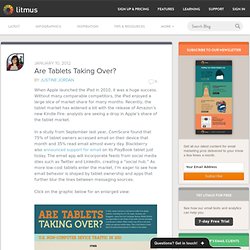
Without many comparable competitors, the iPad enjoyed a large slice of market share for many months. Recently, the tablet market has widened a bit with the release of Amazon’s new Kindle Fire: analysts are seeing a drop in Apple’s share of the tablet market. In a study from September last year, ComScore found that 75% of tablet owners accessed email on their device that month and 35% read email almost every day. Blackberry also announced support for email on its PlayBook tablet just today. A Case Study in Social Media Demographics. Selling into the Sharing Economy. The Next Big Trend in Social Commerce? [Infographics. What’s next for social commerce?
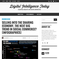
We’ve seen the rise of collective buying power with the group-buy trend, and we’ve seen the commercialisation of social networks – both selling on them, and integrating them into the retail experience. There’ll certainly be more of the same, evermore sophisticated – whether it’s fan-stores on social networks, the portable social graph in retail environments, or the evolution of group-buy beyond daily-deal brokers. But two other trends are increasingly coming up in conversations with industry experts; subscription-based models in commerce (think birchbox, glossybox), andthe sharing economy (think collaborative consumption – again…) TheSharingAvalanche.png (PNG Image, 600 × 5387 pixels) Social Media Report: Spending Time, Money and Going Mobile. Social media not only connects consumers with each other, but also with just about every place they go and everything they watch and buy.
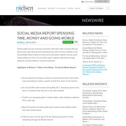
Nielsen’s new Social Media Report looks at trends and consumption patterns across social media platforms in the U.S. and other major markets, exploring the rising influence of social media on consumer behavior. Highlights of Nielsen's "State of the Media: The Social Media Report" All sizes. TheInternetIsFull_4ebebeb3293f4. Trendone_futureentertainment-final.jpg (JPEG Image, 3308x2339 pixels) - Scaled (28%) - (Private Browsing) Infographic: Where Do You Access Twitter From Most Often? - Nicholas Jackson - Technology - The Atlantic - (Private Browsing) In a relatively short time, Twitter has grown from a small service used by a handful of early employees to a platform that delivers more than 200 million tweets every single day.
I'm on my Twitter account for a majority of the day and access it through Tweetdeck, a client that lives on my desktop. It's been days since I last navigated to the actual Twitter website; I usually only visit when I want to search for a specific user. But we all use Twitter differently. An Introduction to Crowdfunding [Infographic] - (Private Browsing) Driven in part by the explosion of vibrant social-networking media, the crowdfunding sensation now stretches to the far reaches of the globe.
![An Introduction to Crowdfunding [Infographic] - (Private Browsing)](http://cdn.pearltrees.com/s/pic/th/introduction-crowdfunding-18714992)
Fostering creativity, philanthropy, and growth, crowdfunding sites have fundamental social and economic impact, and are altering the allocation of capital. This great new infographic — commissioned by the crowdfunding site PleaseFund.Us in collaboration with Crowdsourcing.org — provides insights into crowdfunding including: Its definitionTrendsGeographic prevalenceNumber and location of crowdfunding sitesLaunch datesTypes of crowdfunding models and the evolution of funding ideologiesStimuli and triggersSuccess storiesCrowdfunding and social media. How Much Do Music Artists Earn Online? - (Private Browsing) INFOGRAPHIC: Why Content Marketing Matters - (Private Browsing) October 17th, 2011 by Steve Maloney.
30 Top Infographics for Web Developers and Designers from 2010 - (Private Browsing) An infographic or informative illustration gives an informative presentation of different objects with a combination of text and image .
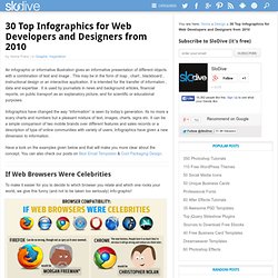
This may be in the form of map , chart , blackboard , instructional design or an interactive application. It is intended for the transfer of information , data and expertise . It is used by journalists in news and background articles, financial reports, on public transport as an explanatory picture, and for scientific or educational purposes. The inkscape tutorials weblog.
The Inner Structure of Infographics: How to Create, Important Tips and Free Tools. Every day Internet users read a lot of data, look through news-websites and blogs, which are really overwhelmed with up to date information.
It’s hard to remember everything important and keep in mind all facts we’ve learned during a day, sometimes some really valuable content is missed. So, how to convey effectively the main message to the readers and how to make them draw attention to your post? As human beings remember better the visual representation of information, than the whole sheet of complete text, the answer is much simpler you might think. Infographic is the best method to present a rich amount of data, explain quickly your main thoughts and show clearly a research. Any word won’t slip from the audience, all significant data will be showcased on the eye-catching graphics.
5 Unbeatable Types of Infographic + Free Tools to Create Them. An infographic (information graphic) has been a very effective way to bait for links and social media votes for ages.

Like anything else, it can be done right or wrong (I am sure you have seen dozens of poorly implemented infographics by now and maybe a few really good ones). How to create a good one? The secret is in days (maybe months) of brainstorming. A cool concept doesn’t even have to be too very well-designed. A Look at the Growing "Work From Home" Phenomenon [INFOGRAPHIC] Working from home is more prevalent and more widely accepted than ever. With 26.2 million teleworkers in the U.S. in 2010, the virtual workforce is expected to grow in coming years. For starters, 56% of senior leaders and hiring managers at Fortune 500 companies believe that the workforce will steadily or greatly increase at their companies, according to a recent survey by WorkSimple.
The study findings outline the changing virtual workforce with a number of compelling stats and findings, as seen in the infographic below. Have you noticed an increase in the number of employees at your workplace that work remotely? Social Media for B2B Marketing Infographic. Here at Ecreative Internet Marketing, most of our clients are in the B2B market — largely industrial companies, which is a niche in which we are experts. Recently we’ve found ourselves fielding B2B social media questions more and more frequently — questions about Facebook, Twitter, and LinkedIn.
So we decided to put together this simple Social Media for B2B Marketing infographic. The infographic gives a nice broad overview of the size of the major social media outlets, and then dives down into some very specific B2B data about B2B buyers and how social media affected lead generation for small to medium B2B businesses. We hope you find this B2B Social Media infographic as interesting as we do!
Social Media Marketing By the Numbers [INFOGRAPHIC] Donny Deutsch, the former adman and talk show host, once recounted a story about a Mitsubishi Super Bowl ad that was tagged with the URL seewhathappens.com. The ad got 600,000 clicks, Deutsch said, which prompted the carmaker to ask, "Is that good? " Deutsch answered: "We told the client it was great, so it was great! " The Mitsubishi campaign ran almost eight years ago.
Have things changed? 10 informative B2B marketing infographics. I've rounded up ten recent infographics on B2B marketing and related issues, including funnel optimisation, marketing automation, and B2B in social media. Where possible, I've added the infographics to this post in a readable size, but for others you can click on the image to see a larger version... B2B content marketing (Buyersphere) B2B lead nurturing guide (EBM) LinkedIn strategies for B2B (Leadformix) 20 Stunning Social Media Statistics Plus Infographic. What Drives Brand Sociablity? [INFOGRAPHIC] By now, most marketers agree that engaging their brands in social media is a good thing, but they also feel that they could be doing it better According to a survey of 1,897 senior executives conducted by Weber Shandwick in partnership with Forbes Insights, 84% of the execs believe their brand's sociability is not up to world-class standards.
What does it take to get there? In the infographic below, Weber Shandwick offers nine tips, including creating your own content for social media and planning social media activity across all channels. 40 Awesome Infographic Designs which Helping Analysts. The Modern Executives Essential Social Media Toolkit Plus [INFOGRAPHIC] Privacy on-line is fast disappearing as search engines and social networks publish information in an instant.
Conversations about people and brands are searchable with granular advanced search functions that include dates and specific media such as images and videos. In the last century(as far back as the ancient web time of 1995) there was no Google or Bing to help you find information easily on the web. Finding people or brands using primitive search engine technology at the time such as AltaVista was rather hit and miss and finding something relevant was often buried as far back as page 20 of the search results. Now to find something about a person you only need to put their name into Google and up will come their LinkedIn, Facebook and Twitter profiles. Awesome Infographics. Awesome Infographics Should you let your employees work from home?
12 Awesome LinkedIn Infographics in 2011. 60 Most Amazing Infographics [Hand-Picked] Современное образовательное учреждение осуществляют самую разностороннюю деятельность: интеллектуальное развитие, нравственное воспитание детей, развитие творческих способностей, художественного вкуса, укрепление здоровья. Все это вы найдете в Прогимназии № 1633. Здесь Вашим детям предлагаются только современные образовательные программы, современные учебные классы, лаборатории, игровые.
Результаты многих исследований и опыта работы, что ученикам дошкольных учреждений и начальной школы самостоятельно достаточно сложно определить сферу своих интересов. Поэтому в задачах прогимназии – познакомить детей с самыми разными видами деятельности и помочь определиться с выбором. В учебном заведении действует психолого-педагогическая служба, которая может порекомендовать ученикам и родителям подходящую учебную программу, организована помощь социального педагога и логопеда. 79 Totally Awesome Infographics – Creative! 40 Useful and Creative Infographics. Six Revisions Menu. Awesome infographics. A rather awesome blog about rather awesome infographics. Managing the virtual workforce. How brands reward loyalty. The Web 2.0 Summit Map - The Data Frame.
Free Infographic Tools. You never need to leave home again. Infographic on Top Email Irritations - What Annoys People About Email? State of the Internet 2011 [Infographic] The Art of Naming a Business. Life of a Facebook Photo.