
How to easily generate a perfectly normal distribution. Many times, for instance when teaching, I needed to quickly and simply generate a perfectly normally distributed sample to illustrate or show some of its characteristics.
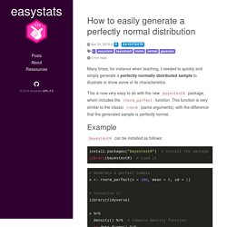
This is now very easy to do with the new bayestestR package, which includes the rnorm_perfect function. This function is very similar to the classic rnorm (same arguments), with the difference that the generated sample is perfectly normal. Example bayestestR can be installed as follows: install.packages("bayestestR") library(bayestestR) x <- rnorm_perfect(n = 100, mean = 0, sd = 1) library(tidyverse) x %>% density() %>% as.data.frame() %>% ggplot(aes(x=x, y=y)) + geom_line() We can also easily color some of the parts of the curve, for instance, the observations lying beyond +2 standard deviations.
WVPlots now at version 1.0.0 on CRAN! Nina Zumel and I have been working on packaging our favorite graphing techniques in a more reusable way that emphasizes the analysis task at hand over the steps needed to produce a good visualization.
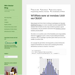
We are excited to announce the WVPlots is now at version 1.0.0 on CRAN! The idea is: we sacrifice some of the flexibility and composability inherent to ggplot2 in R for a menu of prescribed presentation solutions. This is a package to produce plots while you are in the middle of another task. For example the plot below showing both an observed discrete empirical distribution (as stems) and a matching theoretical distribution (as bars) is a built in "one liner. " Tutorials on Advanced Stats and Machine Learning With R. Getting Genetics Done: R: single plot with two different y-axes.
I forgot where I originally found the code to do this, but I recently had to dig it out again to remind myself how to draw two different y axes on the same plot to show the values of two different features of the data.
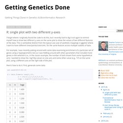
This is somewhat distinct from the typical use case of aesthetic mappings in ggplot2 where I want to have different lines/points/colors/etc. for the same feature across multiple subsets of data. For example, I was recently poking around with some data examining enrichment of a particular set of genes using a hypergeometric test as I was fiddling around with other parameters that included more genes in the selection (i.e., in the classic example, the number of balls drawn from some hypothetical urn).
I wanted to show the -log10(p-value) on one axis and some other value (e.g., “n”) on the same plot, using a different axis on the right side of the plot. Here’s how to do it. First, generate some data: Cascading style sheets for R plots (via the Rcssplot package) This post is contributed by Tomasz Konopka.
Comments are welcome. tomasz@rcssplot.org One of the great features of R is its capable graphics framework. In principle, the framework allows us to customize all aspects of the visual presentation of data. In practice, however, customization is rather tedious. For example, R’s own boxplot function has 17 custom arguments, not counting ...; stripchart has 20. Several impressive frameworks already exist to help with visualization (e.g. ggplot2, plot.ly, etc.)
In practice, we would start using Rcssplot by writing custom settings into a css file. In the R environment, we would parse these css definitions into an R object,
Too Many Users. SjPlot R-package. SjPlot has been released on CRAN!
You can install the package and its dependencies using install.packages("sjPlot")! Description Collection of several plotting and table output functions for data visualization. Results of several statistical analyses (that are commonly used in social sciences) can be visualized using this package, including simple and cross tabulated frequencies, histograms, box plots, (generalized) linear models (forest plots), PCA, correlations, cluster analyses, scatter plots etc. Furthermore, this package contains some tools that are useful when carrying out data analysis or interpreting data (especially intended for people coming from SPSS and who are new to R).
For further details, please refer this blog post… Detailed examples Detailed examples for the functions are published on RPubs. Downloads and Installation Downloads Download PDF manual and source from CRAN. Installation Use install.packages("sjPlot") to install sjPlot-package from CRAN. RPubs documentation.
Basic Plots. Machine Learning. PCA - CA - FA - MDS. Clustering / LPA. Association Rule Mining. Plotting Systems. Color Palettes. Network graphs. Time Series. Maps/GIS - Demographics. Heatmaps. Trees. Διάφορα. GLM related.