
A heatmap as calendar. Recently I was looking for a visual representation to show the daily changes of temperature, precipitation and wind in an application xeo81.shinyapps.io/MeteoExtremosGalicia (in Spanish), which led me to use a heatmap in the form of a calendar.
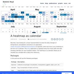
The shiny application is updated every four hours with new data showing calendars for each weather station. The heatmap as a calendar allows you to visualize any variable with a daily time reference. Packages In this post we will use the following packages: if(! For those with less experience with tidyverse, I recommend the short introduction on this blog post. The Mockup Blog: Heatmaps in ggplot2. Many thanks to Ethan Douglas for sharing his heatmap python code on OpenSource Football!
This is a similar walkthrough to Ethan’s post, but in R + ggplot2. Additionally, credit for both collecting the data and the original plot go to Ethan. Please also note that the original code adapted from Ethan came from Sarah Mallepalle et al, 2019. Many thanks to Sarah, Ron, Konstantinos, and Sam for sharing this data collection tool! Input data frame. This package is a tidy wrapper of the package ComplexHeatmap.
The goal of this package is to interface a tidy data frame with this powerful tool. Some of the advantages are: Introduction to heatmaply. Author: Tal Galili (Tal.Galili@gmail.com) A heatmap is a popular graphical method for visualizing high-dimensional data, in which a table of numbers are encoded as a grid of colored cells.
The rows and columns of the matrix are ordered to highlight patterns and are often accompanied by dendrograms. Heatmaps are used in many fields for visualizing observations, correlations, missing values patterns, and more. Interactive heatmaps allow the inspection of specific value by hovering the mouse over a cell, as well as zooming into a region of the heatmap by dragging a rectangle around the relevant area. This work is based on ggplot2 and plotly.js engine. Calendar Heatmaps in ggplot - Ryan Plant. Calendar heatmaps are a neglected, but valuable, way of representing time series data.
Their chief advantage is in allowing the viewer to visually process trends in categorical or continuous data over a period of time, while relating these values to their month, week, and weekday context - something that simple line plots do not efficiently allow for. If you are displaying data on staffing levels, stock returns (as we will do here), on-time performance for transit systems, or any other one dimensional data, a calendar heatmap can do wonders for helping your stakeholders note patterns in the interaction between those variables and their calendar context. In this post, I will use stock data in the form of daily closing prices for the SPY - SPDR S&P 500 ETF, the most popular exchange traded fund in the world. ETF’s are growing in popularity, so much so that there’s even a podcast devoted entirely to them.
First, we import the necessary packages. Heatmaply: an R package for creating interactive cluster heatmaps for online publishing. This post on the heatmaply package is based on my recent paper from the journal bioinformatics (a link to a stable DOI).
The paper was published just last week, and since it is released as CC-BY, I am permitted (and delighted) to republish it here in full. My co-authors for this paper are Jonathan Sidi, Alan O’Callaghan, and Carson Sievert. Summary: heatmaply is an R package for easily creating interactive cluster heatmaps that can be shared online as a stand-alone HTML file. Interactivity includes a tooltip display of values when hovering over cells, as well as the ability to zoom in to specific sections of the figure from the data matrix, the side dendrograms, or annotated labels. Thanks to the synergistic relationship between heatmaply and other R packages, the user is empowered by a refined control over the statistical and visual aspects of the heatmap layout.
Availability: The heatmaply package is available under the GPL-2 Open Source license. Contact: Tal.Galili@math.tau.ac.il. Ggplot2 Time Series Heatmaps: revisited in the tidyverse. Superheat: supercharged heatmaps for R. The heatmap is a useful graphical tool in any data scientist's arsenal.
It's a useful way of representing data that naturally aligns to numeric data in a 2-dimensional grid, where the value of each cell in the grid is represented by a color. It's a natural fit for data that's in a grid already (say, a correlation matrix). But it's also useful for data that can be arranged in a grid, like quantities in a calendar, as a way of comparing clusters, or simply as a combination of two categorical or discrete variables. The base R heatmap function does a good job of generating basic heatmaps (this FlowingData tutorial showcases its capabilities), but if you want to put anything on the margins besides labels you're going to need something more powerful.
Add a scatterplot (or boxplot) to the one of the margins (details and code): The hourly heatmap with ggplot2. I’ve had a few folk get in touch following my last post, all commenting on the last plot : Most of these enquiries went along the following lines: “I hadn’t thought of doing that.
It looks really easy. But how do you do it?” Unfortunately I was away the last couple of days without access to the code, and I didn’t want to pass on the wrong info. HeatmapHrbyDay.R What is the use case? Some comments : The Interpol dataset is pretty large, so we filter out for the first weather station, which conveniently had 2 full years data. If you type ‘p’ in the console at this point you will see the plot. Static and Interactive Heatmap in R - Unsupervised Machine Learning. ComplexHeatmap is an R/bioconductor package, developed by Zuguang Gu, which provides a flexible solution to arrange and annotate multiple heatmaps.
It allows also to visualize the association between different data from different sources. Making Faceted Heatmaps with ggplot2. We were doing some exploratory data analysis on some attacker data at work and one of the things I was interested is what were “working hours” by country.
Now, I don’t put a great deal of faith in the precision of geolocated IP addresses since every geolocation database that exists thinks I live in Vermont (I don’t) and I know that these databases rely on a pretty “meh” distributed process for getting this local data. However, at a country level, the errors are tolerable provided you use a decent geolocation provider. Since a rant about the precision of IP address geolocation was not the point of this post, let’s move on. One of the best ways to visualize these “working hours” is a temporal heatmap. How to easily make beautiful heatmaps with ezplot - Part 8 – Become Great at R. Q: How would you display information in three variables (2 categorical vars and 1 numerical var) in one chart? A: Heat map. In this post, we’ll look at how to easily make effective heatmaps using ezplot. We’ll use a dataset of NBA basketball statistics hosted at flowingdata.com. Let’s get started. Prerequisites Install a set of development tools On Windows, download and install Rtools.
Install and Load ezplot. Getting Genetics Done: R User Group Recap: Heatmaps and Using the caret Package. At our most recent R user group meeting we were delighted to have presentations from Mark Lawson and Steve Hoang, both bioinformaticians at Hemoshear. All of the code used in both demos is in our Meetup’s GitHub repo. Making heatmaps in R Steve started with an overview of making heatmaps in R. Using the iris dataset, Steve demonstrated making heatmaps of the continuous iris data using the heatmap.2 function from the gplots package, the aheatmap function from NMF, and the hard way using ggplot2.
The “best in class” method used aheatmap to draw an annotated heatmap plotting z-scores of columns and annotated rows instead of raw values, using the Pearson correlation instead of Euclidean distance as the distance metric. Classification and regression using caret Mark wrapped up with a gentle introduction to the caret package for classification and regression training. Display Large Matrix as an Image. Plotting a matrix as an image in R. Squash - multivariate visualization package for R. Squash is an add-on package for the R statistical environment. This package provides functions for color-based visualization of multivariate data, i.e. colorgrams or heatmaps.
Lower-level functions are provided to map numeric values to colors, display a matrix as an array of colors, and draw color keys. Higher-level plotting functions are provided to generate a bivariate histogram, a dendrogram aligned with a color-coded matrix, a triangular distance matrix, and more. The current version is 1.0.6 (2014-08-04). As with many R packages, squash can be obtained from CRAN, or can can be downloaded and installed automatically by entering the following at the R prompt: install.packages('squash') Previous versions are here.
Please send questions or comments about squash to Aron. News Aug 5, 2014: Version 1.0.6 is now available from CRAN. Aug 15, 2011: squash is now available from CRAN. Examples. Video: Using heat maps to visualize matrices. (This article was originally published at The DO Loop, and syndicated at StatsBlogs.) One of my presentations at SAS Global Forum 2014 was about the new heat map functions in SAS/IML 13.1. Over the summer I created a short video of my presentation, which gives an overview of visualizing matrices with heat maps, and describes how to choose colors for heat maps: If your browser does not support embedded video, you can go directly to the video on YouTube. If you prefer to read articles about heat maps so that you can study the concepts and cut and paste examples, here are a few recent blog posts that are based on my SAS Global Forum presentation: Interactive Heatmaps (and Dendrograms) – A Shiny App.
Heatmaps are a great way to visualize data matrices. Heatmap color and organization can be used to encode information about the data and metadata to help learn about the data at hand. An example of this could be looking at the raw data or hierarchically clustering samples and variables based on their similarity or differences. Controlling heatmap colors with ggplot2. MarginTale: ggplot2 Time Series Heatmaps. Charting time series as calendar heat maps in R. Last month we showcased the JSM Data Expo, where the winning entry was a visualization of airline delays represented as a color-coded calendar.
That graphic was created in SAS, but now thanks to reader Paul Bleicher, we can show you how to create the same graphic in R. Paul Bleicher, MD PhD is Chief Medical Officer at Humedica, a next-generation clinical informatics company that provides novel business intelligence solutions to the health care and life science industries. Calender Heatmap with Google Analytics Data. As data analytics consulting firm, we think we are fortunate that we keep finding problems to find. Using R: Correlation heatmap with ggplot2. Calendar charts with googleVis.