
Correlation Analysis in R, Part 2: Performing and Reporting Correlation Analysis – Data Enthusiast's Blog. This is the second part of the Correlation Analysis in R series.
In this post, I will provide an overview of some of the packages and functions used to perform correlation analysis in R, and will then address reporting and visualizing correlations as text, tables, and correlation matrices in online and print publications. Performing Correlation Analysis: Basic Tools Comparing stats::cor.test, rstatix::cor_test, and correlation::cor_test There are multiple packages that allow to perform basic correlation analysis and provide a sufficiently detailed output. By sufficiently detailed I mean more detailed than that of stats::cor(). Let’s illustrate the use of cor_test() from both packages with the data collected by Gorman, Williams, and Fraser (2014), which is available as the palmerpenguins package. Advantages of rstatix::cor_test(): Disadvantages of rstatix::cor_test(): Let’s illustrate: Retrieving p-values and Confidence Intervals.
Correlation Analysis in R, Part 1: Basic Theory – Data Enthusiast's Blog. Introduction There are probably tutorials and posts on all aspects of correlation analysis, including on how to do it in R.
So why more? When I was learning statistics, I was surprised by how few learning materials I personally found to be clear and accessible. This might be just me, but I suspect I am not the only one who feels this way. Also, everyone’s brain works differently, and different people would prefer different explanations. These series are based on my notes and summaries of what I personally consider some the best textbooks and articles on basic stats, combined with the R code to illustrate the concepts and to give practical examples.
Why correlation analysis specifically, you might ask? Although this series will go beyond the basic explanation of what a correlation coefficient is and will thus include several posts, it is not intended to be a comprehensive source on the subject. I was inspired to write these series by The Feynman Technique of Learning. Correlation coefficient and correlation test in R - Stats and R. Correlations between variables play an important role in a descriptive analysis.
A correlation measures the relationship between two variables, that is, how they are linked to each other. In this sense, a correlation allows to know which variables evolve in the same direction, which ones evolve in the opposite direction, and which ones are independent. In this article, I show how to compute correlation coefficients, how to perform correlation tests and how to visualize relationships between variables in R.
Correlation is usually computed on two quantitative variables. See the Chi-square test of independence if you need to study the relationship between two qualitative variables. On the “correlation” between a continuous and a categorical variable. Let us get back on the Titanic dataset, loc_fichier = " download.file(loc_fichier, "titanic.RData") load("titanic.RData") base = base[!
Is.na(base$Age),] On consider two variables, the age x (the continuous one) and the survivor indicator y (the qualitative one) X = base$Age Y = base$Survived It looks like the age might be a valid explanatory variable in the logistic regression, The significance test here has a p-value just below 4. 1-pchisq(964.52-960.23,1) [1] 0.03833717. The ulimate package for correlations (by easystats) The correlation package The easystats project continues to grow with its more recent addition, a package devoted to correlations.
Check-out its webpage here! It’s lightweight, easy to use, and allows for the computation of many different kinds of correlations, such as partial correlations, Bayesian correlations, multilevel correlations, polychoric correlations, biweight, percentage bend or Sheperd’s Pi correlations (types of robust correlation), distance correlation (a type of non-linear correlation) and more, also allowing for combinations between them (for instance, Bayesian partial multilevel correlation).
You can install and load the package as follows: Correlogram in R: how to highlight the most correlated variables in a dataset - Stats and R. Photo by Pritesh Sudra Correlation, often computed as part of descriptive statistics, is a statistical tool used to study the relationship between two variables, that is, whether and how strongly couples of variables are associated.
Calculating And Visualising Correlation Coefficients With Inspectdf - Calculating and visualising correlation coefficients with inspectdf (and why correlations matrices make life hard) In a previous post, we explored categorical data using the inspectdf package.

In this post, we tackle a different exploratory problem of calculating and visualising correlation coefficients. To install inspectdf from CRAN, you’ll first need to run: installed.packages("inspectdf") We’ll begin the tutorial by loading the inspectdf and dplyr packages, the latter we’ll need for some dataframe manipulation. Tidy correlation tests in R. When we try to estimate the correlation coefficient between multiple variables, the task is more complicated in order to obtain a simple and tidy result.
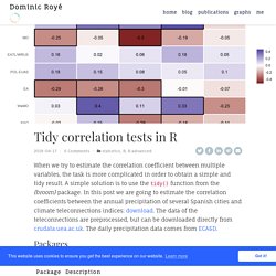
A simple solution is to use the tidy() function from the {broom} package. In this post we are going to estimate the correlation coefficients between the annual precipitation of several Spanish cities and climate teleconnections indices: download. The data of the teleconnections are preprocessed, but can be downloaded directly from crudata.uea.ac.uk. The daily precipitation data comes from ECA&D. Exploring correlations in R with corrr. August 21, 2018 @drsimonj here to share a (sort of) readable version of my presentation at the amst-R-dam meetup on 14 August, 2018: “Exploring correlations in R with corrr”.
Those who attended will know that I changed the topic of the talk, originally advertised as “R from academia to commerical business”. For anyone who’s interested, I gave that talk at useR! 2018 and, thanks to the R consortium, you can watch it here. I also gave a “Wrangling data in the Tidyverse” tutorial that you can follow at Part 1 and Part 2. Moving to corrr — the first package I ever created. I spent a lot of time exploring correlation matrices to make model decisions, and diagnose poor fits or unexpected results! Beautiful and Powerful Correlation Tables in R. Elegant correlation table using xtable R package - Easy Guides - Wiki - STHDA. The R qgraph Package: Using R to Visualize Complex Relationships Among Variables in a Large Dataset, Part One. The R qgraph Package: Using R to Visualize Complex Relationships Among Variables in a Large Dataset, Part One A Tutorial by D.
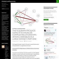
M. Wiig, Professor of Political Science, Grand View University In my most recent tutorials I have discussed the use of the tabplot() package to visualize multivariate mixed data types in large datasets. This type of table display is a handy way to identify possible relationships among variables, but is limited in terms of interpretation and the number of variables that can be meaningfully displayed. Fashion() output with corrr. (This article was first published on blogR, and kindly contributed to R-bloggers) Tired of trying to get your data to print right or formatting it in a program like excel? Try out fashion() from the corrr package: d <- data.frame( gender = factor(c("Male", "Female", NA)), age = c(NA, 28.1111111, 74.3), height = c(188, NA, 168.78906), fte = c(NA, .78273, .9) ) d #> gender age height fte #> 1 Male NA 188.0000 NA #> 2 Female 28.11111 NA 0.78273 #> 3 <NA> 74.30000 168.7891 0.90000 library(corrr) fashion(d) #> gender age height fte #> 1 Male 188.00 #> 2 Female 28.11 .78 #> 3 74.30 168.79 .90 But how does it work and what does it do?
The inspiration: correlations and decimals The insipration for fashion() came from my unending frustration at getting a correlation matrix to print out exactly how I wanted. But this is just plain ugly. Decimal places rounded to the same length (usually 2) All the leading zeros removed, but keeping the decimal aligned with/without - for negative numbers. Ggcorrplot: Visualization of a correlation matrix using ggplot2. The easiest way to visualize a correlation matrix in R is to use the package corrplot.
In our previous article we also provided a quick-start guide for visualizing a correlation matrix using ggplot2. Another solution is to use the function ggcorr() in ggally package. However, the ggally package doesn’t provide any option for reordering the correlation matrix or for displaying the significance level. In this article, we’ll describe the R package ggcorrplot that can displays easily a correlation matrix using ‘ggplot2’. It provides a solution for reordering the correlation matrix and displays the significance level on the correlogram. Ggcorrplot can be installed from CRAN as follow: install.packages("ggcorrplot") Or, install the latest version from GitHub:
Visualizing Correlations with Corrgrams. Posted on 01 Jun 2013 In this post we'll talk about corrgrams: a graphical tool for visualizing a matrix of correlations. Corrgrams One of the very basic tasks when analyzing some dataset is to examine the correlations of the available variables. Assuming that the data is in matrix format (observations in rows, variables in columns), the typical approach to get the correlations is by calculating the matrix of correlations. Among the different plotting options that we can use to visualize such correlations, we have the so-called corrgrams.