
Handmade Data Visualization - adriano.attus.it. Digital Agency Data Tumblr: Archive. Getting the data - and getting it right by James Ball on Prezi. Untitled. Infographic: Mining Pinterest To Discover Our Color Preferences, By Room. Pinterest can be an inspiring place for home decorating.
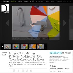
But unless you have five Gs to spend on that one particular chaise lounge, its utility can end in the daydream. When you wake, you’re standing in IKEA again, arguing with your spouse over the proper pronunciation of an umlaut. Colour and Space is a project by designers Mie Frey Damgaard and Peter Ørntoft for decorative paint brand Jotun (Turkey). It digs through Turkish Pinterest boards, analyzing two fairly basic but powerful categories: color and location. The results are placed into simple pie charts, showing preferred colors in places around the home like kids’ rooms (the faintest pink), living rooms (maize), and kitchens (white). “We think it works as inspiration for at least the Turkish consumers,” Ørntoft tells Co.Design. Indeed. While Colour and Space only examines Turkey’s Pinterest boards, they explored a bit deeper through their own research. Visual data. Infographics & Data Visualization.
Create Infographics. Infographics. The Noun Project. Information aesthetics - Data Visualization & Information Design. La Lettura - Visual Data. Visualising Data. Recommended readings for the infographics and visualization course. This post includes a list of recommended (non-mandatory) readings for all my Introduction to Infographics and Data Visualization courses.The main reading of those classes is my own book: The Functional Art: An Introduction to Information Graphics and Visualization.I also mention the series of long-form articles that I am writing for Peachpit Press1.
Emotional Data Visualization: Periscopic's "U.S. Gun Deaths" and the Challenge of Uncertainty2. 20 Great Infographics of 2012. 2012 has certainly been an eventful year, with everything from elections, to olympics, to scientific breakthroughs, to major weather events.

To help review some of the things that happened, here are 20 of the best static infographics from the year. 1. There were several space related events this year. NASA’s Curiosity rover landed on mars, and successfully began collecting data. As this graphic by billowyclouds shows, the scariest part was a terrifying 7 minute landing. Transparency.jpg (JPEG Image, 2560×1440 pixels) - Scaled (50%) Computer Infographics. We Love Infographics.
The Handmade information visualization Pool. Data Viz Gets Physical. While many are busy churning out formulaic infographics, it’s great to see others being considerably more creative.

Some endeavour to come up with new forms of visualisation, and others focus on gathering new data or experimenting with design. The visualisations featured in this post explore the use of different materials for representing data. I was prompted to write this post by the latest edition of Visualisation Magazine (the handmade volume). I did see a post criticising one of the visualisations I’ve included here for its lack of scientific accuracy, but I think that was missing the point. There have been some hot debates on such topics in data visualisation recently, and they are worthwhile conversations. With that said, I hope you enjoy the collection… Infographics. 20 Websites Using Infographics. Infographics is a visual representation of information. Designers often use it to explain complex things in a simple way.
For many years infographics could be found in magazines, brochures and other printed materials, but now it’s becoming a part of the digital world. 40 Super-Cool Infographics You Absolutely Have To See. Infographics can be a great source for learning new facts and getting design inspiration.
I even know several web designers who frequently make infographics to practice some skills. In this article we’ll be having a look at a great collection of these that you definitely should see! Here’s something for everyone. Infographics. 50 Informative and Well-Designed Infographics. It’s impossible to comprehend complex data or analyze large amounts of information, if we only use words or texts.
Information graphics or better known as infographics are visual explanation of data, information or knowledge. These graphics are excellent visual tools for explaining huge amounts of information where complex data needs to be explained immediately and clearly. Let me show you how Rick Mans explain how infographics ease the process of communicating conceptual information Image credit. Infographic is one of the most challenging types of graphic design because the creation process alone is pretty intensive. 20 Infographic Driven Website Designs – the Latest Web Design Trend. Infographics have now permeated through all aspects of the modern web world.
And it seems that they become more valuable as our need to understand a complex content increases. So, 2011 is supposed to be the year of a huge growth of the infographics influence with the ever-increasing variety of infographic driven designs. As you search the web you’ll come across a wide range of interactive and graphical maps, charts, diagrams, blackboards, instructional designs and their concepts being copied and applied to web layouts.
More and more home page backgrounds now integrate some visualized data about a particular project, site navigation, or some key content that is to be conveyed. Why is it so popular? Have a look on the examples of infographic driven designs given below and that will make you more clear about the concept. 10 Great Timeline Infographics. Timelines infographics visually represent a sequence of events that happen over time, allowing the user to understand the visualized data quickly and effectively.
Alma Mater.: InfoGraphic Designs: Overview, Examples and Best Practices. Infographics are traditionally viewed as visual elements such as signs, charts, maps, or diagrams that aid comprehension of a given text-based content.
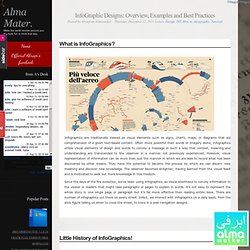
Often more powerful than words or imagery alone, infographics utilize visual elements of design and words to convey a message in such a way that context, meaning and understanding are transcended to the observer in a manner not previously experienced. However, visual representation of information can be more than just the manner in which we are able to record what has been discovered by other means. They have the potential to become the process by which we can discern new meaning and discover new knowledge. The observer becomes enlighten, having learned from the visual feast and is motivated to seek out more knowledge in this medium. Since the days of the fire evolution, we’ve been using infographics, as visual shorthand to convey information to the viewer or readers that might take paragraphs or pages to explain in words. Portfolios. Submit Infographics (by Killer Infographics) 7 Amazing Infographics about Fitness.
London’s Twitter Languages. **Update: You can see a new fully-interactive version here** Last year Eric Fischer produced a great map (see end of post) visualising the language communities of Twitter.
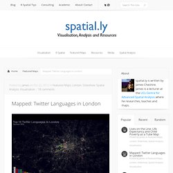
The map, perhaps unsurprisingly, closely matches the geographic extents of the world’s major linguistic groups. On seeing these broad patterns I wondered how well they applied London- a great international city. The graphic above shows (and here for non-zoom version) the spatial distribution of about 3.3 million geo-located tweets (based on GPS) coloured by the language detected using Google’s translation tools. Ed Manley collected the data and he goes into more detail about the data here. Even though the map contains over 3 million tweets it is still a fairly selective sample of Londoners- they only include people who have a good location (through GPS) and those who are connected to the internet.