

The Art Of Timelines For Learning. Sharebar Click for large version on Wikipedia Now that infographics have entered our consciousness, we no longer need to think of timelines as events placed on a generic horizontal arrow.
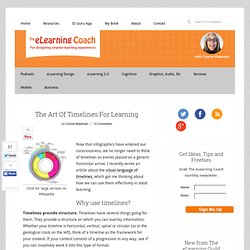
I recently wrote an article about the visual language of timelines, which got me thinking about how we can use them effectively in adult learning. Why use timelines? Timelines provide structure. Timelines enable chunking. The Visual Language of Timelines. Time is often considered to be a subjective experience—it seems to pass quickly or it drags on and on.
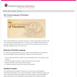
Structuring time with timelines, however, provides a sense of stability and objectivity. It’s a way to give temporal events a framework so we can show how occurrences relate to each other. Essentially, timelines provide a way to tell a story. Elements of Timeline Language. A Periodic Table of Visualization Methods.
The Data Visualisation Catalogue. Color Hex - ColorHexa.com. eLearning - PowerPoint. Illusions in Data Visualization. Data visualizations are effective ways for inputting information into a human’s brain, and as Visual Analytics Researcher at Tableau Software and Visual.ly advisor Robert Kosara says, visualizations are what makes our world real.
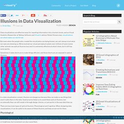
But even when the people who created the visualization are being honest, we can’t always trust what our eyes are showing us. We’ve evolved our visual perceptual system over millions of years (some other animals see optical illusions too) and it is extremely effective at what it does, but it still has some quirks. Sometimes it takes shortcuts to make things efficient, and those shortcuts are exposed in optical illusions. In a data visualization context, illusions are dangerous because they can make us see things that aren’t really there in the data. Good practice helps us to avoid these optical illusions, but occasionally they can still sneak in through design choices, or just quirks in the way data lines up.
47 Top Typography Tools and Resources. Typography is the foundation of design on the web.
Back in 2006, designer and founder of iA Oliver Reichenstein even went so far as to proclaim "web design is 95% typography. " It's imperative, then, to have a thorough, grounded education in optimizing and utilizing typography to create a balanced, harmonious, accessible hierarchy of content, when working on the web. To help you improve and learn more about typography, we have compiled 25 useful tools and resources, from fundamentals to modular scales. Have we left out your favorite typography tool or resource? If so, please share your recommendations with other readers in the comments. About David Margolis - The Slide Guru. Hi, I’m David Margolis, the creator of Slide Guru.
I’m glad you found your way to my website. As a Presentation Specialist, I’ve spent the last 10 years designing high-level presentations, delivering executive keynotes, developing corporate pitches, creating brand guidelines and innovating presentation systems across a wide variety of industries that include Advertising, Sport, Finance and Telecoms. Over my career I’ve designed over 50,000 slides. On this website you will find an extensive slide gallery, featuring over 1,000 professionally designed slides that I’ve extracted or adapted from my slide portfolio.
21 Ways To Get Visual Ideas. Sharebar When you’re stuck, in a rut or brain drained, it’s hard to be creative on demand.
Marketo-true-colors-918x3235.png (PNG Image, 918x3235 pixels) - Scaled (19%) Presentation design blog Idea Transplant. Dear NASA: No More Rainbow Color Scales, Please. Dear NASA, The visualization community has noticed your insistence on using rainbow color scales for representing continuous data.
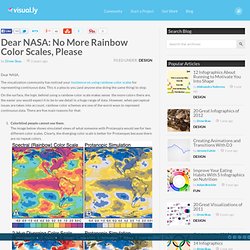
This is a plea to you (and anyone else doing the same thing) to stop. On the surface, the logic behind using a rainbow color scale makes sense: the more colors there are, the easier you would expect it to be to see detail in a huge range of data. However, when perceptual issues are taken into account, rainbow color schemes are one of the worst ways to represent continuous data. There are five main reasons for that: VRA Resources. Educational animation. Educational animations are animations produced for the specific purpose of fostering learning.
The popularity of using animations to help learners understand and remember information has greatly increased since the advent of powerful graphics-oriented computers. This technology allows animations to be produced much more easily and cheaply than in former years. Previously, traditional animation required specialised labour-intensive techniques that were both time-consuming and expensive. In contrast, software is now available that makes it possible for individual educators to author their own animations without the need for specialist expertise. Teachers are no longer limited to relying on static graphics but can readily convert them into educational animations. Animations for Education[edit] Creating Animations in PowerPoint to Support Student Learning and Engagement.
Key Takeaways Judicious use of animation can support teaching goals and further engage students in classroom presentations.
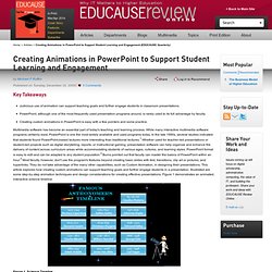
PowerPoint, although one of the most frequently used presentation programs around, is rarely used to its full advantage by faculty. Creating custom animations in PowerPoint is easy with a few pointers and some practice. Multimedia software has become an essential part of today's teaching and learning process. While many interactive multimedia software programs certainly exist, PowerPoint is one the most widely available and used programs today. Figure 1. Animations Can Engage Student Interest The use of animations is becoming increasingly widespread in many educational presentations. Framework for evaluating the Quality of Multimedia Learning Resources. Using Digital Media to Enhance Educational Transfer.
Note: This is cross posted at Smart Blog on Education.
Educational transfer is the point of education, right? If students can’t use what we’ve taught them in new, real-life situations, then we end up with students who are good at school and bad at life. Recent research from National Academies Press reminds us that one of the best ways to promote transfer is to balance students’ cognitive load while they consume or create multimedia. Every time students are presented with a new idea or situation, the following three processes happen simultaneously: · Extraneous processing – This type of processing handles all of the “extra stuff” that occurs within a situation. . · Essential processing – This is the processing that is directly related to the task at hand. Blog.SpoonGraphics. The Artist's Toolkit: Explore. Powerpoint07Animation. Education Using Powerpoint - High quality PowerPoint slideshows and resources for the teaching and revision of GCSE and KS3 Science and A Level Physics.
Leveraging Words and Visuals in Training. Whether you are a facilitator or a designer-developer of training materials, your basic communication tools are: visuals (static or animated) and words (printed or narrated). Is learning better when you add graphics to your lessons? When you display an effective visual, is it better to explain it with audio narration or with text? When are animated visuals more effective than a series of still visuals? In my next few articles in this series, we’ll look at what research has to say on these issues. Guideline: Augment Words with Relevant Visuals In controlled experiments in which the same content was communicated with either relevant visuals and words or with words alone, the versions with visuals resulted in significantly better learning. Based on what we already discussed, the text-only version was not as effective as text with either of the added visuals (Butcher, 2006).
Multimodal-Learning-Through-Media.pdf. Tutorials. How to Make a State Grid Map in R Something of a cross between a reference table and a map, the state grid provides equal space to each state and a semblance of the country to quickly pick out individual states. Amazing Resource for Design Freebies. The Complete Social Media Icons Set [EPS, PSD, CSS] Is it time to mix up the social media icons on your website?
Try Candy, a new social media icon set from designer Ahmed Kaludi. The set has everything you need to help users... UIcons – Free Line Icons (AI, EPS, SVG, PNG) There’s nothing bigger in design right now than the use of great icon sets throughout a project. Thankfully for you, there’s UIcons. This huge collection of crisp and diverse... Teach Yourself Graphic Design: A Self-Study Course Outline. Fortunately, it isn’t required to go to design school in order to be a graphic designer.
A good foundation in graphic design history, theory, and practical application will help you hit the ground running. One Hour PowerPoint: Ten Strategies for Improving Presentations. Six Principles of Effective e-Learning: What Works and Why by Ruth Clark. "For the past ten years, Richard Mayer and his colleagues at the University of California at Santa Barbara have conducted a series of controlled experiments on how to best use audio, text, and graphics to optimize learning in multimedia. Six media element principles can be defined based on Mayer’s work. What follows is a summary of these principles along with supporting examples, psychological rationale, and research. " Evaluating multimedia presentations. When Typography Speaks Louder Than Words. Advertisement Clever graphic designers love to use typography to explore the interaction between the look of type and what type actually says.
Presentation Skills for Teachers version 3.0. Ideas on how to create powerful presentations. STEAL THIS PRESENTATION! Over 45 Free Speech Bubbles to Make Your E-Learning Courses Talk. Presentation Design 411. Visual Literacy: An E-Learning Tutorial on Visualization for Communication, Engineering and Business.
Visual Design Basics. The Principles of Design. The web professional's online magazine of choice. 50 Totally Free Lessons in Graphic Design Theory. How to Focus a Presentation. 12 Ways to Become a Better Designer in 2012 - Designer Blog Designer Blog. 10 Books Of Visual Ideas. A Non-Designer's Guide to Typefaces and Layout.
You Need to Know These Seven Tips If You Build Graphics for E-Learning. A Beginner's Guide to Combining Multiple Fonts. 10 Visual Design Quick Tips. Method & Models for Students. The Social Business Video People Just Get. “Five Cardinal Sins” of presentations « Presentation Impact.
Fonts. 6 Steps To Creating A Knockout Online Portfolio. 30 Free Seamless Background Textures. Presentation Magazine - Free advice and 519 PowerPoint templates. 7 Secrets to Getting the Graphics You Need for Rapid E-Learning. Typographic Design Patterns and Best Practices - Smashing Magazine. Instructional Design And The Six Thinking Hats. Tweak Your Slides: Ten Design Principles for Educators (version 3.0)