
The Ultimate Guide to Flexbox — Learning Through Examples. 11 things I learned reading the flexbox spec – Hacker Noon. Flexbox’s Best-Kept Secret – Hacker Noon. Let’s get flexible!
Of course if you read the spec, you’ll see that auto margins are referenced right in the middle: Spec Reference: 8.1. Aligning with auto margins. If you apply auto margins to a flex item, that item will automatically extend its specified margin to occupy the extra space in the flex container, depending on the direction in which the auto-margin is applied. For example, a <div> with the style margin-left: auto would be pushed all the way to the right of the flex container, with the left-side margin taking up any extra space between the left edge of the element and its previous sibling. If you don’t specify a direction, simply applying margin: auto, a flex item would evenly distribute any extra space on either side of the itself equally. The magic of using auto margins in conjunction with Flexbox comes from allowing you to override the default alignment specified by justify-content on an individual flex item.
How to create horizontally scrollable sections with Flexbox. This article is example focused, and the problem we’ll be solving is pretty standard.
The road to learning by precept is long, by example short and effective — Lucius Seneca How do you create a section that scrolls horizontally — with great support on browsers, mobile inclusive? Flexbox! Yeah, that’s the short answer. Let’s flesh that out a bit. Basic Code Setup Consider the markup below. It’s essentially a section with a couple div elements as children. Code Styles Because no one loves ugly designs, let’s have some very basic styling: The first few lines, 1 -5 explicitly sets the width and height of the root elements to 100% Line 8 gives the body a background-color, line 9 takes away margin around the body, while lines 10 to 12 ensures that the direct child element of body is positioned exactly at the center — vertically and horizontally.
To see this in effect, give the child element, <section class=”card"> some styling: Line 2 is quite obvious. Now everything should look like this at this point: Even more about how Flexbox works — explained in big, colorful, animated gifs. Understanding Flexbox: Everything you need to know – freeCodeCamp. Doesn’t that look pretty?
I’ll get into the inner workings of Flexbox while you learn to build the music app layout. You’ll also get a feel for the role Flexbox plays in responsive web design, too. I’m excited to show you all this. But before you get started building user interfaces, I’m going to walk you through some drills, first. This may seem boring, but it’s all part of the process of getting you adept at Flexbox.
Let’s get started. Introduction. How Flexbox works — explained with big, colorful, animated gifs. Flexbox promises to save us from the evils of plain CSS (like vertical alignment).
Well, Flexbox does deliver on that goal. But mastering its new mental model can be challenging. So let’s take an animated look at how Flexbox works, so we can use it to build better layouts. Flexbox’s underlying principle is to make layouts flexible and intuitive. To accomplish this, it lets containers decide for themselves how to evenly distribute their children — including their size and the space between them. This all sounds good in principle. In this article, we’ll dive into the 5 most common Flexbox properties. Property #1: Display: Flex Here’s our example webpage: You have four colored divs of various sizes, held within a grey container div. In order to get started with Flexbox, you need to make your container into a flex container.
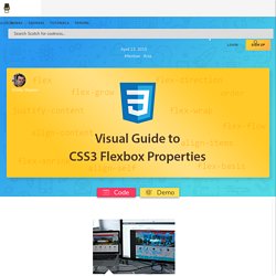
Not a lot has changed — your divs are displayed inline now, but that’s about it. Property #2: Flex Direction Flex-direction, however, let’s you rotate the main axis. Conclusion. A Visual Guide to CSS3 Flexbox Properties. The Flexbox Layout officially called CSS Flexible Box Layout Module is new layout module in CSS3 made to improve the items align, directions and order in the container even when they are with dynamic or even unknown size.
The prime characteristic of the flex container is the ability to modify the width or height of its children to fill the available space in the best possible way on different screen sizes. Many designers and developers find this flexbox layout easier to use, as positioning of the elements is simpler thus more complex layouts can be achieved with less code, leading to simpler development process. Flexbox layout algorithm is direction based unlike the block or inline layout which are vertically and horizontally based. This flexbox layout should be used for small application components, while new CSS Grid Layout Module is emerging to handle the large scale layouts. Basics. A Complete Guide to Flexbox. Visual Guide to CSS3 Flexbox: Flexbox Playground.