
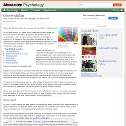
Psychology of Color: Infographic on the impact of color. Perhaps no choice is as vital to marketing as color.

Whether you are selecting the color for a product or for your email marketing campaign, color has tremendous impact on all of us. Subconsciously, we associate different colors with different things. This infographic examines the psychology of color and looks at some common associations of different colors. It shows the overall importance of color to consumers and characteristics of many individual colors, and it also helps show the connection between graphic design and psychology.
The numbers are pretty fascinating! While color can be appealing to us visually, a lot more is going on behind the scenes than just an aesthetic. Embed This Graphic On Your Site <img src=” alt=”Psychology of Color Infographic” />Infographic by <a title=”WebpageFX” href=” Color Psychology Will Empower Your Life. Color Psychology. Colors, like features, follow the changes of the emotions. - Pablo Picasso Do you feel anxious in a yellow room?
Does the color blue make you feel calm and relaxed? Artists and interior designers have long understood how color can dramatically affect moods, feelings, and emotions. It is a powerful communication tool and can be used to signal action, influence mood, and cause physiological reactions. Certain colors have been associated with increased blood pressure, increased metabolism, and eyestrain. "Given the prevalence of color, one would expect color psychology to be a well-developed area," note researchers Andrew Elliot and Markus Maier. Despite the general lack of research in this area, the concept of color psychology has become a hot topic in marketing, art, design, and other areas. Of course, your feelings about color are often deeply personal and rooted in your own experience or culture. Why is color such a powerful force in our lives?
Archimess - The Psychology of Colors No.2 - Infographic. The Psychology of Color in Marketing and Branding. The psychology of color as it relates to persuasion is one of the most interesting — and most controversial — aspects of marketing. At Help Scout we believe the problem has always been depth of analysis. Color theory is a topic of complexity and nuance, but splashy infographics rarely go beyond See ‘n Say levels of coverage. Green Lantern can’t turn lemons into lemonade and I’m left equally unequipped to make smart decisions about the spectrum which shades our world. But why is such a potentially colorful conversation so unwaveringly shallow?
Misconceptions around the psychology of color As research shows, it’s likely because personal preference, experiences, upbringing, cultural differences, and context muddy the effect individual colors have on us. But there’s still plenty to learn and consider if we humbly accept that concrete answers aren’t a guarantee. The importance of colors in branding Credit: The Logo Company Color trends for men and women Here were Hallock’s findings:
Goethe on the Psychology of Color and Emotion. Color is an essential part of how we experience the world, both biologically and culturally.
One of the earliest formal explorations of color theory came from an unlikely source — the German poet, artist, and politician Johann Wolfgang von Goethe, who in 1810 published Theory of Colors (public library; public domain), his treatise on the nature, function, and psychology of colors. Though the work was dismissed by a large portion of the scientific community, it remained of intense interest to a cohort of prominent philosophers and physicists, including Arthur Schopenhauer, Kurt Gödel, and Ludwig Wittgenstein. One of Goethe’s most radical points was a refutation of Newton’s ideas about the color spectrum, suggesting instead that darkness is an active ingredient rather than the mere passive absence of light. YELLOWThis is the color nearest the light. It appears on the slightest mitigation of light, whether by semi-transparent mediums or faint reflection from white surfaces. Color Think Tank - the psychology of color. Our personal and cultural associations affect our experience of color.
Colors are seen as warm or cool mainly because of long-held (and often universal) associations. Yellow, orange and red are associated with the heat of sun and fire; blue, green and violet with the coolness of leaves, sea and the sky. Warm colors seem closer to the viewer than cool colors, but vivid cool colors can overwhelm light and subtle warm colors. Using warm colors for foreground and cool colors for background enhances the perception of depth. Although red, yellow and orange are in general considered high-arousal colors and blue, green and most violets are low-arousal hues, the brilliance, darkness and lightness of a color can alter the psychological message.
Colors act upon the body as well as the mind. People will actually gamble more and make riskier bets when seated under a red light as opposed to a blue light. Color Think Tank - the psychology of color.